FabCon is coming to Atlanta
Join us at FabCon Atlanta from March 16 - 20, 2026, for the ultimate Fabric, Power BI, AI and SQL community-led event. Save $200 with code FABCOMM.
Register now!- Power BI forums
- Get Help with Power BI
- Desktop
- Service
- Report Server
- Power Query
- Mobile Apps
- Developer
- DAX Commands and Tips
- Custom Visuals Development Discussion
- Health and Life Sciences
- Power BI Spanish forums
- Translated Spanish Desktop
- Training and Consulting
- Instructor Led Training
- Dashboard in a Day for Women, by Women
- Galleries
- Data Stories Gallery
- Themes Gallery
- Contests Gallery
- QuickViz Gallery
- Quick Measures Gallery
- Visual Calculations Gallery
- Notebook Gallery
- Translytical Task Flow Gallery
- TMDL Gallery
- R Script Showcase
- Webinars and Video Gallery
- Ideas
- Custom Visuals Ideas (read-only)
- Issues
- Issues
- Events
- Upcoming Events
The Power BI Data Visualization World Championships is back! Get ahead of the game and start preparing now! Learn more
- Power BI forums
- Forums
- Get Help with Power BI
- Desktop
- WaterFall Formula Option
- Subscribe to RSS Feed
- Mark Topic as New
- Mark Topic as Read
- Float this Topic for Current User
- Bookmark
- Subscribe
- Printer Friendly Page
- Mark as New
- Bookmark
- Subscribe
- Mute
- Subscribe to RSS Feed
- Permalink
- Report Inappropriate Content
WaterFall Formula Option
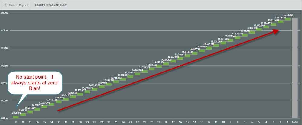
Did you ever try to create a Waterfall chart and you run into a chart that just adds everything and looks like this?
Other solutions I have found here involve creating another custom table that does measures the +/- by time period but that can become cumbersome with multiple measures, tables, and time frames. They do not allow me to use my current data set and history. That is because I get weekly bucket data.
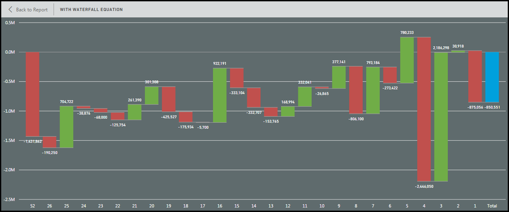
I was able to work out the following formula which enables me to easily get a net change by period, grouped dates, and use the formula to create the same for other measures very quickly. I just haven’t seen anything like this on the community so I thought the solution would come in handy. Here is what the same measure looks like using the Waterfall equation.
A few notes:
I use a WeekNumber Ascending/Descending to keep my charts cleaner and in line with other templates. You can use dates, months, years whatever just make sure you update the formula to match and a table to make Asc/Desc correlating numbers. It also enables me to group weeks and maintain Week 1 as the most current week etc. I grouped weeks 52 through week 27 and that gave me a great starting bar so I can evaluate the full change over a year but with 26 weeks of detail. This too can be adjusted or grouped to your liking.
WeekNum can be replaced by your number based reference column and the logic still works. You will just have to change MAX to MIN or “-“ to “+” depending on how you want the flow to happen. So minor changes may be needed. You can get more complicated and create Tables that give dimensions (names of products etc) a number and use that to get the same effect by charting by that fact.
Volume = SUM(Volume) ß Used in the first graph
Volume_WF = CALCULATE(sum(Table[Volume]),FILTER(ALL(dWeekList),dWeekList[Week_Seq_Number_Desc]=MAX(dWeekList[Week_Seq_Number_Desc]))) - CALCULATE(sum(Table[Volume]),FILTER(ALL(dWeekList),(dWeekList[Week_Seq_Number_Desc] -1 )=MAX(dWeekList[Week_Seq_Number_Dec])))
I hope this helps you make some great charts and struggle a little less with one of the best visuals BI has!
RW
- Mark as New
- Bookmark
- Subscribe
- Mute
- Subscribe to RSS Feed
- Permalink
- Report Inappropriate Content
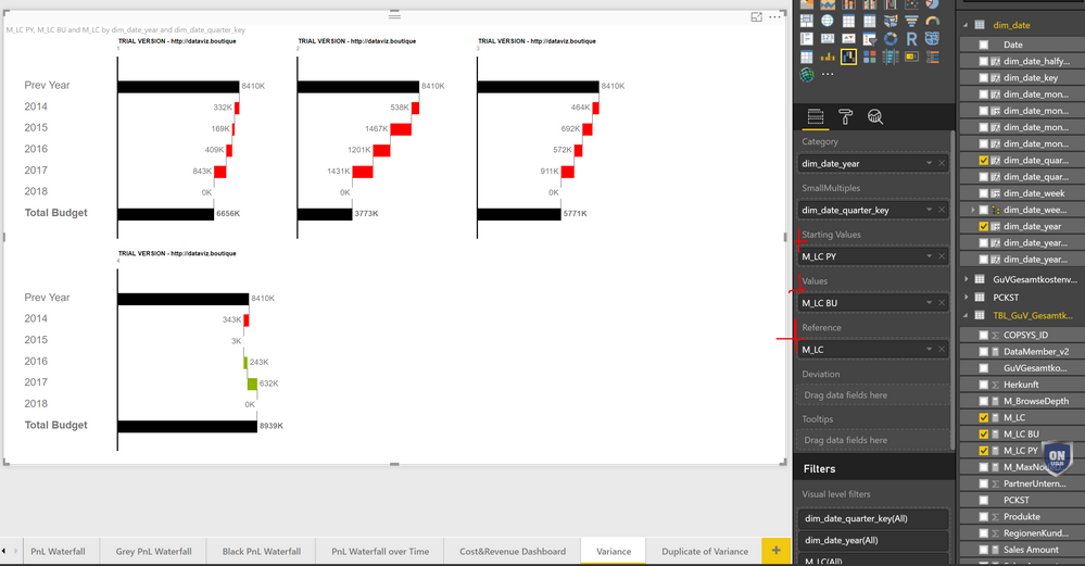
Have a look at the PowerBI Ultimate Waterfall Chart
http://dataviz.boutique/2017/03/22/powerbi-ultimate-waterfall-custom-visual/
BR
Klaus
- Mark as New
- Bookmark
- Subscribe
- Mute
- Subscribe to RSS Feed
- Permalink
- Report Inappropriate Content
Helpful resources

Power BI Dataviz World Championships
The Power BI Data Visualization World Championships is back! Get ahead of the game and start preparing now!

| User | Count |
|---|---|
| 40 | |
| 36 | |
| 34 | |
| 31 | |
| 27 |
| User | Count |
|---|---|
| 136 | |
| 103 | |
| 67 | |
| 65 | |
| 56 |


