FabCon is coming to Atlanta
Join us at FabCon Atlanta from March 16 - 20, 2026, for the ultimate Fabric, Power BI, AI and SQL community-led event. Save $200 with code FABCOMM.
Register now!- Power BI forums
- Get Help with Power BI
- Desktop
- Service
- Report Server
- Power Query
- Mobile Apps
- Developer
- DAX Commands and Tips
- Custom Visuals Development Discussion
- Health and Life Sciences
- Power BI Spanish forums
- Translated Spanish Desktop
- Training and Consulting
- Instructor Led Training
- Dashboard in a Day for Women, by Women
- Galleries
- Data Stories Gallery
- Themes Gallery
- Contests Gallery
- Quick Measures Gallery
- Visual Calculations Gallery
- Notebook Gallery
- Translytical Task Flow Gallery
- TMDL Gallery
- R Script Showcase
- Webinars and Video Gallery
- Ideas
- Custom Visuals Ideas (read-only)
- Issues
- Issues
- Events
- Upcoming Events
Calling all Data Engineers! Fabric Data Engineer (Exam DP-700) live sessions are back! Starting October 16th. Sign up.
- Power BI forums
- Forums
- Get Help with Power BI
- Desktop
- Visuals with milestone or event note?
- Subscribe to RSS Feed
- Mark Topic as New
- Mark Topic as Read
- Float this Topic for Current User
- Bookmark
- Subscribe
- Printer Friendly Page
- Mark as New
- Bookmark
- Subscribe
- Mute
- Subscribe to RSS Feed
- Permalink
- Report Inappropriate Content
Visuals with milestone or event note?
Hi there,
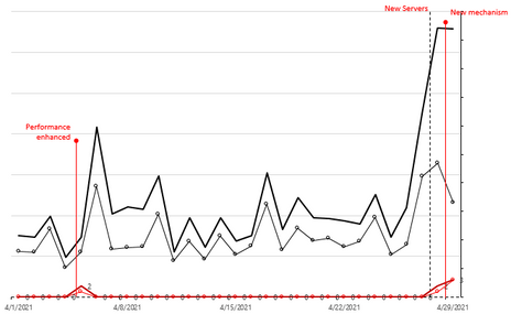
Is there a visual can display a chart with note on timeline?
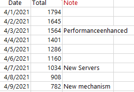
E.g. user can add note in table or anywhere else and they will be displayed with data. (please ignore the date difference between table and chart, just for example)
IMO, this will make clean & clear view on project analysis, what result is possibly triggered by what changes.
Please advise if there is a visual suppor this.
Thanks in advance.
H
Solved! Go to Solution.
- Mark as New
- Bookmark
- Subscribe
- Mute
- Subscribe to RSS Feed
- Permalink
- Report Inappropriate Content
Hi @Anonymous ,
I have found the cause of the issue. the x-axis constant line only apply for continuous x-axis. When you drill down to the weeknum, it become categorical type. so the x-axis constant line disappear.
You need to change your weeknum column to numeric use the following calculated column:
Weeknum = WEEKNUM(Table[DATE])
Then when you drill down to the weeknum level , the constant line will not disappear.
If this post helps, then please consider Accept it as the solution to help the other members find it more quickly.
Best Regards,
Dedmon Dai
- Mark as New
- Bookmark
- Subscribe
- Mute
- Subscribe to RSS Feed
- Permalink
- Report Inappropriate Content
@Anonymous , x-axis constant line was introduced in March 2020,
But I doubt that will fir in for what you need
You need to check for some custom visual -https://appsource.microsoft.com/en-us/marketplace/apps?product=power-bi-visuals
- Mark as New
- Bookmark
- Subscribe
- Mute
- Subscribe to RSS Feed
- Permalink
- Report Inappropriate Content
Hi @amitchandak ,
Thanks for the information, this is helpful!
I can add another Gantt chart for note below the line chart with the function: X axis constant line for line charts.
However, I cannot find the option in my line visual.
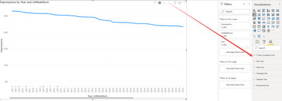
Seems the option "X axis constant line" is only availabe when it is Date in X-Axis, once I apply Hierarchy with WeekNumber, it will not available.
I can only find "Y-Axis Constant Line"
Could you please help to advise?
Thanks & have a good day.
H
- Mark as New
- Bookmark
- Subscribe
- Mute
- Subscribe to RSS Feed
- Permalink
- Report Inappropriate Content
Hi @Anonymous ,
Why you need to put the two field in the x-axis? I suggest you use the build-in date hierarchy only. But based on my test, it all works well in my environment. Are you using the latest version of the desktop?
If this post helps, then please consider Accept it as the solution to help the other members find it more quickly.
Best Regards,
Dedmon Dai
- Mark as New
- Bookmark
- Subscribe
- Mute
- Subscribe to RSS Feed
- Permalink
- Report Inappropriate Content
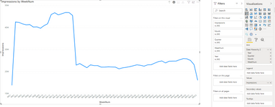
Hi @v-deddai1-msft , can you please try to drill down the X-axis to "WeekNum" level? I just find before down to WeekNum level at my visual, the option was available, which means available at Year, Quarter, Month, but once I drill down to WeekNum level, the option disappears.
- Mark as New
- Bookmark
- Subscribe
- Mute
- Subscribe to RSS Feed
- Permalink
- Report Inappropriate Content
Hi @Anonymous ,
I have found the cause of the issue. the x-axis constant line only apply for continuous x-axis. When you drill down to the weeknum, it become categorical type. so the x-axis constant line disappear.
You need to change your weeknum column to numeric use the following calculated column:
Weeknum = WEEKNUM(Table[DATE])
Then when you drill down to the weeknum level , the constant line will not disappear.
If this post helps, then please consider Accept it as the solution to help the other members find it more quickly.
Best Regards,
Dedmon Dai
- Mark as New
- Bookmark
- Subscribe
- Mute
- Subscribe to RSS Feed
- Permalink
- Report Inappropriate Content
Hi @v-deddai1-msft ,
Thanks for the reply.
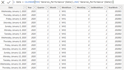
After adding more column and make the intWeekNum to "Number",
I can see the option in some condition, but for following situations, there is a problem or the option is still not avaialbe:
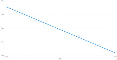
If I use "Go to the next level in the Hierarchy", the option is available, but the X-axis contains no "YEAR" information.
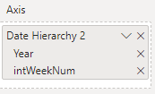
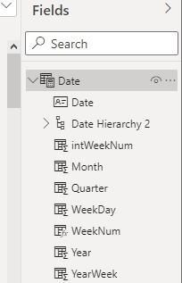
(I've added the intWeekNum to Hierarchy)
From the upper level you can see, the Year is included in the data. So the expected result shall be the X-axis contains Year-intWeekNumber together in the first visual.
But if I use this option: Expand All Down Level in the Hierarchy, I can see the X-axis contains Year-intWeekNum which is good, but there is no "X-axis constant line" option...
Could you please help to this?
Thanks & have a good one.
- Mark as New
- Bookmark
- Subscribe
- Mute
- Subscribe to RSS Feed
- Permalink
- Report Inappropriate Content
Hi @Anonymous ,
As I mentioned above, the x-axis constant line only apply for continuous x-axis. When you Expand All Down Level in the Hierarchy ,the x-axis became categorical type. so the x-axis constant line disappear.
If this post helps, then please consider Accept it as the solution to help the other members find it more quickly.
Best Regards,
Dedmon Dai
- Mark as New
- Bookmark
- Subscribe
- Mute
- Subscribe to RSS Feed
- Permalink
- Report Inappropriate Content
Putting 2 fields into X-axis is the most effective way I can find that to make it ranking by date when I apply WeekNum.
I tried to remove the "Date" but only keeping the Date Hirarchy, but as you can see, there is no X-axis.
Maybe I get something wrong setting in Hirarchy?
Can you advise where do you get the date hierarchy that can include WeekNum?
I use calculated columns in table:
Thanks.
H
Helpful resources

FabCon Global Hackathon
Join the Fabric FabCon Global Hackathon—running virtually through Nov 3. Open to all skill levels. $10,000 in prizes!

Power BI Monthly Update - October 2025
Check out the October 2025 Power BI update to learn about new features.

