FabCon is coming to Atlanta
Join us at FabCon Atlanta from March 16 - 20, 2026, for the ultimate Fabric, Power BI, AI and SQL community-led event. Save $200 with code FABCOMM.
Register now!- Power BI forums
- Get Help with Power BI
- Desktop
- Service
- Report Server
- Power Query
- Mobile Apps
- Developer
- DAX Commands and Tips
- Custom Visuals Development Discussion
- Health and Life Sciences
- Power BI Spanish forums
- Translated Spanish Desktop
- Training and Consulting
- Instructor Led Training
- Dashboard in a Day for Women, by Women
- Galleries
- Data Stories Gallery
- Themes Gallery
- Contests Gallery
- QuickViz Gallery
- Quick Measures Gallery
- Visual Calculations Gallery
- Notebook Gallery
- Translytical Task Flow Gallery
- TMDL Gallery
- R Script Showcase
- Webinars and Video Gallery
- Ideas
- Custom Visuals Ideas (read-only)
- Issues
- Issues
- Events
- Upcoming Events
The Power BI Data Visualization World Championships is back! Get ahead of the game and start preparing now! Learn more
- Power BI forums
- Forums
- Get Help with Power BI
- Desktop
- Visuals changing size/location on different screen...
- Subscribe to RSS Feed
- Mark Topic as New
- Mark Topic as Read
- Float this Topic for Current User
- Bookmark
- Subscribe
- Printer Friendly Page
- Mark as New
- Bookmark
- Subscribe
- Mute
- Subscribe to RSS Feed
- Permalink
- Report Inappropriate Content
Visuals changing size/location on different screen sizes
I am having a unique problem on a recently developed dashboard. I wasn't able to find any relevant post so I will outline the issue and some things I have tried, without success, to remedy.
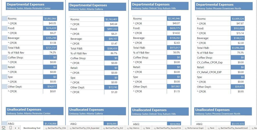
I built a benchmarking dashboard that compare 4 sites to each other with multiple metrics, I wanted to pass granular details for these sites utilizing tooltips. To achieve this I used a blank measure in a card and set it to be transparent so the user hovers over the value in the matrix and it acts as a typical tooltip would. I did it this way because of performance issues with the dashboard, it is insanely large and the matrix design loads much faster.
Here are the differences between a view from my large monitor (27 Inch with 1920 x 1080 res) & laptop. Although all the Blue areas have tooltips you can clearly see the "movement" in the light blue ones to the left of the first column of data. I believe this is due to the matrix resizing (unsure why).
I have tried the following:
View > Page View > Fit to Width
View > Page View > Fit to Page
View > Page View > Actual Size
Grouping all visuals together
Grouping visuals together and turning on "Lock aspect ratio"
I am open to all suggestions including a redesign of the visuals but can not abide with the sloppy project appearance for users...help!?
Monitor View:
Laptop View:

Solved! Go to Solution.
- Mark as New
- Bookmark
- Subscribe
- Mute
- Subscribe to RSS Feed
- Permalink
- Report Inappropriate Content
Updated: I have found a resolution, I came to the conclussion that the screen size used to the load the page was causing the issues and optimizing for one distrubed the layering of the other. I utilized simple navigation features to add a desktop vs laptop view in my reporting and optimized the pages to the appropriate links. Two seperate pages with simplistic navigation.
I just used PNG files for desktop monitor and laptop and linked to the formated page.
Helpful resources

Power BI Dataviz World Championships
The Power BI Data Visualization World Championships is back! Get ahead of the game and start preparing now!

| User | Count |
|---|---|
| 40 | |
| 38 | |
| 36 | |
| 29 | |
| 28 |
| User | Count |
|---|---|
| 127 | |
| 88 | |
| 78 | |
| 66 | |
| 64 |


