FabCon is coming to Atlanta
Join us at FabCon Atlanta from March 16 - 20, 2026, for the ultimate Fabric, Power BI, AI and SQL community-led event. Save $200 with code FABCOMM.
Register now!- Power BI forums
- Get Help with Power BI
- Desktop
- Service
- Report Server
- Power Query
- Mobile Apps
- Developer
- DAX Commands and Tips
- Custom Visuals Development Discussion
- Health and Life Sciences
- Power BI Spanish forums
- Translated Spanish Desktop
- Training and Consulting
- Instructor Led Training
- Dashboard in a Day for Women, by Women
- Galleries
- Data Stories Gallery
- Themes Gallery
- Contests Gallery
- QuickViz Gallery
- Quick Measures Gallery
- Visual Calculations Gallery
- Notebook Gallery
- Translytical Task Flow Gallery
- TMDL Gallery
- R Script Showcase
- Webinars and Video Gallery
- Ideas
- Custom Visuals Ideas (read-only)
- Issues
- Issues
- Events
- Upcoming Events
Get Fabric Certified for FREE during Fabric Data Days. Don't miss your chance! Request now
- Power BI forums
- Forums
- Get Help with Power BI
- Desktop
- Re: Visualizing Throughput Against Turnaround
- Subscribe to RSS Feed
- Mark Topic as New
- Mark Topic as Read
- Float this Topic for Current User
- Bookmark
- Subscribe
- Printer Friendly Page
- Mark as New
- Bookmark
- Subscribe
- Mute
- Subscribe to RSS Feed
- Permalink
- Report Inappropriate Content
Visualizing Throughput Against Turnaround
Hi All,
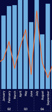
What would you recommend as the best visuals for comparing volume of items processed against throughput time? The standard seems to be a combo line and column chart, but I find the line to be overly volatile when throughput varies significantly from one period to the next, or when slicing on a sub-category with a small sample size.
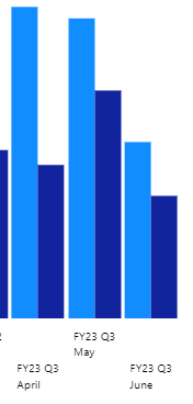
My next go-to was to use a dual y-axis column chart, but Microsoft doesn't seem to support that by default. There are some third party visuals that do, however these unfortunately concatenate my date hierarchy on the x-axis.
Any suggestions?
- Mark as New
- Bookmark
- Subscribe
- Mute
- Subscribe to RSS Feed
- Permalink
- Report Inappropriate Content
Hi,
Without seeing the Y-axis (or axes) on your combo chart I can't tell whether from June to July you really are going from 20% to 80%, or whether the line is going from 31% to 34%, but the minimum and maximum values on the Y axis are 30 and 35.
If the latter then this is easily fixed by setting the minimum value on your secondary Y axis to zero (presumably throughput can never be less than zero).
If (as I suspect) it's the former, then I would remove the volatility by aggregating over a longer time period. I would keep the combo chart and create a new measure showing the average over the quarter. Something like this, assuming you have a date table:
ThroughPutQ = var currMonth = SELECTEDVALUE('Date_V'[Month Number])
return
if(currMonth <= 3,
CALCULATE([ThroughPut], all('Date_V'[MMM]),'Date_V'[Month Number] <= 3),
if(currMonth <= 6,
CALCULATE([ThroughPut], all('Date_V'[MMM]),'Date_V'[Month Number] >=4,'Date_V'[Month Number] <= 6),
if(currMonth <= 9,
CALCULATE([ThroughPut], all('Date_V'[MMM]),'Date_V'[Month Number] >=7,'Date_V'[Month Number] <= 9),
CALCULATE([ThroughPut], all('Date_V'[MMM]),'Date_V'[Month Number] >= 10)
)))
Alternatively you could also use a rolling average, which would also smooth the volatility, but it might be less clear to your users what that represents if they're expecting it to be strictly monthly. A flat line for the quarter is visually unambiguous.
I don't think an alternative visual is going to do it for you as if your measure is volatile, then it will show as volatile in any alternative visual.
Finally, consider keeping the volatility in. It may be visually unappealing, but it is an accurate reflection of the data and tells a story in its own way.
Helpful resources

Power BI Monthly Update - November 2025
Check out the November 2025 Power BI update to learn about new features.

Fabric Data Days
Advance your Data & AI career with 50 days of live learning, contests, hands-on challenges, study groups & certifications and more!


