- Power BI forums
- Updates
- News & Announcements
- Get Help with Power BI
- Desktop
- Service
- Report Server
- Power Query
- Mobile Apps
- Developer
- DAX Commands and Tips
- Custom Visuals Development Discussion
- Health and Life Sciences
- Power BI Spanish forums
- Translated Spanish Desktop
- Power Platform Integration - Better Together!
- Power Platform Integrations (Read-only)
- Power Platform and Dynamics 365 Integrations (Read-only)
- Training and Consulting
- Instructor Led Training
- Dashboard in a Day for Women, by Women
- Galleries
- Community Connections & How-To Videos
- COVID-19 Data Stories Gallery
- Themes Gallery
- Data Stories Gallery
- R Script Showcase
- Webinars and Video Gallery
- Quick Measures Gallery
- 2021 MSBizAppsSummit Gallery
- 2020 MSBizAppsSummit Gallery
- 2019 MSBizAppsSummit Gallery
- Events
- Ideas
- Custom Visuals Ideas
- Issues
- Issues
- Events
- Upcoming Events
- Community Blog
- Power BI Community Blog
- Custom Visuals Community Blog
- Community Support
- Community Accounts & Registration
- Using the Community
- Community Feedback
Register now to learn Fabric in free live sessions led by the best Microsoft experts. From Apr 16 to May 9, in English and Spanish.
- Power BI forums
- Forums
- Get Help with Power BI
- Desktop
- Re: Visualization of a multiple choices question i...
- Subscribe to RSS Feed
- Mark Topic as New
- Mark Topic as Read
- Float this Topic for Current User
- Bookmark
- Subscribe
- Printer Friendly Page
- Mark as New
- Bookmark
- Subscribe
- Mute
- Subscribe to RSS Feed
- Permalink
- Report Inappropriate Content
Visualization of a multiple choices question in a bar chart
Hi,
I would like to create a bar chart but havent found an easy way yet to do so. I have no problem when all the data is within one column , but sometime I need to summarize a question with data in multiple column.
My data has one column for each possible answer. As below :

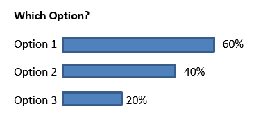
I need to build one bar chart graph summarizing the results of the data for "Which Option?" that would look like that
I have tried many things but fail as my data is structured that way.
Can someone help ?
Solved! Go to Solution.
- Mark as New
- Bookmark
- Subscribe
- Mute
- Subscribe to RSS Feed
- Permalink
- Report Inappropriate Content
You can do this with both DAX and Power Query
With DAX....... Go to Modelling Tab and press the NEW TABLE button...
NEW TABLE =
VAR TotalRows =
    COUNTROWS ( TableName )
RETURN
    UNION (
        ROW (
            "Option", "Option 1",
            "Count", DIVIDE (
                CALCULATE (
                    COUNTROWS ( TableName ),
                    TableName[Option 1: Which Option?] = "Option 1"
                ),
                TotalRows
            )
        ),
        ROW (
            "Option", "Option 2",
            "Count", DIVIDE (
                CALCULATE (
                    COUNTROWS ( TableName ),
                    TableName[Option 2: Which Option?] = "Option 2"
                ),
                TotalRows
            )
        ),
        ROW (
            "Option", "Option 3",
            "Count", DIVIDE (
                CALCULATE (
                    COUNTROWS ( TableName ),
                    TableName[Option 3: Which Option?] = "Option 3"
                ),
                TotalRows
            )
        )
    )
Regards
Zubair
Please try my custom visuals
- Mark as New
- Bookmark
- Subscribe
- Mute
- Subscribe to RSS Feed
- Permalink
- Report Inappropriate Content
Hello,
For this issue i recommend creating a measure for each option ( as long as it's about three in your real data aswell )
Use the COUNT() function to count the times option 1 is used in column 1 + the times option 1 is used in column 2 etc...
Do this for every option and add the measures to your bar chart.
Hope this helps
- Mark as New
- Bookmark
- Subscribe
- Mute
- Subscribe to RSS Feed
- Permalink
- Report Inappropriate Content
You can do this with both DAX and Power Query
With DAX....... Go to Modelling Tab and press the NEW TABLE button...
NEW TABLE =
VAR TotalRows =
    COUNTROWS ( TableName )
RETURN
    UNION (
        ROW (
            "Option", "Option 1",
            "Count", DIVIDE (
                CALCULATE (
                    COUNTROWS ( TableName ),
                    TableName[Option 1: Which Option?] = "Option 1"
                ),
                TotalRows
            )
        ),
        ROW (
            "Option", "Option 2",
            "Count", DIVIDE (
                CALCULATE (
                    COUNTROWS ( TableName ),
                    TableName[Option 2: Which Option?] = "Option 2"
                ),
                TotalRows
            )
        ),
        ROW (
            "Option", "Option 3",
            "Count", DIVIDE (
                CALCULATE (
                    COUNTROWS ( TableName ),
                    TableName[Option 3: Which Option?] = "Option 3"
                ),
                TotalRows
            )
        )
    )
Regards
Zubair
Please try my custom visuals
- Mark as New
- Bookmark
- Subscribe
- Mute
- Subscribe to RSS Feed
- Permalink
- Report Inappropriate Content
With Power Query, its much more convenient if you have many columns
Step # 1
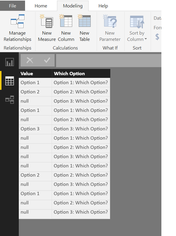
Unpivot your Table by selecting all Columns. Rename the Columns
Step # 2
Add this MEASURE to the TRANSFORMED table
Percentage =
DIVIDE (
    CALCULATE (
        COUNTROWS ( TableName ),
        FILTER (
            ALLEXCEPT ( TableName, TableName[Which Option] ),
            TableName[Value] <> "null"
        )
    ),
    CALCULATE (
        COUNTROWS ( TableName ),
        ALLEXCEPT ( TableName, TableName[Which Option] )
    )
)
Regards
Zubair
Please try my custom visuals
- Mark as New
- Bookmark
- Subscribe
- Mute
- Subscribe to RSS Feed
- Permalink
- Report Inappropriate Content
Hi,
Above approach of creating a seperate table will work one way, i.e. if the slicer/filters are from master data, data in new table can be sliced accordingly, whereas if we click on newly created response (from new table), it will not bring any change in charts created from master data.
Can that be resolved.
Regards,
Parth
Helpful resources

Microsoft Fabric Learn Together
Covering the world! 9:00-10:30 AM Sydney, 4:00-5:30 PM CET (Paris/Berlin), 7:00-8:30 PM Mexico City

Power BI Monthly Update - April 2024
Check out the April 2024 Power BI update to learn about new features.

| User | Count |
|---|---|
| 104 | |
| 95 | |
| 80 | |
| 67 | |
| 62 |
| User | Count |
|---|---|
| 146 | |
| 110 | |
| 107 | |
| 86 | |
| 63 |


