Get Fabric certified for FREE!
Don't miss your chance to take the Fabric Data Engineer (DP-700) exam on us!
Learn more- Power BI forums
- Get Help with Power BI
- Desktop
- Service
- Report Server
- Power Query
- Mobile Apps
- Developer
- DAX Commands and Tips
- Custom Visuals Development Discussion
- Health and Life Sciences
- Power BI Spanish forums
- Translated Spanish Desktop
- Training and Consulting
- Instructor Led Training
- Dashboard in a Day for Women, by Women
- Galleries
- Data Stories Gallery
- Themes Gallery
- Contests Gallery
- QuickViz Gallery
- Quick Measures Gallery
- Visual Calculations Gallery
- Notebook Gallery
- Translytical Task Flow Gallery
- TMDL Gallery
- R Script Showcase
- Webinars and Video Gallery
- Ideas
- Custom Visuals Ideas (read-only)
- Issues
- Issues
- Events
- Upcoming Events
We've captured the moments from FabCon & SQLCon that everyone is talking about, and we are bringing them to the community, live and on-demand. Starts on April 14th. Register now
- Power BI forums
- Forums
- Get Help with Power BI
- Desktop
- Visual Formatting Issue
- Subscribe to RSS Feed
- Mark Topic as New
- Mark Topic as Read
- Float this Topic for Current User
- Bookmark
- Subscribe
- Printer Friendly Page
- Mark as New
- Bookmark
- Subscribe
- Mute
- Subscribe to RSS Feed
- Permalink
- Report Inappropriate Content
Visual Formatting Issue
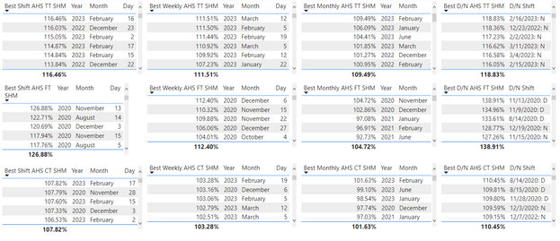
I'd like to get the Month, Day and year to display in the same row for my multi row card visual. Any tips on how to do this? Also, if anybody knows how to make a slicer so only the top value appears that would be great. Thanks!
- Mark as New
- Bookmark
- Subscribe
- Mute
- Subscribe to RSS Feed
- Permalink
- Report Inappropriate Content
@Anonymous , Need to understand data model for that. But calculation group may help
Calculation Groups- Measure Slicer, Measure Header Grouping, Measure to dimension conversion. Complex Table display : https://youtu.be/qMNv67P8Go0
If this does not help
Can you share sample data and sample output in table format? Or a sample pbix after removing sensitive data.
- Mark as New
- Bookmark
- Subscribe
- Mute
- Subscribe to RSS Feed
- Permalink
- Report Inappropriate Content
@amitchandak Here is a screenshot of the top five values for each dataset in a table. Does this help? I want to display only the top value (highest value percent) with the date in a format that is easy to view for end users.
Here is an example of how I have the fields set up for the tables. The screenshot below is what is being used for the bottom left table in the above screenshot.
Unfortunatly I cannot share the pbix file as the data is queried from SQL and is protected.
Helpful resources

New to Fabric Survey
If you have recently started exploring Fabric, we'd love to hear how it's going. Your feedback can help with product improvements.

Power BI DataViz World Championships - June 2026
A new Power BI DataViz World Championship is coming this June! Don't miss out on submitting your entry.

Join our Fabric User Panel
Share feedback directly with Fabric product managers, participate in targeted research studies and influence the Fabric roadmap.

| User | Count |
|---|---|
| 57 | |
| 40 | |
| 36 | |
| 19 | |
| 18 |
| User | Count |
|---|---|
| 70 | |
| 69 | |
| 38 | |
| 35 | |
| 23 |


