FabCon is coming to Atlanta
Join us at FabCon Atlanta from March 16 - 20, 2026, for the ultimate Fabric, Power BI, AI and SQL community-led event. Save $200 with code FABCOMM.
Register now!- Power BI forums
- Get Help with Power BI
- Desktop
- Service
- Report Server
- Power Query
- Mobile Apps
- Developer
- DAX Commands and Tips
- Custom Visuals Development Discussion
- Health and Life Sciences
- Power BI Spanish forums
- Translated Spanish Desktop
- Training and Consulting
- Instructor Led Training
- Dashboard in a Day for Women, by Women
- Galleries
- Data Stories Gallery
- Themes Gallery
- Contests Gallery
- QuickViz Gallery
- Quick Measures Gallery
- Visual Calculations Gallery
- Notebook Gallery
- Translytical Task Flow Gallery
- TMDL Gallery
- R Script Showcase
- Webinars and Video Gallery
- Ideas
- Custom Visuals Ideas (read-only)
- Issues
- Issues
- Events
- Upcoming Events
The Power BI Data Visualization World Championships is back! Get ahead of the game and start preparing now! Learn more
- Power BI forums
- Forums
- Get Help with Power BI
- Desktop
- Re: Visual Filter for Cumulative Sum Issue
- Subscribe to RSS Feed
- Mark Topic as New
- Mark Topic as Read
- Float this Topic for Current User
- Bookmark
- Subscribe
- Printer Friendly Page
- Mark as New
- Bookmark
- Subscribe
- Mute
- Subscribe to RSS Feed
- Permalink
- Report Inappropriate Content
Visual Filter for Cumulative Sum Issue
Hi,
I need some help with cumulative sum line.
Before selecting any slicer, the visual shows this:
But after applying filter, the visual shows the below.
How then can I make the line graph show the full graph, starting from zero to the end of the chart, similar to the first screenshot?
Regards,
Nicholas Hiew
Solved! Go to Solution.
- Mark as New
- Bookmark
- Subscribe
- Mute
- Subscribe to RSS Feed
- Permalink
- Report Inappropriate Content
@AnonymousUpdate cummulative total DAX as give below and that will do it, as @Seward12533 suggested to use cross filter to both direction, it has performance hit but instead of setting up the relationship, you can use it in DAX formula basically you are using cross filter to both direction when required
Cumulative =
CALCULATE(
SUM('Table2'[Count]),
CROSSFILTER(Table1[Week of Year],Table2[Week No.], Both),
FILTER(ALL('Table2'),
'Table2'[Week No.]<=MAX('Table2'[Week No.]))
)
Subscribe to the @PowerBIHowTo YT channel for an upcoming video on List and Record functions in Power Query!!
Learn Power BI and Fabric - subscribe to our YT channel - Click here: @PowerBIHowTo
If my solution proved useful, I'd be delighted to receive Kudos. When you put effort into asking a question, it's equally thoughtful to acknowledge and give Kudos to the individual who helped you solve the problem. It's a small gesture that shows appreciation and encouragement! ❤
Did I answer your question? Mark my post as a solution. Proud to be a Super User! Appreciate your Kudos 🙂
Feel free to email me with any of your BI needs.
- Mark as New
- Bookmark
- Subscribe
- Mute
- Subscribe to RSS Feed
- Permalink
- Report Inappropriate Content
@Anonymous try this
Cumulative = VAR Result =
CALCULATE(
SUM('Table2'[Count]),
CROSSFILTER(Table1[Week of Year],Table2[Week No.], Both),
FILTER(ALL('Table2'),
'Table2'[Week No.]<=MAX('Table2'[Week No.]))
)
RETURN
IF(Result,Result,0)
- Mark as New
- Bookmark
- Subscribe
- Mute
- Subscribe to RSS Feed
- Permalink
- Report Inappropriate Content
Also what is your desired result? do you want the **bleep** to be unaffected by the filter or do you want the scale to be fixed? The problem is the **bleep** is being plotted on its own axis and PBI is dynamically adjusting it based on the data. Or do you want the other data to not be displayed and only show the filtered data?
If you want the **bleep** to adjust.
Look at either turning off the secondary Y axis to you **bleep** is plotted on the same scale (probably not what you want) or fixing the scales manually
If you want the **bleep** not be affected make sure you the USE the ALL filter(s) for the slicers your using
If you want the other data to be filtered out then adjust the visual interations and chose filter.
- Mark as New
- Bookmark
- Subscribe
- Mute
- Subscribe to RSS Feed
- Permalink
- Report Inappropriate Content
Can you share sample data and what is your current measure?
Subscribe to the @PowerBIHowTo YT channel for an upcoming video on List and Record functions in Power Query!!
Learn Power BI and Fabric - subscribe to our YT channel - Click here: @PowerBIHowTo
If my solution proved useful, I'd be delighted to receive Kudos. When you put effort into asking a question, it's equally thoughtful to acknowledge and give Kudos to the individual who helped you solve the problem. It's a small gesture that shows appreciation and encouragement! ❤
Did I answer your question? Mark my post as a solution. Proud to be a Super User! Appreciate your Kudos 🙂
Feel free to email me with any of your BI needs.
- Mark as New
- Bookmark
- Subscribe
- Mute
- Subscribe to RSS Feed
- Permalink
- Report Inappropriate Content
Hi Both,
This is my desired result (lines in red), when sliced by category.
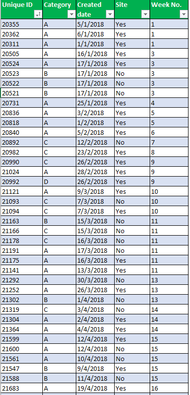
My Data (Table 1) looks like this, with the last column "Week No." is created in query editor:
And I have another table (Table 2) created to give me the following value (only the first column is from an excel sheet):
For cumulative column (note that I use excel to replicate these), I used the following measure:
Cumulative =
CALCULATE(
SUM('Table 2'[Count]),
FILTER(ALL('Table 2'),
'Table 2'[Week No.]<=MAX('Table 2'[Week No.]))
)
EDIT: I also tried adding a column for cumulative, which still yield the same visual results:
Cumulative =
CALCULATE(
SUM('Table 2'[Count]),
FILTER(ALL('Table 2'),
'Table 2'[Week No.]<=EARLIER('Table 2'[Week No.]))
)
Appreciate your help. Thanks.
Regards,
Nicholas
- Mark as New
- Bookmark
- Subscribe
- Mute
- Subscribe to RSS Feed
- Permalink
- Report Inappropriate Content
The **bleep** Measure would be following this pattern.
**bleep** = CALCULATE(sum(fact[value],all(date),filter(date,date[date]<=max(date[date]))
In your case since you only want cume YTD you would need to add a condition to filter out prior and future years &&date[year]=year(now())
So it would look something like
**bleep** = CALCULATE(sum(fact[value],all(date),filter(date,date[date]<=max(date[date]&&date[year]=year(now()))
The problem your having is your slicers are eliminating the data so your current measure for calculating the **bleep** will return null so nothing is displayed the measure based on the dates from the date table will return the results you require and you let the filter context of the PowerBI engine do the work an you don’t need to deal with the secondary table or the complexities of earlier. (Which is awesome that you figured out I still don’t have my head fully around that. )
- Mark as New
- Bookmark
- Subscribe
- Mute
- Subscribe to RSS Feed
- Permalink
- Report Inappropriate Content
Hey @Anonymous Can you share the data in excel sheet for the solution?
Subscribe to the @PowerBIHowTo YT channel for an upcoming video on List and Record functions in Power Query!!
Learn Power BI and Fabric - subscribe to our YT channel - Click here: @PowerBIHowTo
If my solution proved useful, I'd be delighted to receive Kudos. When you put effort into asking a question, it's equally thoughtful to acknowledge and give Kudos to the individual who helped you solve the problem. It's a small gesture that shows appreciation and encouragement! ❤
Did I answer your question? Mark my post as a solution. Proud to be a Super User! Appreciate your Kudos 🙂
Feel free to email me with any of your BI needs.
- Mark as New
- Bookmark
- Subscribe
- Mute
- Subscribe to RSS Feed
- Permalink
- Report Inappropriate Content
Hey,
Here you go:
https://drive.google.com/file/d/1gr0UHXhg-Va_aLt-0QENIxqKVtKZtCLu/view?usp=sharing
Regards,
Nicholas
- Mark as New
- Bookmark
- Subscribe
- Mute
- Subscribe to RSS Feed
- Permalink
- Report Inappropriate Content
Hi @Anonymous,
It seems that you want to have a visual filter with cumulative Sum?
Could you share a screenshot of your visual filter setting?
Actually, if you have a visual filter for cumulative sum, it will show the values match the filter condition.
Best Regards,
Cherry
If this post helps, then please consider Accept it as the solution to help the other members find it more quickly.
- Mark as New
- Bookmark
- Subscribe
- Mute
- Subscribe to RSS Feed
- Permalink
- Report Inappropriate Content
Hi @v-piga-msft,
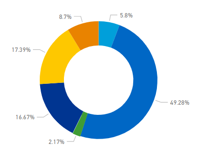
I used a donut chart based on the category. So for example, when no category is applied, it shows this:
When I choose a category, say for category A:
Now obviously this looks fine since this constitutes most of the values, however the cumulative line is still not right, as it still shows the total, not total by category.
This becomes ugly when I apply to Category C:
My slicer looks like this:
Hope my explanation is clear enough.
Regards,
Nicholas Hiew
- Mark as New
- Bookmark
- Subscribe
- Mute
- Subscribe to RSS Feed
- Permalink
- Report Inappropriate Content
Hi @Anonymous,
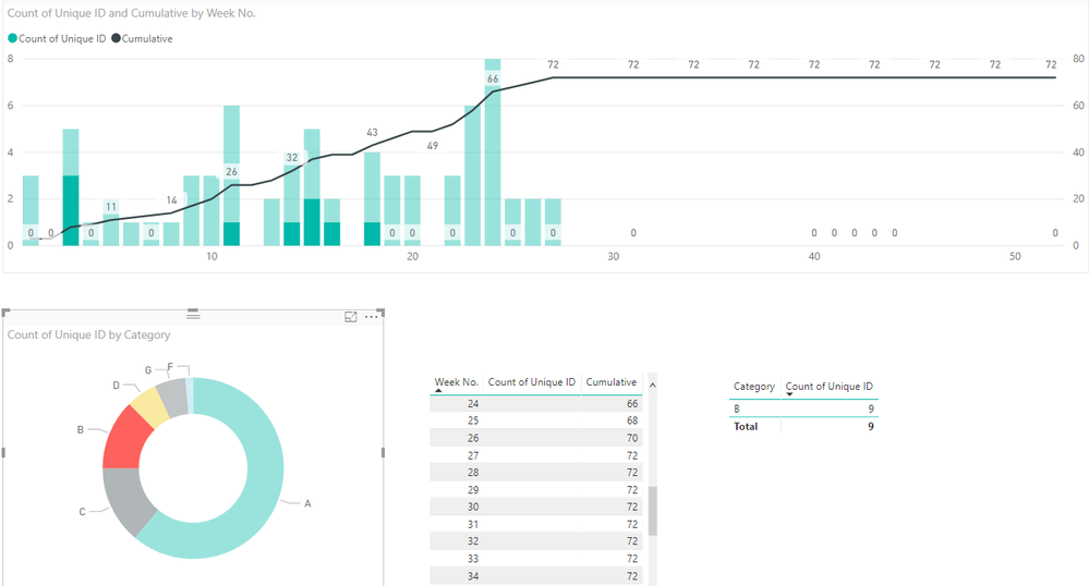
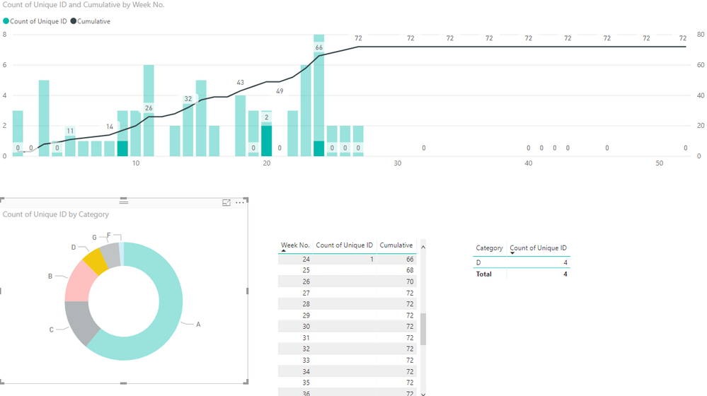
Do you want to get the output like below?
When I click "B" on the Donut chart, it will show this.
When I click "D" on the Donut chart, it will show like below.
If you want the output above, you could have a reference of the attachment.
Best Regards,
Cherry
If this post helps, then please consider Accept it as the solution to help the other members find it more quickly.
- Mark as New
- Bookmark
- Subscribe
- Mute
- Subscribe to RSS Feed
- Permalink
- Report Inappropriate Content
Hi @v-piga-msft,
I would like the cumulative line to be dynamic as well. Meaning when I choose category A, the cumulative line changes to Category A's cumulative line.
- Mark as New
- Bookmark
- Subscribe
- Mute
- Subscribe to RSS Feed
- Permalink
- Report Inappropriate Content
Hi, it has to do with the filter context not applying the way you think it will. When you use the slicer on one table it does not force that relationship backwards against the arrows. There are may ways to handle it. The simlest is to edit the relationship so it crossfilters in both directions. This however is not the most robust solution. Take a look at this tutorial I put together for an internal user group for some more robust solutions that will work as you develop more complicated models.
- Mark as New
- Bookmark
- Subscribe
- Mute
- Subscribe to RSS Feed
- Permalink
- Report Inappropriate Content
@AnonymousUpdate cummulative total DAX as give below and that will do it, as @Seward12533 suggested to use cross filter to both direction, it has performance hit but instead of setting up the relationship, you can use it in DAX formula basically you are using cross filter to both direction when required
Cumulative =
CALCULATE(
SUM('Table2'[Count]),
CROSSFILTER(Table1[Week of Year],Table2[Week No.], Both),
FILTER(ALL('Table2'),
'Table2'[Week No.]<=MAX('Table2'[Week No.]))
)
Subscribe to the @PowerBIHowTo YT channel for an upcoming video on List and Record functions in Power Query!!
Learn Power BI and Fabric - subscribe to our YT channel - Click here: @PowerBIHowTo
If my solution proved useful, I'd be delighted to receive Kudos. When you put effort into asking a question, it's equally thoughtful to acknowledge and give Kudos to the individual who helped you solve the problem. It's a small gesture that shows appreciation and encouragement! ❤
Did I answer your question? Mark my post as a solution. Proud to be a Super User! Appreciate your Kudos 🙂
Feel free to email me with any of your BI needs.
- Mark as New
- Bookmark
- Subscribe
- Mute
- Subscribe to RSS Feed
- Permalink
- Report Inappropriate Content
Thanks @parry2k and @Seward12533!
BTW @parry2k, do you know how to make the line start from week 1 as well?
- Mark as New
- Bookmark
- Subscribe
- Mute
- Subscribe to RSS Feed
- Permalink
- Report Inappropriate Content
@Anonymous try this
Cumulative = VAR Result =
CALCULATE(
SUM('Table2'[Count]),
CROSSFILTER(Table1[Week of Year],Table2[Week No.], Both),
FILTER(ALL('Table2'),
'Table2'[Week No.]<=MAX('Table2'[Week No.]))
)
RETURN
IF(Result,Result,0)
- Mark as New
- Bookmark
- Subscribe
- Mute
- Subscribe to RSS Feed
- Permalink
- Report Inappropriate Content
- Mark as New
- Bookmark
- Subscribe
- Mute
- Subscribe to RSS Feed
- Permalink
- Report Inappropriate Content
Hi @v-piga-msft just to clarify I said the cross filter was the easiest. But my attachment compared several options and recommended forcing the context via DAX or if possible slice off a bridge table that forced a standard relationship down into each of the tables. One question I have is the performance differecne of using CROSSFILTER vsreferencing the other table name (which I assume implies a cross filter) This is the method I currently favor but if there is a performance benefit to using crossfilter vs just the table name I will start using that.
- Mark as New
- Bookmark
- Subscribe
- Mute
- Subscribe to RSS Feed
- Permalink
- Report Inappropriate Content
Here is the pbix file if anyone is interested:
https://drive.google.com/file/d/1pT9GoD_vD0DZfVpwDKHkzDwuuU63nnEB/view?usp=sharing
Helpful resources

Power BI Dataviz World Championships
The Power BI Data Visualization World Championships is back! Get ahead of the game and start preparing now!

| User | Count |
|---|---|
| 39 | |
| 37 | |
| 33 | |
| 33 | |
| 29 |
| User | Count |
|---|---|
| 134 | |
| 96 | |
| 78 | |
| 67 | |
| 65 |


