- Power BI forums
- Get Help with Power BI
- Desktop
- Service
- Report Server
- Power Query
- Mobile Apps
- Developer
- DAX Commands and Tips
- Custom Visuals Development Discussion
- Health and Life Sciences
- Power BI Spanish forums
- Translated Spanish Desktop
- Training and Consulting
- Instructor Led Training
- Dashboard in a Day for Women, by Women
- Galleries
- Data Stories Gallery
- Themes Gallery
- Contests Gallery
- QuickViz Gallery
- Quick Measures Gallery
- Visual Calculations Gallery
- Notebook Gallery
- Translytical Task Flow Gallery
- TMDL Gallery
- R Script Showcase
- Webinars and Video Gallery
- Ideas
- Custom Visuals Ideas (read-only)
- Issues
- Issues
- Events
- Upcoming Events
We've captured the moments from FabCon & SQLCon that everyone is talking about, and we are bringing them to the community, live and on-demand. Starts on April 14th. Register now
- Power BI forums
- Forums
- Get Help with Power BI
- Desktop
- Violin plot display error?
- Subscribe to RSS Feed
- Mark Topic as New
- Mark Topic as Read
- Float this Topic for Current User
- Bookmark
- Subscribe
- Printer Friendly Page
- Mark as New
- Bookmark
- Subscribe
- Mute
- Subscribe to RSS Feed
- Permalink
- Report Inappropriate Content
Violin plot display error?
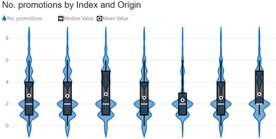
Can anyone explain to me what I am doing wrong/the reason why sometimes my violin plot looks odd, for example like the below:
if i add a filter to the visual and adjust the number of categories shown it may display correctly as per the below.
- Mark as New
- Bookmark
- Subscribe
- Mute
- Subscribe to RSS Feed
- Permalink
- Report Inappropriate Content
Hi @Anonymous
Thanks for reaching out to us.
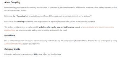
Please check if this article helps,
Violin Plot: Custom Visual for Power BI | coacervo
Best Regards,
Community Support Team _Tang
If this post helps, please consider Accept it as the solution to help the other members find it more quickly.
Helpful resources

New to Fabric Survey
If you have recently started exploring Fabric, we'd love to hear how it's going. Your feedback can help with product improvements.

Power BI DataViz World Championships - June 2026
A new Power BI DataViz World Championship is coming this June! Don't miss out on submitting your entry.

Join our Fabric User Panel
Share feedback directly with Fabric product managers, participate in targeted research studies and influence the Fabric roadmap.

| User | Count |
|---|---|
| 53 | |
| 38 | |
| 33 | |
| 16 | |
| 16 |
| User | Count |
|---|---|
| 68 | |
| 63 | |
| 38 | |
| 34 | |
| 22 |


