Join us at the 2025 Microsoft Fabric Community Conference
March 31 - April 2, 2025, in Las Vegas, Nevada. Use code MSCUST for a $150 discount! Early bird discount ends December 31.
Register Now- Power BI forums
- Get Help with Power BI
- Desktop
- Service
- Report Server
- Power Query
- Mobile Apps
- Developer
- DAX Commands and Tips
- Custom Visuals Development Discussion
- Health and Life Sciences
- Power BI Spanish forums
- Translated Spanish Desktop
- Training and Consulting
- Instructor Led Training
- Dashboard in a Day for Women, by Women
- Galleries
- Community Connections & How-To Videos
- COVID-19 Data Stories Gallery
- Themes Gallery
- Data Stories Gallery
- R Script Showcase
- Webinars and Video Gallery
- Quick Measures Gallery
- 2021 MSBizAppsSummit Gallery
- 2020 MSBizAppsSummit Gallery
- 2019 MSBizAppsSummit Gallery
- Events
- Ideas
- Custom Visuals Ideas
- Issues
- Issues
- Events
- Upcoming Events
Be one of the first to start using Fabric Databases. View on-demand sessions with database experts and the Microsoft product team to learn just how easy it is to get started. Watch now
- Power BI forums
- Forums
- Get Help with Power BI
- Desktop
- Re: Violin Plot on Power BI Page
- Subscribe to RSS Feed
- Mark Topic as New
- Mark Topic as Read
- Float this Topic for Current User
- Bookmark
- Subscribe
- Printer Friendly Page
- Mark as New
- Bookmark
- Subscribe
- Mute
- Subscribe to RSS Feed
- Permalink
- Report Inappropriate Content
Violin Plot on Power BI Page
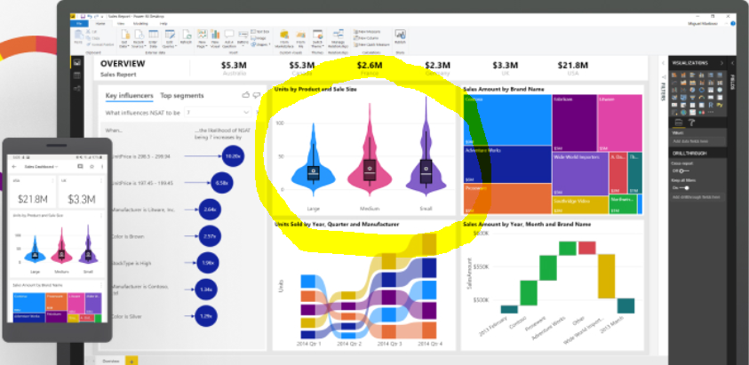
How is the violin plot created that is shown on all Power BI marketing materials? I have used the violin plot that can be downloaded from the store, but does not have the same impact as this visual.
Solved! Go to Solution.
- Mark as New
- Bookmark
- Subscribe
- Mute
- Subscribe to RSS Feed
- Permalink
- Report Inappropriate Content
Hi , @Anonymous
I downloaded the violin plot from the store and it have the similar impact as this visual .
Maybe you need to do some changes in “ Format” to get the impact you want.
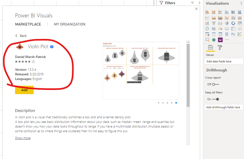
Here is a sample I made:
You can refer to this article for more details about Violin Plot:
https://appsource.microsoft.com/en/product/power-bi-visuals/wa104381947
Best Regards,
Community Support Team _ Eason
If this post helps, then please consider Accept it as the solution to help the other members find it more quickly.
- Mark as New
- Bookmark
- Subscribe
- Mute
- Subscribe to RSS Feed
- Permalink
- Report Inappropriate Content
Hi @Anonymous
I'm the author of the visual and in addition to the links provided by @v-easonf-msft, I also wrote this article on the correct use of the Sampling field to help clarify how the data needs to be structured for the Violin Plot, as it works differently to a number of the core visuals. Hopefully you'll find it useful.
I notice this post is a couple of weeks old, so I hope you have managed to get the visual to do what you want by now, but feel free to reach out to me if you have any specific questions - I'll be happy to help 🙂
All the best,
Daniel
Did I answer your question? Mark my post as a solution!
Proud to be a Super User!
My course: Introduction to Developing Power BI Visuals
On how to ask a technical question, if you really want an answer (courtesy of SQLBI)
- Mark as New
- Bookmark
- Subscribe
- Mute
- Subscribe to RSS Feed
- Permalink
- Report Inappropriate Content
Hi @dm-p
I have a log table which consists of 4 columns (UserID, eventID, rating, timestamp). It has about 12000 rows. I created an index field to ensure each entry has an unique identifier and then used the index field for sampling and numeric rating field for measure. However, nothing returned from my violint plot canvas. I then replaced this index field with UserID or eventID, either one could generate a violin plot. Could you please help me with this?
best,
WeDuan
- Mark as New
- Bookmark
- Subscribe
- Mute
- Subscribe to RSS Feed
- Permalink
- Report Inappropriate Content
Further details, for the measure field, I have created a calculated measure (average rating) instead of using the actual rating from the log file, which is probably the reason why it didn't plot. The internation is to create a calander table link to the log file and then add weekday (Mon-Sun) into the category field so that I can see the distribution of average rating under different day of the week,
Helpful resources

Join us at the Microsoft Fabric Community Conference
March 31 - April 2, 2025, in Las Vegas, Nevada. Use code MSCUST for a $150 discount!

We want your feedback!
Your insights matter. That’s why we created a quick survey to learn about your experience finding answers to technical questions.

Microsoft Fabric Community Conference 2025
Arun Ulag shares exciting details about the Microsoft Fabric Conference 2025, which will be held in Las Vegas, NV.

| User | Count |
|---|---|
| 124 | |
| 87 | |
| 87 | |
| 70 | |
| 51 |
| User | Count |
|---|---|
| 205 | |
| 153 | |
| 97 | |
| 79 | |
| 69 |


