FabCon is coming to Atlanta
Join us at FabCon Atlanta from March 16 - 20, 2026, for the ultimate Fabric, Power BI, AI and SQL community-led event. Save $200 with code FABCOMM.
Register now!- Power BI forums
- Get Help with Power BI
- Desktop
- Service
- Report Server
- Power Query
- Mobile Apps
- Developer
- DAX Commands and Tips
- Custom Visuals Development Discussion
- Health and Life Sciences
- Power BI Spanish forums
- Translated Spanish Desktop
- Training and Consulting
- Instructor Led Training
- Dashboard in a Day for Women, by Women
- Galleries
- Data Stories Gallery
- Themes Gallery
- Contests Gallery
- QuickViz Gallery
- Quick Measures Gallery
- Visual Calculations Gallery
- Notebook Gallery
- Translytical Task Flow Gallery
- TMDL Gallery
- R Script Showcase
- Webinars and Video Gallery
- Ideas
- Custom Visuals Ideas (read-only)
- Issues
- Issues
- Events
- Upcoming Events
Get Fabric Certified for FREE during Fabric Data Days. Don't miss your chance! Request now
- Power BI forums
- Forums
- Get Help with Power BI
- Desktop
- View distribution frequency of a measure
- Subscribe to RSS Feed
- Mark Topic as New
- Mark Topic as Read
- Float this Topic for Current User
- Bookmark
- Subscribe
- Printer Friendly Page
- Mark as New
- Bookmark
- Subscribe
- Mute
- Subscribe to RSS Feed
- Permalink
- Report Inappropriate Content
View distribution frequency of a measure
Hi everyone,
Could someone tell me if it would be possible to visualize the frequency of distribution of values of a calculated measure? For example, I have a table of values with a column "X", and I would like to evaluate for each row of that column a new measure "Y". So if I have 10 different values in that column "X", I will have 10 different values for measure "Y". Would it be possible to visualize these calculated values in a distribution density plot, without having to use calculated columns or tables? (I would like the chart to be responsive to filters applied on the main table, maybe grouping the results into bins)
So far I haven't gotten any clues as to what needs to be done. I tried to start by generating a formula that returned the values of the measure applied to each row, similar to what the DAX VALUES method does with columns, but it did not work. I've been using Power BI for a short time but I believe there may be some workaround for at least this.
- Mark as New
- Bookmark
- Subscribe
- Mute
- Subscribe to RSS Feed
- Permalink
- Report Inappropriate Content
Hi @Anonymous ,
According to your description, if you only put the measure in a chart to see its distribution frequency, it can't get the expected result, because measure is based on the corresponding column to generate values. The number of measures is the same as the number of values in the column, if there's only a measure in the visual, it will only return one value. Additionally, a measure can't be in the Axis of a chart.
Best Regards,
Community Support Team _ kalyj
If this post helps, then please consider Accept it as the solution to help the other members find it more quickly.
- Mark as New
- Bookmark
- Subscribe
- Mute
- Subscribe to RSS Feed
- Permalink
- Report Inappropriate Content
Hi @Anonymous ,
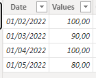
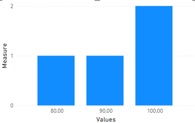
Do you mean to have a table with values like this and see how many 80, 90 or 100 there are?
If you add the column to the X-Axis and the do a count on the Y-Axis it will give you the expected result.
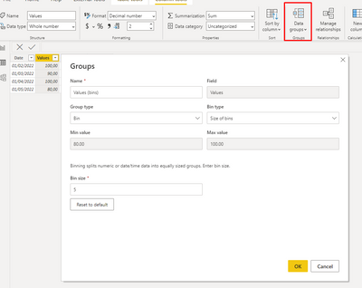
If you want to add bins you can select the specific column and then do data groups
Regards
Miguel Félix
Did I answer your question? Mark my post as a solution!
Proud to be a Super User!
Check out my blog: Power BI em PortuguêsHelpful resources

Power BI Monthly Update - November 2025
Check out the November 2025 Power BI update to learn about new features.

Fabric Data Days
Advance your Data & AI career with 50 days of live learning, contests, hands-on challenges, study groups & certifications and more!


