A new Data Days event is coming soon!
This time we’re going bigger than ever. Fabric, Power BI, SQL, AI and more. We're covering it all. You won't want to miss it.
Learn more- Power BI forums
- Get Help with Power BI
- Desktop
- Service
- Report Server
- Power Query
- Mobile Apps
- Developer
- DAX Commands and Tips
- Custom Visuals Development Discussion
- Health and Life Sciences
- Power BI Spanish forums
- Translated Spanish Desktop
- Training and Consulting
- Instructor Led Training
- Dashboard in a Day for Women, by Women
- Galleries
- Data Stories Gallery
- Themes Gallery
- Contests Gallery
- QuickViz Gallery
- Quick Measures Gallery
- Visual Calculations Gallery
- Notebook Gallery
- Translytical Task Flow Gallery
- TMDL Gallery
- R Script Showcase
- Webinars and Video Gallery
- Ideas
- Custom Visuals Ideas (read-only)
- Issues
- Issues
- Events
- Upcoming Events
Did you hear? There's a new SQL AI Developer certification (DP-800). Start preparing now and be one of the first to get certified. Register now
- Power BI forums
- Forums
- Get Help with Power BI
- Desktop
- Very weird problem
- Subscribe to RSS Feed
- Mark Topic as New
- Mark Topic as Read
- Float this Topic for Current User
- Bookmark
- Subscribe
- Printer Friendly Page
- Mark as New
- Bookmark
- Subscribe
- Mute
- Subscribe to RSS Feed
- Permalink
- Report Inappropriate Content
Very weird problem
In power Bi I have some self made columns where everything seems correct:
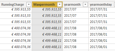
RunningCharge is a column with a cumulative sum beginning at the start of the year and sums all charges to that date
And Maxpermonth is a column where he takes the maximum value of per month of RunningCharge
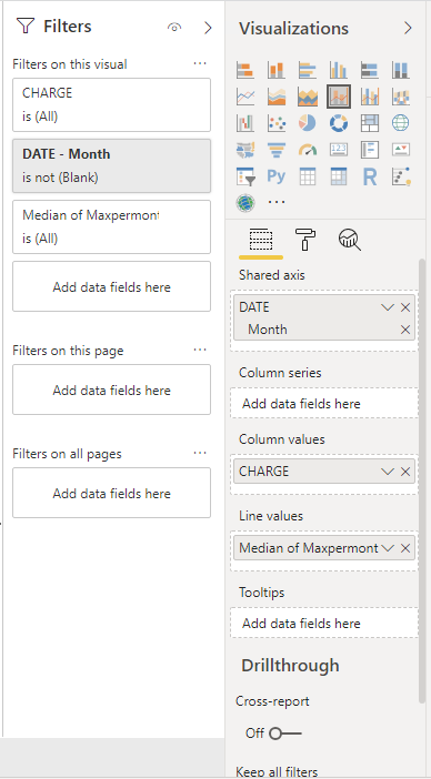
I made an visualization where every month contains the sum of all charges for that certain month and there is a line in that chart that shows the maximum value per month for the running charge. So you can see the cumulative charge over the year and see which months have the most influence of that cumulative run.
(I can not show the visualization for private reasons, but I can show this:)
Now the weird part. You see I choose the median of the Maxpermonth for the line. The reason for that is that is the only way it works. When I choose the maximum, minimum or average, if it worked correctly, it should not make any difference, because all the values for one month in the column Maxpermonth are the same. But somehow it gives totally different values.
Now the even more weird part of it. When I choose for example maximum, he chooses the maximum for some months that don't even have that maximum in it. For example, in April 2017 there was a maximum of about €70.000. For April 2017, he gives that value, but also for some other months which makes no sense at all, even for months (not only April) in 2018 he gives the same value. When I look at the columns there is really nothing wrong with it.
Sorry for not sharing the plots, but I just can't share that information
- Mark as New
- Bookmark
- Subscribe
- Mute
- Subscribe to RSS Feed
- Permalink
- Report Inappropriate Content
Hi @Anonymous
has your question been answered?
If I answered your question, please mark my post as solution, this will also help others.
Please give Kudos for support.
Please mark my post as solution, this will also help others.
Please give Kudos for support.
Marcus Wegener works as Full Stack Power BI Engineer at BI or DIE.
His mission is clear: "Get the most out of data, with Power BI."
twitter - LinkedIn - YouTube - website - podcast - Power BI Tutorials
- Mark as New
- Bookmark
- Subscribe
- Mute
- Subscribe to RSS Feed
- Permalink
- Report Inappropriate Content
@Anonymous ,
Have you tried with Analytics pane? https://docs.microsoft.com/en-us/power-bi/desktop-analytics-pane
Regards,
Jimmy Tao
- Mark as New
- Bookmark
- Subscribe
- Mute
- Subscribe to RSS Feed
- Permalink
- Report Inappropriate Content
- Mark as New
- Bookmark
- Subscribe
- Mute
- Subscribe to RSS Feed
- Permalink
- Report Inappropriate Content
Hi @Anonymous ,
i recommend a date table and a running total measure.
There is a running total quick measure
https://powerbi.microsoft.com/en-us/blog/quick-measures-preview/
If I answered your question, please mark my post as solution, this will also help others.
Please give Kudos for support.
Please mark my post as solution, this will also help others.
Please give Kudos for support.
Marcus Wegener works as Full Stack Power BI Engineer at BI or DIE.
His mission is clear: "Get the most out of data, with Power BI."
twitter - LinkedIn - YouTube - website - podcast - Power BI Tutorials
Helpful resources

Power BI Monthly Update - April 2026
Check out the April 2026 Power BI update to learn about new features.

Data Days 2026 coming soon!
Sign up to receive a private message when registration opens and key events begin.

New to Fabric Survey
If you have recently started exploring Fabric, we'd love to hear how it's going. Your feedback can help with product improvements.

| User | Count |
|---|---|
| 34 | |
| 31 | |
| 25 | |
| 20 | |
| 16 |
| User | Count |
|---|---|
| 61 | |
| 49 | |
| 28 | |
| 23 | |
| 23 |


