Join us at FabCon Vienna from September 15-18, 2025
The ultimate Fabric, Power BI, SQL, and AI community-led learning event. Save €200 with code FABCOMM.
Get registered- Power BI forums
- Get Help with Power BI
- Desktop
- Service
- Report Server
- Power Query
- Mobile Apps
- Developer
- DAX Commands and Tips
- Custom Visuals Development Discussion
- Health and Life Sciences
- Power BI Spanish forums
- Translated Spanish Desktop
- Training and Consulting
- Instructor Led Training
- Dashboard in a Day for Women, by Women
- Galleries
- Data Stories Gallery
- Themes Gallery
- Contests Gallery
- Quick Measures Gallery
- Notebook Gallery
- Translytical Task Flow Gallery
- TMDL Gallery
- R Script Showcase
- Webinars and Video Gallery
- Ideas
- Custom Visuals Ideas (read-only)
- Issues
- Issues
- Events
- Upcoming Events
Compete to become Power BI Data Viz World Champion! First round ends August 18th. Get started.
- Power BI forums
- Forums
- Get Help with Power BI
- Desktop
- Value format on visual is wrong when using a slice...
- Subscribe to RSS Feed
- Mark Topic as New
- Mark Topic as Read
- Float this Topic for Current User
- Bookmark
- Subscribe
- Printer Friendly Page
- Mark as New
- Bookmark
- Subscribe
- Mute
- Subscribe to RSS Feed
- Permalink
- Report Inappropriate Content
Value format on visual is wrong when using a slicer for multiple measures
Hi,
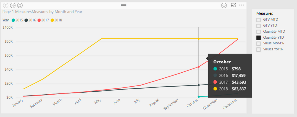
I created multiple measures using revenue (currency) and order quantity (number) and put them all in a slicer using a new table.
I created this measure and put it in the value field of a line chart:
Page 1 Measures =
Switch(
ALLSELECTED('Metrics Overview'[Measures]),
"GTV MTD",[GTV MTD],
"GTV YTD",[GTV YTD],
"Quantity MTD",[Quantity MTD],
"Quantity YTD",[Quantity YTD]
)
The issue is that the graph only shows values in $, even when selecting quantity measures that sum up numbers. Is there a way to format the y-axis and values based on the measure selected?
Thanks!
Solved! Go to Solution.
- Mark as New
- Bookmark
- Subscribe
- Mute
- Subscribe to RSS Feed
- Permalink
- Report Inappropriate Content
@GvidoB,
I am afraid that it is not possible to change Y-Axis value format based on the measure selected. In the Line chart, you drag "Page 1 Measures" into Value of Line chart, thus all the measures use same format as “Page 1 Measures".
Regards,
Lydia
If this post helps, then please consider Accept it as the solution to help the other members find it more quickly.
- Mark as New
- Bookmark
- Subscribe
- Mute
- Subscribe to RSS Feed
- Permalink
- Report Inappropriate Content
Thank you @v-yuezhe-msft for the info. It's a shame.
I guess I' ll simply create one visual per format type and have MTD/YTD as selectable options for all of them.


