Join the #PBI10 DataViz contest
Power BI is turning 10, and we’re marking the occasion with a special community challenge. Use your creativity to tell a story, uncover trends, or highlight something unexpected.
Get started- Power BI forums
- Get Help with Power BI
- Desktop
- Service
- Report Server
- Power Query
- Mobile Apps
- Developer
- DAX Commands and Tips
- Custom Visuals Development Discussion
- Health and Life Sciences
- Power BI Spanish forums
- Translated Spanish Desktop
- Training and Consulting
- Instructor Led Training
- Dashboard in a Day for Women, by Women
- Galleries
- Webinars and Video Gallery
- Data Stories Gallery
- Themes Gallery
- Contests Gallery
- Quick Measures Gallery
- Notebook Gallery
- Translytical Task Flow Gallery
- R Script Showcase
- Ideas
- Custom Visuals Ideas (read-only)
- Issues
- Issues
- Events
- Upcoming Events
Join us for an expert-led overview of the tools and concepts you'll need to become a Certified Power BI Data Analyst and pass exam PL-300. Register now.
- Power BI forums
- Forums
- Get Help with Power BI
- Desktop
- Value field not visible in Power BI Desktop
- Subscribe to RSS Feed
- Mark Topic as New
- Mark Topic as Read
- Float this Topic for Current User
- Bookmark
- Subscribe
- Printer Friendly Page
- Mark as New
- Bookmark
- Subscribe
- Mute
- Subscribe to RSS Feed
- Permalink
- Report Inappropriate Content
Value field not visible in Power BI Desktop
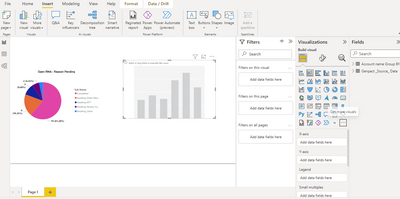
While plotting Charts on Power BI Desktop, I am unable to see value field. On the contrary Its reflected while I try to plot Pie chart.
Please help me with this! I am totally new to Power BI
Solved! Go to Solution.
- Mark as New
- Bookmark
- Subscribe
- Mute
- Subscribe to RSS Feed
- Permalink
- Report Inappropriate Content
Hi @Anonymous ,
This video seems to be old. If I am right it from Year 2020. And after that Power BI has got nearly 2 years worth of monthly updates.
It looks like in current Power BI version you don't see this values section anymore. Now you see x-axis y-axis section for the chart visuals.
Also whatever you used to add in the Values section earlier, now goes to y-axis section in the latest version.
Hope this helps.
- Mark as New
- Bookmark
- Subscribe
- Mute
- Subscribe to RSS Feed
- Permalink
- Report Inappropriate Content
Hi, @Syndicate_Admin @Anonymous
Yes, In the current version of Power BI, the 'Values' section has been replaced by 'X-axis' and 'Y-axis' sections for chart visuals. What you previously added to the 'Values' section now goes into the 'Y-axis' section in the latest version.
If you want to access more summarization options like average, sum, or count.
First you need to, change the data type in your datasheet to whole number. Once that's done, the options will be available.
Hope this helps you.
- Mark as New
- Bookmark
- Subscribe
- Mute
- Subscribe to RSS Feed
- Permalink
- Report Inappropriate Content
Hi @Anonymous ,
I am not 100% sure on what you mean by: I am unable to see value field. On the contrary Its reflected while I try to plot Pie chart.
Can you please elaborate more here?
Attach some screenshot for your pie-chart visual explaining what value field you are referring here?
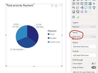
If I understand your question you mean why you see values section in pie-chart when compared to another charts.
Pie chart allows you to represent one metric there fore you have Values section in there.
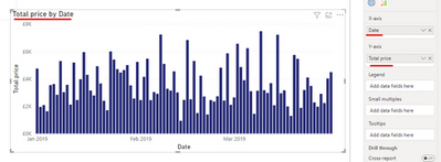
Other charts like the one you have highlighted stacked column chart, allows you to use x-axis and y-axis to be represented. Therefore doesn't have values section. Something like below where I have shown you want to repesent Total price by date:
- Mark as New
- Bookmark
- Subscribe
- Mute
- Subscribe to RSS Feed
- Permalink
- Report Inappropriate Content
Thank for your Quick response 🙂 Please see the image below for Pie chart- where Value field is reflecting on right hand side. But when i try to do for Bar chart, it doesn't show value field.
- Mark as New
- Bookmark
- Subscribe
- Mute
- Subscribe to RSS Feed
- Permalink
- Report Inappropriate Content
HI @Anonymous
Please see my previous response with explanation please.
I am mentioning my response again here.
If I understand your question you mean why you see values section in pie-chart when compared to another charts.
Pie chart allows you to represent one metric there fore you have Values section in there.
Other charts like the one you have highlighted stacked column chart, allows you to use x-axis and y-axis to be represented. Therefore doesn't have values section. Something like below where I have shown you want to repesent Total price by date:
- Mark as New
- Bookmark
- Subscribe
- Mute
- Subscribe to RSS Feed
- Permalink
- Report Inappropriate Content
@Pragati11 Thanks for your response, but still my question remains that How do I add values?
Please refer to this SC as I have been following this video:
Here you can that you are able to add values in value field for Column charts.
- Mark as New
- Bookmark
- Subscribe
- Mute
- Subscribe to RSS Feed
- Permalink
- Report Inappropriate Content
Hi @Anonymous ,
This video seems to be old. If I am right it from Year 2020. And after that Power BI has got nearly 2 years worth of monthly updates.
It looks like in current Power BI version you don't see this values section anymore. Now you see x-axis y-axis section for the chart visuals.
Also whatever you used to add in the Values section earlier, now goes to y-axis section in the latest version.
Hope this helps.
- Mark as New
- Bookmark
- Subscribe
- Mute
- Subscribe to RSS Feed
- Permalink
- Report Inappropriate Content
Thank you very much I was watching a tutorial of introduction of Power BI and I could not find the field of value and I was going to give up
- Mark as New
- Bookmark
- Subscribe
- Mute
- Subscribe to RSS Feed
- Permalink
- Report Inappropriate Content
Helpful resources

Join our Fabric User Panel
This is your chance to engage directly with the engineering team behind Fabric and Power BI. Share your experiences and shape the future.

Power BI Monthly Update - June 2025
Check out the June 2025 Power BI update to learn about new features.

| User | Count |
|---|---|
| 72 | |
| 70 | |
| 55 | |
| 37 | |
| 31 |
| User | Count |
|---|---|
| 83 | |
| 64 | |
| 63 | |
| 49 | |
| 45 |


