Join us at the 2025 Microsoft Fabric Community Conference
March 31 - April 2, 2025, in Las Vegas, Nevada. Use code MSCUST for a $150 discount! Early bird discount ends December 31.
Register Now- Power BI forums
- Get Help with Power BI
- Desktop
- Service
- Report Server
- Power Query
- Mobile Apps
- Developer
- DAX Commands and Tips
- Custom Visuals Development Discussion
- Health and Life Sciences
- Power BI Spanish forums
- Translated Spanish Desktop
- Training and Consulting
- Instructor Led Training
- Dashboard in a Day for Women, by Women
- Galleries
- Community Connections & How-To Videos
- COVID-19 Data Stories Gallery
- Themes Gallery
- Data Stories Gallery
- R Script Showcase
- Webinars and Video Gallery
- Quick Measures Gallery
- 2021 MSBizAppsSummit Gallery
- 2020 MSBizAppsSummit Gallery
- 2019 MSBizAppsSummit Gallery
- Events
- Ideas
- Custom Visuals Ideas
- Issues
- Issues
- Events
- Upcoming Events
Be one of the first to start using Fabric Databases. View on-demand sessions with database experts and the Microsoft product team to learn just how easy it is to get started. Watch now
- Power BI forums
- Forums
- Get Help with Power BI
- Desktop
- Re: Using stacked bar chart as a slicer - but high...
- Subscribe to RSS Feed
- Mark Topic as New
- Mark Topic as Read
- Float this Topic for Current User
- Bookmark
- Subscribe
- Printer Friendly Page
- Mark as New
- Bookmark
- Subscribe
- Mute
- Subscribe to RSS Feed
- Permalink
- Report Inappropriate Content
Using stacked bar chart as a slicer - but highlight entire bar when clicked
I'm fairly new to Power BI and have a question regarding the Stacked Bar Chart.
Configuration is as follows:
Axis = Employee Name
Legend = Billable / Non-Billable
Value = Hours
As expected this shows 1 bar per employee, each with 2 segments to indicate the billable and non-billable portions.
My client effectively wants to use the stacked bar chart as a slicer at the Axis (Employee) level rather than the Legend (Billable/Non-Billable) level.
i.e. When I click on an individual segment for an employee, the default behaviour in Power BI is to filter to that employee and segment. Is it possible to configure the stacked bar chart so it visually highlights the entire bar (and subsequently filters to employee only)?
I noticed that one of the online sample dashboards does this but I can't see any option in the chart settings to replicate what he's done. See the 'Engineers Billable Hours' page on this dashboard as an example: http://community.powerbi.com/t5/Data-Stories-Gallery/Business-Sales-Report-PowerBI/m-p/60491
Thanks
Pete
Solved! Go to Solution.
- Mark as New
- Bookmark
- Subscribe
- Mute
- Subscribe to RSS Feed
- Permalink
- Report Inappropriate Content
Hi @pjn,
Based on my test, currently stacked bar chart not support multiple select feature.
For you requirement, you can post this to ideas.
In addition, I find a same request for 100% stacked bar chart. ![]()
Multiple selection by Legend in 100% Stacked chart
Regards,
Xiaoxin Sheng
If this post helps, please consider accept as solution to help other members find it more quickly.
- Mark as New
- Bookmark
- Subscribe
- Mute
- Subscribe to RSS Feed
- Permalink
- Report Inappropriate Content
Hi @pjn,
According to your description, you want to the effect like below?
You can open the "Format" tab and click on "Edit Interactions" to open the interaction UI, then you can modify it:
Notice: click on one visual to active it will show the its interaction for other visuals.
Regards,
Xiaoxin Sheng
If this post helps, please consider accept as solution to help other members find it more quickly.
- Mark as New
- Bookmark
- Subscribe
- Mute
- Subscribe to RSS Feed
- Permalink
- Report Inappropriate Content
Hi @v-shex-msft
Thanks for the reply. I'd tried changing the interactions but still couldn't get the effect I was after. I've added some screenshots below to show it.
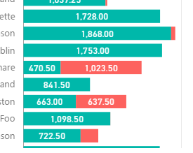
With no item clicked in chart, everything is highlighted accordingly (this is okay)
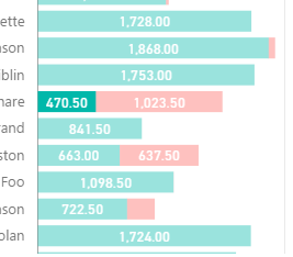
Then when I click on one element in this chart (in this case I clicked the 470.50 section), everything dims except for that single element (this is the default behaviour).
What I'm hoping to achieve is that clicking on either the 470.50 or 1023.50 elements in that chart highlights the entire row rather than the one element I clicked on (screenshot was simulated in Paint because I can't get it to do this!)
I've tried experimenting with Edit Interactions but this only seems to define what happens between charts, and not the behaviour of the chart itself. I couldn't see anything in the Format pane either. It's possible that I'm missing something really obvious though!
Regards
Pete
- Mark as New
- Bookmark
- Subscribe
- Mute
- Subscribe to RSS Feed
- Permalink
- Report Inappropriate Content
Hi @pjn,
Based on my test, currently stacked bar chart not support multiple select feature.
For you requirement, you can post this to ideas.
In addition, I find a same request for 100% stacked bar chart. ![]()
Multiple selection by Legend in 100% Stacked chart
Regards,
Xiaoxin Sheng
If this post helps, please consider accept as solution to help other members find it more quickly.
- Mark as New
- Bookmark
- Subscribe
- Mute
- Subscribe to RSS Feed
- Permalink
- Report Inappropriate Content
Thanks for the confirmation @v-shex-msft
Out of curiosity I've left a comment on the dashboard page I originally linked to, asking the author how he did it. I'm going to assume he's used a custom visual to achieve the effect (or maybe some clever stacking of multiple charts, one behind the other)
Thanks again for doing your own tests and your suggestions.
Pete
Helpful resources

Join us at the Microsoft Fabric Community Conference
March 31 - April 2, 2025, in Las Vegas, Nevada. Use code MSCUST for a $150 discount!

We want your feedback!
Your insights matter. That’s why we created a quick survey to learn about your experience finding answers to technical questions.

Microsoft Fabric Community Conference 2025
Arun Ulag shares exciting details about the Microsoft Fabric Conference 2025, which will be held in Las Vegas, NV.

| User | Count |
|---|---|
| 124 | |
| 87 | |
| 85 | |
| 70 | |
| 51 |
| User | Count |
|---|---|
| 205 | |
| 153 | |
| 97 | |
| 79 | |
| 69 |


