- Power BI forums
- Get Help with Power BI
- Desktop
- Service
- Report Server
- Power Query
- Mobile Apps
- Developer
- DAX Commands and Tips
- Custom Visuals Development Discussion
- Health and Life Sciences
- Power BI Spanish forums
- Translated Spanish Desktop
- Training and Consulting
- Instructor Led Training
- Dashboard in a Day for Women, by Women
- Galleries
- Data Stories Gallery
- Themes Gallery
- Contests Gallery
- QuickViz Gallery
- Quick Measures Gallery
- Visual Calculations Gallery
- Notebook Gallery
- Translytical Task Flow Gallery
- TMDL Gallery
- R Script Showcase
- Webinars and Video Gallery
- Ideas
- Custom Visuals Ideas (read-only)
- Issues
- Issues
- Events
- Upcoming Events
Learn from the best! Meet the four finalists headed to the FINALS of the Power BI Dataviz World Championships! Register now
- Power BI forums
- Forums
- Get Help with Power BI
- Desktop
- Using Multiple Slicers on Graph
- Subscribe to RSS Feed
- Mark Topic as New
- Mark Topic as Read
- Float this Topic for Current User
- Bookmark
- Subscribe
- Printer Friendly Page
- Mark as New
- Bookmark
- Subscribe
- Mute
- Subscribe to RSS Feed
- Permalink
- Report Inappropriate Content
Using Multiple Slicers on Graph
I currently have two slicers that effect my dashboard - one for Team and one for Date
I am wanting to have a bar graph that uses both filters to get the correct data so that I can filter by the Team and show the data for the selected month
Is this possible?
Solved! Go to Solution.
- Mark as New
- Bookmark
- Subscribe
- Mute
- Subscribe to RSS Feed
- Permalink
- Report Inappropriate Content
Hi @aausten22
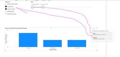
Yes, of course, this is how it works on default.
Please see an attached picture
Or linked file :
Sample file with 2 slicers
If this post helps, then please consider Accepting it as the solution to help the other members find it more quickly
Rita Fainshtein | Microsoft MVP
https://www.linkedin.com/in/rita-fainshtein/
Blog : https://www.madeiradata.com/profile/ritaf/profile
- Mark as New
- Bookmark
- Subscribe
- Mute
- Subscribe to RSS Feed
- Permalink
- Report Inappropriate Content
Hi,
It is possible. A visual/graph can use all the filters present in a dashboard and provides the correct data after filtering.
Thank You
- Mark as New
- Bookmark
- Subscribe
- Mute
- Subscribe to RSS Feed
- Permalink
- Report Inappropriate Content
Hi @aausten22
Yes, of course, this is how it works on default.
Please see an attached picture
Or linked file :
Sample file with 2 slicers
If this post helps, then please consider Accepting it as the solution to help the other members find it more quickly
Rita Fainshtein | Microsoft MVP
https://www.linkedin.com/in/rita-fainshtein/
Blog : https://www.madeiradata.com/profile/ritaf/profile
Helpful resources
| User | Count |
|---|---|
| 51 | |
| 39 | |
| 29 | |
| 19 | |
| 17 |
| User | Count |
|---|---|
| 66 | |
| 57 | |
| 41 | |
| 21 | |
| 19 |


