Fabric Data Days starts November 4th!
Advance your Data & AI career with 50 days of live learning, dataviz contests, hands-on challenges, study groups & certifications and more!
Get registered- Power BI forums
- Get Help with Power BI
- Desktop
- Service
- Report Server
- Power Query
- Mobile Apps
- Developer
- DAX Commands and Tips
- Custom Visuals Development Discussion
- Health and Life Sciences
- Power BI Spanish forums
- Translated Spanish Desktop
- Training and Consulting
- Instructor Led Training
- Dashboard in a Day for Women, by Women
- Galleries
- Data Stories Gallery
- Themes Gallery
- Contests Gallery
- Quick Measures Gallery
- Visual Calculations Gallery
- Notebook Gallery
- Translytical Task Flow Gallery
- TMDL Gallery
- R Script Showcase
- Webinars and Video Gallery
- Ideas
- Custom Visuals Ideas (read-only)
- Issues
- Issues
- Events
- Upcoming Events
Get Fabric Certified for FREE during Fabric Data Days. Don't miss your chance! Learn more
- Power BI forums
- Forums
- Get Help with Power BI
- Desktop
- Using Measures as Axis in line chart
- Subscribe to RSS Feed
- Mark Topic as New
- Mark Topic as Read
- Float this Topic for Current User
- Bookmark
- Subscribe
- Printer Friendly Page
- Mark as New
- Bookmark
- Subscribe
- Mute
- Subscribe to RSS Feed
- Permalink
- Report Inappropriate Content
Using Measures as Axis in line chart
I would like to build a simple graph like the following (from Excel - X-axis shows running total quantity, and the Y-axis shows per ton margin.
😞
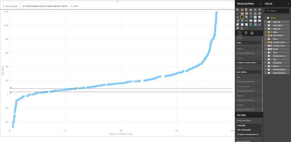
Now, I managed to put this in PBI using the index column, and the best result I got is this:
As you may see, this scatter plot is not presentation-friendly. As the values I use are measures, I am not being able to get the same result from line graphs. I also could not manage to build a calculated column for running total quantity. The measure formula is as follows:
Q-ty(tn) running total in Index =
CALCULATE(
	SUM('Result'[Aggr.Qty]);
	FILTER(
		ALLSELECTED('Result'[Index]);
		ISONORAFTER('Result'[Index]; MAX('Result'[Index]); DESC)
	)
)
Please, advise me on getting the desired output, which is a simple line with running total qty on X and per ton margin on Y.
- Mark as New
- Bookmark
- Subscribe
- Mute
- Subscribe to RSS Feed
- Permalink
- Report Inappropriate Content
@foyiq,
Create a calculate column that represents running total using DAX below, then create line chart and check if you get expected result.
Running Total COLUMN =
CALCULATE (
SUM ( 'Result'[Aggr.Qty]);
ALL ( 'Result' );
'Result'[Index]<= EARLIER ('Result'[Index])
)
Regards,
Lydia
Helpful resources

Fabric Data Days
Advance your Data & AI career with 50 days of live learning, contests, hands-on challenges, study groups & certifications and more!

Power BI Monthly Update - October 2025
Check out the October 2025 Power BI update to learn about new features.


