- Power BI forums
- Get Help with Power BI
- Desktop
- Service
- Report Server
- Power Query
- Mobile Apps
- Developer
- DAX Commands and Tips
- Custom Visuals Development Discussion
- Health and Life Sciences
- Power BI Spanish forums
- Translated Spanish Desktop
- Training and Consulting
- Instructor Led Training
- Dashboard in a Day for Women, by Women
- Galleries
- Data Stories Gallery
- Themes Gallery
- Contests Gallery
- QuickViz Gallery
- Quick Measures Gallery
- Visual Calculations Gallery
- Notebook Gallery
- Translytical Task Flow Gallery
- TMDL Gallery
- R Script Showcase
- Webinars and Video Gallery
- Ideas
- Custom Visuals Ideas (read-only)
- Issues
- Issues
- Events
- Upcoming Events
Learn from the best! Meet the four finalists headed to the FINALS of the Power BI Dataviz World Championships! Register now
- Power BI forums
- Forums
- Get Help with Power BI
- Desktop
- User customizable Pivot Table
- Subscribe to RSS Feed
- Mark Topic as New
- Mark Topic as Read
- Float this Topic for Current User
- Bookmark
- Subscribe
- Printer Friendly Page
- Mark as New
- Bookmark
- Subscribe
- Mute
- Subscribe to RSS Feed
- Permalink
- Report Inappropriate Content
User customizable Pivot Table
Hi,
I have a requirement in my Power BI report that I'm struggling with for days now.
My datamodel is quite large with > 20 tables. I would like a matrix where I can count the distinct amount of customers and let the user of the report in his browser dynamically add and remove dimensions as rows and/or columns in where the distinct amount of customers is grouped by the values of these dimensions.
In short: I’m searching for a way to create the Excel Pivot Table functionality J. The goal is that the user of the report can create their own custom made reports in his browser in which the value is always the distinct amount of customers, but the rows and columns in which those amount of customers are grouped can manually be selected.
Simple Example (with only one table)
ID | Office | Active | Color |
1 | GR | Yes | Red |
2 | GR | Yes | Blue |
3 | GR | No | Blue |
4 | NO | No | Blue |
5 | NO | No | Red |
6 | NO | No | Red |
7 | ZW | No | Red |
8 | ZW | No | Blue |
9 | ZW | Yes | Blue |
10 | ZW | Yes | Blue |
The User can choose the report rows and columns. For example he wishes to see the amount of customers by Color and Office as Rows and Active as a Column. The result should something like this:
Rows | Yes | No | Total |
Blue | 3 | 3 | 6 |
GR | 1 | 1 | 2 |
NO | 1 | 1 | |
ZW | 2 | 1 | 3 |
Red | 1 | 3 | 4 |
GR | 1 | 1 | |
NO | 2 | 2 | |
ZW | 1 | 1 | |
Total | 4 | 6 | 10 |
Thanks & Regards,
Tiemen
Solved! Go to Solution.
- Mark as New
- Bookmark
- Subscribe
- Mute
- Subscribe to RSS Feed
- Permalink
- Report Inappropriate Content
The new preview feature 'personalize visual experience' is the solution for me. Thank you for your help.
Regards,
Tiemen
- Mark as New
- Bookmark
- Subscribe
- Mute
- Subscribe to RSS Feed
- Permalink
- Report Inappropriate Content
The new preview feature 'personalize visual experience' is the solution for me. Thank you for your help.
Regards,
Tiemen
- Mark as New
- Bookmark
- Subscribe
- Mute
- Subscribe to RSS Feed
- Permalink
- Report Inappropriate Content
Hi @Anonymous ,
Glad to hear the issue is solved. You can accept your reply as solution, that way, other community members could easily find the answer when they get same issues.
Best Regards,
Yingjie Li
- Mark as New
- Bookmark
- Subscribe
- Mute
- Subscribe to RSS Feed
- Permalink
- Report Inappropriate Content
Hi @Anonymous ,
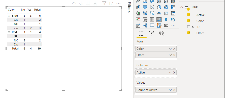
Based on your expected output, you can use Matrix visual to achieve it directly:
Best Regards,
Yingjie Li
If this post helps then please consider Accept it as the solution to help the other members find it more quickly.
- Mark as New
- Bookmark
- Subscribe
- Mute
- Subscribe to RSS Feed
- Permalink
- Report Inappropriate Content
@Anonymous , use all expect
https://www.sqlbi.com/articles/using-allexcept-versus-all-and-values/
This should give you the required data
- Mark as New
- Bookmark
- Subscribe
- Mute
- Subscribe to RSS Feed
- Permalink
- Report Inappropriate Content
Hi @amitchandak ,
Thanks for your reply. Personally I do not the relation between creating a customizable pivot table in Power BI for browser based users and using ALLEXCEPT in DAX. Can you explain how ALLEXCEPT can help me in creating the customizable pivot table?
Regards,
Tiemen
Helpful resources

New to Fabric Survey
If you have recently started exploring Fabric, we'd love to hear how it's going. Your feedback can help with product improvements.

Power BI DataViz World Championships - June 2026
A new Power BI DataViz World Championship is coming this June! Don't miss out on submitting your entry.

Join our Fabric User Panel
Share feedback directly with Fabric product managers, participate in targeted research studies and influence the Fabric roadmap.

| User | Count |
|---|---|
| 57 | |
| 38 | |
| 33 | |
| 19 | |
| 16 |
| User | Count |
|---|---|
| 69 | |
| 66 | |
| 41 | |
| 32 | |
| 25 |

