- Subscribe to RSS Feed
- Mark Topic as New
- Mark Topic as Read
- Float this Topic for Current User
- Bookmark
- Subscribe
- Printer Friendly Page
- Mark as New
- Bookmark
- Subscribe
- Mute
- Subscribe to RSS Feed
- Permalink
- Report Inappropriate Content
Use SSAS Tabular KPI as a chart (donut) color
Hi,
I have an SSAS tabular model and there is several KPI measures. I want to use these KPI measures as a base of the donut chart color .. green - yellow - red so that if the KPI value is poor then donut is red and if KPI value is good donut color is red
Is this possible or is there some kind of workaround ?
Pasi
- Mark as New
- Bookmark
- Subscribe
- Mute
- Subscribe to RSS Feed
- Permalink
- Report Inappropriate Content
Hi @tynipa,
Based on my test, using donut chart cannot meet your requirement. You can contact Zoom Charts for more function.
Regards,
Frank
If this post helps, then please consider Accept it as the solution to help the others find it more quickly.
- Mark as New
- Bookmark
- Subscribe
- Mute
- Subscribe to RSS Feed
- Permalink
- Report Inappropriate Content
Hi @tynipa,
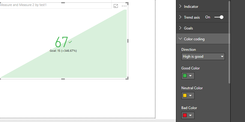
We can use the color coding here to achieve your goal.
Also please find the pbix as attached.
Regards,
Frank
If this post helps, then please consider Accept it as the solution to help the others find it more quickly.
- Mark as New
- Bookmark
- Subscribe
- Mute
- Subscribe to RSS Feed
- Permalink
- Report Inappropriate Content
Hi Frank,
Yes I know that I can use the KPI chart, but I should get this working with the donut chart .....
Pasi
Helpful resources

Join us at the Microsoft Fabric Community Conference
March 31 - April 2, 2025, in Las Vegas, Nevada. Use code MSCUST for a $150 discount!

Microsoft Fabric Community Conference 2025
Arun Ulag shares exciting details about the Microsoft Fabric Conference 2025, which will be held in Las Vegas, NV.

| User | Count |
|---|---|
| 113 | |
| 76 | |
| 56 | |
| 55 | |
| 43 |
| User | Count |
|---|---|
| 183 | |
| 120 | |
| 80 | |
| 67 | |
| 57 |

