FabCon is coming to Atlanta
Join us at FabCon Atlanta from March 16 - 20, 2026, for the ultimate Fabric, Power BI, AI and SQL community-led event. Save $200 with code FABCOMM.
Register now!- Power BI forums
- Get Help with Power BI
- Desktop
- Service
- Report Server
- Power Query
- Mobile Apps
- Developer
- DAX Commands and Tips
- Custom Visuals Development Discussion
- Health and Life Sciences
- Power BI Spanish forums
- Translated Spanish Desktop
- Training and Consulting
- Instructor Led Training
- Dashboard in a Day for Women, by Women
- Galleries
- Data Stories Gallery
- Themes Gallery
- Contests Gallery
- QuickViz Gallery
- Quick Measures Gallery
- Visual Calculations Gallery
- Notebook Gallery
- Translytical Task Flow Gallery
- TMDL Gallery
- R Script Showcase
- Webinars and Video Gallery
- Ideas
- Custom Visuals Ideas (read-only)
- Issues
- Issues
- Events
- Upcoming Events
Get Fabric Certified for FREE during Fabric Data Days. Don't miss your chance! Request now
- Power BI forums
- Forums
- Get Help with Power BI
- Desktop
- Unable to complete Exercise - Create visuals in Po...
- Subscribe to RSS Feed
- Mark Topic as New
- Mark Topic as Read
- Float this Topic for Current User
- Bookmark
- Subscribe
- Printer Friendly Page
- Mark as New
- Bookmark
- Subscribe
- Mute
- Subscribe to RSS Feed
- Permalink
- Report Inappropriate Content
Unable to complete Exercise - Create visuals in Power BI
Hello all,
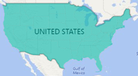
I'm new to this community and Power BI. I'm working through the tutorial provided through the links in my admin portal. I'm current on the "Exercise - Create visuals in Power BI" and it shows adding a field called State to the Report View and it presents as a Geo Map with bubbles. Later in the execise it says to change the visual from Map to Filled Map. When I do that it fills all the areas which have a bubble with the same color and not separate colors as the tutorial depicts.
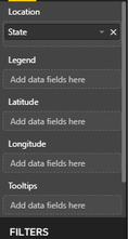
Also, the next step says to dran another field to the Color Saturation well and there is no such well below Longitude in my interface.
I know I'm probably missing a step somewhere. Any help would be greatly appreciated.
DJS
Solved! Go to Solution.
- Mark as New
- Bookmark
- Subscribe
- Mute
- Subscribe to RSS Feed
- Permalink
- Report Inappropriate Content
Check Tips and tricks for Power BI map visualizations and take a look at Color saturation on visuals upgraded to use conditional formatting.
If this post helps, then please consider Accept it as the solution to help the other members find it more quickly.
- Mark as New
- Bookmark
- Subscribe
- Mute
- Subscribe to RSS Feed
- Permalink
- Report Inappropriate Content
Thanks Sam,
That provided the answers I needed. I hope Microsoft will be updating their tutorial as I have a few other staff members who need to use this to get started.
So far, I'm liking Powere BI and what it can provide. Our CEO has been asking for these capabilities for a while. Next steps are to learn more about how to make more interesting stories with Power BI.
I'm hoping to find more tutorials soon.
Thanks again,
DJS
- Mark as New
- Bookmark
- Subscribe
- Mute
- Subscribe to RSS Feed
- Permalink
- Report Inappropriate Content
Check Tips and tricks for Power BI map visualizations and take a look at Color saturation on visuals upgraded to use conditional formatting.
If this post helps, then please consider Accept it as the solution to help the other members find it more quickly.
Helpful resources

Power BI Monthly Update - November 2025
Check out the November 2025 Power BI update to learn about new features.

Fabric Data Days
Advance your Data & AI career with 50 days of live learning, contests, hands-on challenges, study groups & certifications and more!


