FabCon is coming to Atlanta
Join us at FabCon Atlanta from March 16 - 20, 2026, for the ultimate Fabric, Power BI, AI and SQL community-led event. Save $200 with code FABCOMM.
Register now!- Power BI forums
- Get Help with Power BI
- Desktop
- Service
- Report Server
- Power Query
- Mobile Apps
- Developer
- DAX Commands and Tips
- Custom Visuals Development Discussion
- Health and Life Sciences
- Power BI Spanish forums
- Translated Spanish Desktop
- Training and Consulting
- Instructor Led Training
- Dashboard in a Day for Women, by Women
- Galleries
- Data Stories Gallery
- Themes Gallery
- Contests Gallery
- QuickViz Gallery
- Quick Measures Gallery
- Visual Calculations Gallery
- Notebook Gallery
- Translytical Task Flow Gallery
- TMDL Gallery
- R Script Showcase
- Webinars and Video Gallery
- Ideas
- Custom Visuals Ideas (read-only)
- Issues
- Issues
- Events
- Upcoming Events
Get Fabric Certified for FREE during Fabric Data Days. Don't miss your chance! Request now
- Power BI forums
- Forums
- Get Help with Power BI
- Desktop
- Two fileds, same visual, need to see all the data ...
- Subscribe to RSS Feed
- Mark Topic as New
- Mark Topic as Read
- Float this Topic for Current User
- Bookmark
- Subscribe
- Printer Friendly Page
- Mark as New
- Bookmark
- Subscribe
- Mute
- Subscribe to RSS Feed
- Permalink
- Report Inappropriate Content
Two fileds, same visual, need to see all the data labels
Hi, I need help with this problem:
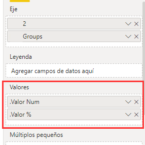
In a bar chart, I need to display two fields.
But not both together, but to show one or another, depending on the value selected in a slicer
One of the fields represents percentages, and the other represents absolute numeric values.
I use a stacked bar chart and it works fine.
But the problem is that for small values it does not show the data labels.
If I place only one of the fields in the chart, the data labels are shown, but if I place both, even if both are never shown together, it does not show the data labels.
How can I do to show one or the other field in the same chart, keeping each one its format (percentage or number), and always showing the data labels?
I attach screenshots to help understanding.
Thank you very much!
Solved! Go to Solution.
- Mark as New
- Bookmark
- Subscribe
- Mute
- Subscribe to RSS Feed
- Permalink
- Report Inappropriate Content
Hi @pmaurizi ,
You can achieve this with bookmarks creating two visualizations
https://docs.microsoft.com/en-us/power-bi/create-reports/desktop-bookmarks
Or this can also be done using the calcuted groups with external tools.
However be aware that if you use this option you won't be abble to use implicit measures on your model anymore, meanig you cannot drag as column to a chart and make a sum or a count you will need to star using measures for all calculations.
Regards
Miguel Félix
Did I answer your question? Mark my post as a solution!
Proud to be a Super User!
Check out my blog: Power BI em Português- Mark as New
- Bookmark
- Subscribe
- Mute
- Subscribe to RSS Feed
- Permalink
- Report Inappropriate Content
Hi @pmaurizi ,
You can achieve this with bookmarks creating two visualizations
https://docs.microsoft.com/en-us/power-bi/create-reports/desktop-bookmarks
Or this can also be done using the calcuted groups with external tools.
However be aware that if you use this option you won't be abble to use implicit measures on your model anymore, meanig you cannot drag as column to a chart and make a sum or a count you will need to star using measures for all calculations.
Regards
Miguel Félix
Did I answer your question? Mark my post as a solution!
Proud to be a Super User!
Check out my blog: Power BI em PortuguêsHelpful resources

Power BI Monthly Update - November 2025
Check out the November 2025 Power BI update to learn about new features.

Fabric Data Days
Advance your Data & AI career with 50 days of live learning, contests, hands-on challenges, study groups & certifications and more!


