Fabric Data Days starts November 4th!
Advance your Data & AI career with 50 days of live learning, dataviz contests, hands-on challenges, study groups & certifications and more!
Get registered- Power BI forums
- Get Help with Power BI
- Desktop
- Service
- Report Server
- Power Query
- Mobile Apps
- Developer
- DAX Commands and Tips
- Custom Visuals Development Discussion
- Health and Life Sciences
- Power BI Spanish forums
- Translated Spanish Desktop
- Training and Consulting
- Instructor Led Training
- Dashboard in a Day for Women, by Women
- Galleries
- Data Stories Gallery
- Themes Gallery
- Contests Gallery
- QuickViz Gallery
- Quick Measures Gallery
- Visual Calculations Gallery
- Notebook Gallery
- Translytical Task Flow Gallery
- TMDL Gallery
- R Script Showcase
- Webinars and Video Gallery
- Ideas
- Custom Visuals Ideas (read-only)
- Issues
- Issues
- Events
- Upcoming Events
Get Fabric Certified for FREE during Fabric Data Days. Don't miss your chance! Request now
- Power BI forums
- Forums
- Get Help with Power BI
- Desktop
- Two dates on X-axis based on 2 dimensions AND one ...
- Subscribe to RSS Feed
- Mark Topic as New
- Mark Topic as Read
- Float this Topic for Current User
- Bookmark
- Subscribe
- Printer Friendly Page
- Mark as New
- Bookmark
- Subscribe
- Mute
- Subscribe to RSS Feed
- Permalink
- Report Inappropriate Content
Two dates on X-axis based on 2 dimensions AND one measure on Y-axis
Hello Community!
I have a simple case but can't solve it with PowerBI, so I need an advice.
I have MS OLAP Cube and I connected to it using Power BI.
I have fact table "FACT" with a lot of columns including 2 ones: "Open Time" and "Close Time".
I have 2 dimensions "Dim_Open_Date" and "Dim_Close_Date". Both dimensions with hierarchy like Year-Quarter-Month-Day.
I have a simple measure called "Entites Count" - just a count of rows.
I want to create a visual like "Clustered column chart" where on X-axis I will have date hierarchy (Y-Q-M-D) and on Y-axis I will have my measure "Entites Count" - left bar biuld on "Dim_Open_Date" and right bar build on "Dim_Close_Date".
That's it. Will be appreciate any piece of advice. Thank you!
- Mark as New
- Bookmark
- Subscribe
- Mute
- Subscribe to RSS Feed
- Permalink
- Report Inappropriate Content
Hi @Vadim_Drevin,
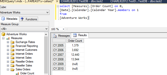
This issue is more related to MDX query, if you can get "Open date Entites Count" and "Close date Entites Count" in your MDX, then you can create this bar chart easily. So you need to create those two measure in your cube. Here is the sample query for you reference.
Regards,
Charlie Liao
Helpful resources

Power BI Monthly Update - November 2025
Check out the November 2025 Power BI update to learn about new features.

Fabric Data Days
Advance your Data & AI career with 50 days of live learning, contests, hands-on challenges, study groups & certifications and more!

| User | Count |
|---|---|
| 98 | |
| 72 | |
| 50 | |
| 48 | |
| 42 |

