Join us at the 2025 Microsoft Fabric Community Conference
Microsoft Fabric Community Conference 2025, March 31 - April 2, Las Vegas, Nevada. Use code FABINSIDER for a $400 discount.
Register now- Power BI forums
- Get Help with Power BI
- Desktop
- Service
- Report Server
- Power Query
- Mobile Apps
- Developer
- DAX Commands and Tips
- Custom Visuals Development Discussion
- Health and Life Sciences
- Power BI Spanish forums
- Translated Spanish Desktop
- Training and Consulting
- Instructor Led Training
- Dashboard in a Day for Women, by Women
- Galleries
- Webinars and Video Gallery
- Data Stories Gallery
- Themes Gallery
- Power BI DataViz World Championships Gallery
- Quick Measures Gallery
- R Script Showcase
- COVID-19 Data Stories Gallery
- Community Connections & How-To Videos
- 2021 MSBizAppsSummit Gallery
- 2020 MSBizAppsSummit Gallery
- 2019 MSBizAppsSummit Gallery
- Events
- Ideas
- Custom Visuals Ideas
- Issues
- Issues
- Events
- Upcoming Events
The Power BI DataViz World Championships are on! With four chances to enter, you could win a spot in the LIVE Grand Finale in Las Vegas. Show off your skills.
- Power BI forums
- Forums
- Get Help with Power BI
- Desktop
- Re: Two date slicers in one tab
- Subscribe to RSS Feed
- Mark Topic as New
- Mark Topic as Read
- Float this Topic for Current User
- Bookmark
- Subscribe
- Printer Friendly Page
- Mark as New
- Bookmark
- Subscribe
- Mute
- Subscribe to RSS Feed
- Permalink
- Report Inappropriate Content
Two date slicers in one tab
Hi,
I don't know if someone has the answer to this....
I have a date field and some other data that I can model - i.e. barchart.
In a PowerBI tab (sheet), I want to put a line down the middle (easy), and show last week (left side) vs this week (right side).
The problem is, I have one date field and when I create two slicers they don't work independently - i.e. 20/03/2017 and 27/03/2017.
Help!
THanks.
Solved! Go to Solution.
- Mark as New
- Bookmark
- Subscribe
- Mute
- Subscribe to RSS Feed
- Permalink
- Report Inappropriate Content
Hi @SachinC,
You can follow the steps below to achieve your requirement.
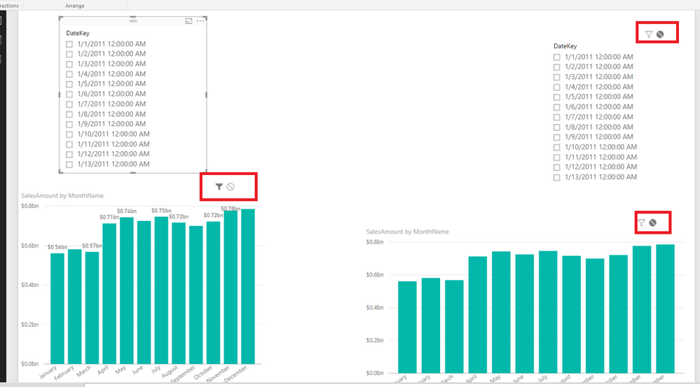
1. click on the slicer on the left side, choose “None” for the visual and slicer in the right side. See my example in the screenshot below.
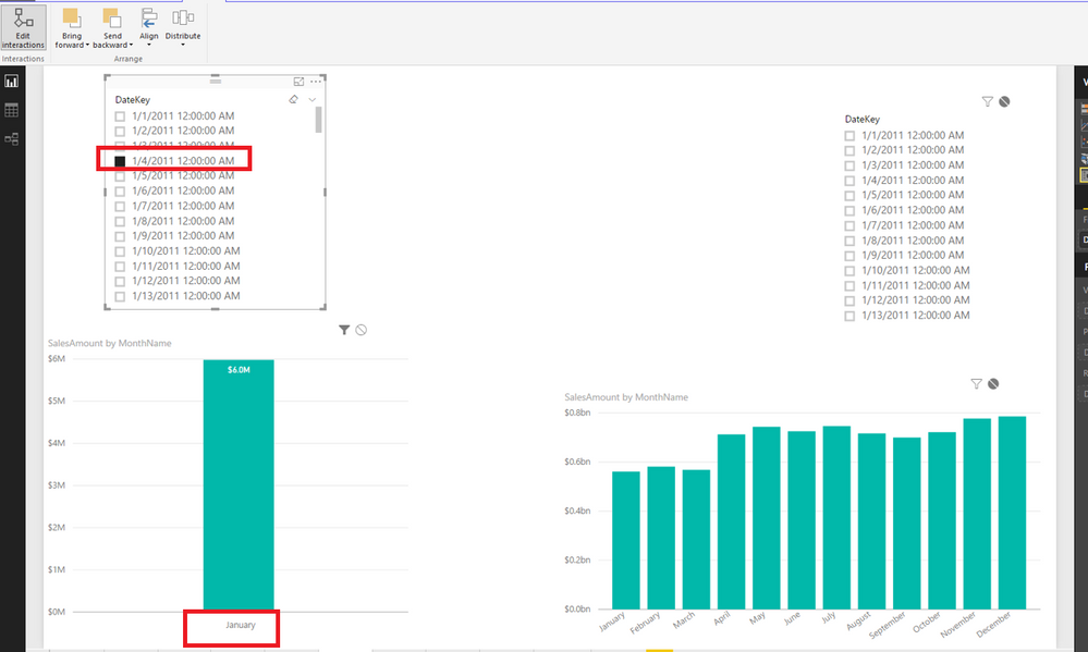
2. select “20, March 2017” in the left slicer to filter the left visual. See my example in the screenshot below.
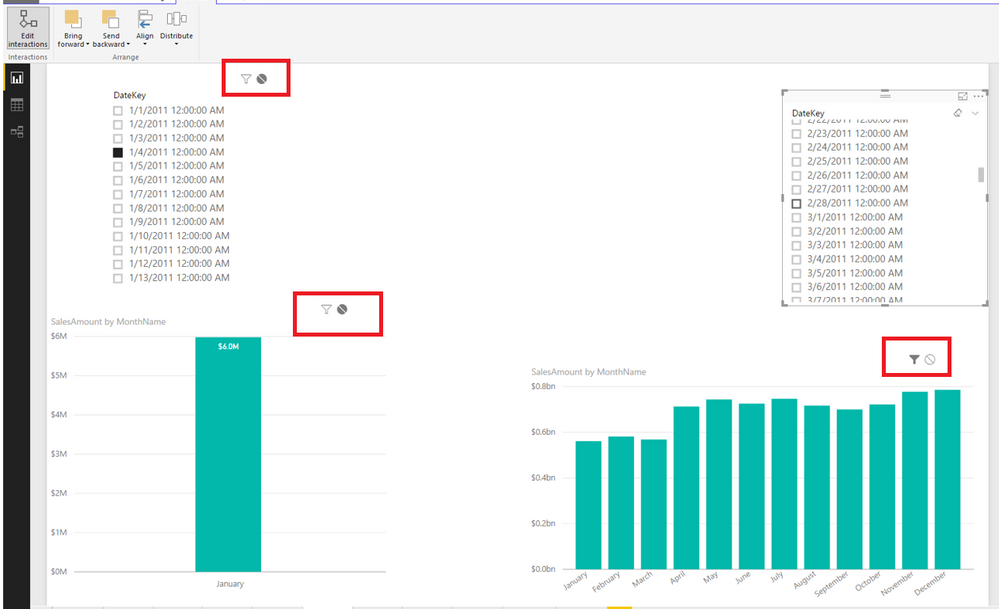
3. click on the slicer on the right side, choose ”None” for the visual and slicer in the left side. See my example in the screenshot below.
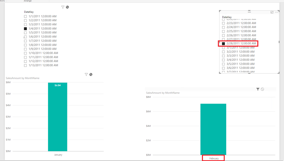
4. select “27, March 2017” in the right slicer to filter the right visual. See my example in the screenshot below.
Thanks,
Lydia Zhang
If this post helps, then please consider Accept it as the solution to help the other members find it more quickly.
- Mark as New
- Bookmark
- Subscribe
- Mute
- Subscribe to RSS Feed
- Permalink
- Report Inappropriate Content
I have the same question. So how does that visualization flitering shows by the slicers? (the round button)
- Mark as New
- Bookmark
- Subscribe
- Mute
- Subscribe to RSS Feed
- Permalink
- Report Inappropriate Content
So chose none for interactions between slicers.
Regards
Mfelix
Regards
Miguel Félix
Did I answer your question? Mark my post as a solution!
Proud to be a Super User!
Check out my blog: Power BI em Português- Mark as New
- Bookmark
- Subscribe
- Mute
- Subscribe to RSS Feed
- Permalink
- Report Inappropriate Content
Hi,
Thanks for your reply. I had a go, but got lost. Please help. See attached pic to assist.
Thanks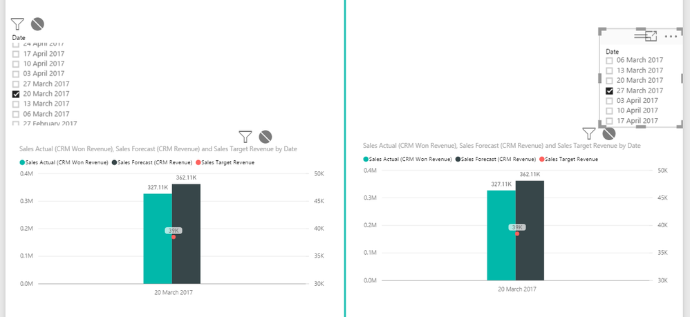
- Mark as New
- Bookmark
- Subscribe
- Mute
- Subscribe to RSS Feed
- Permalink
- Report Inappropriate Content
Hi @SachinC,
You can follow the steps below to achieve your requirement.
1. click on the slicer on the left side, choose “None” for the visual and slicer in the right side. See my example in the screenshot below.
2. select “20, March 2017” in the left slicer to filter the left visual. See my example in the screenshot below.
3. click on the slicer on the right side, choose ”None” for the visual and slicer in the left side. See my example in the screenshot below.
4. select “27, March 2017” in the right slicer to filter the right visual. See my example in the screenshot below.
Thanks,
Lydia Zhang
If this post helps, then please consider Accept it as the solution to help the other members find it more quickly.
Helpful resources

Join us at the Microsoft Fabric Community Conference
March 31 - April 2, 2025, in Las Vegas, Nevada. Use code MSCUST for a $150 discount!

Power BI Monthly Update - February 2025
Check out the February 2025 Power BI update to learn about new features.

Join our Community Sticker Challenge 2025
If you love stickers, then you will definitely want to check out our Community Sticker Challenge!

| User | Count |
|---|---|
| 84 | |
| 69 | |
| 68 | |
| 39 | |
| 37 |
