FabCon is coming to Atlanta
Join us at FabCon Atlanta from March 16 - 20, 2026, for the ultimate Fabric, Power BI, AI and SQL community-led event. Save $200 with code FABCOMM.
Register now!- Power BI forums
- Get Help with Power BI
- Desktop
- Service
- Report Server
- Power Query
- Mobile Apps
- Developer
- DAX Commands and Tips
- Custom Visuals Development Discussion
- Health and Life Sciences
- Power BI Spanish forums
- Translated Spanish Desktop
- Training and Consulting
- Instructor Led Training
- Dashboard in a Day for Women, by Women
- Galleries
- Data Stories Gallery
- Themes Gallery
- Contests Gallery
- QuickViz Gallery
- Quick Measures Gallery
- Visual Calculations Gallery
- Notebook Gallery
- Translytical Task Flow Gallery
- TMDL Gallery
- R Script Showcase
- Webinars and Video Gallery
- Ideas
- Custom Visuals Ideas (read-only)
- Issues
- Issues
- Events
- Upcoming Events
The Power BI Data Visualization World Championships is back! Get ahead of the game and start preparing now! Learn more
- Power BI forums
- Forums
- Get Help with Power BI
- Desktop
- Two Measures to Draw One Line
- Subscribe to RSS Feed
- Mark Topic as New
- Mark Topic as Read
- Float this Topic for Current User
- Bookmark
- Subscribe
- Printer Friendly Page
- Mark as New
- Bookmark
- Subscribe
- Mute
- Subscribe to RSS Feed
- Permalink
- Report Inappropriate Content
Two Measures to Draw One Line
Hi everyone, let me preface this by saying I'm not sure the requested feature is entirely possible.
What I'm trying to do is create two separate measures for a line chart. I want the measure to check the last day of the dataset, and if we're meeting or above goal; it should draw the entire line. Second measure does the same thing, just if we're below goal.
A couple important items that may help:
1) I'm tracking running sales and a running sales goal this looks something like
2) The last day of the mock dataset is 1/6/22
3) Here is what I'd envision the table looking like if the measures were working as intended.
Above Goal (as of 1/6):
Below Goal (as of 12/16):
Unfortunately, the way its currently calculating is
Measures to note:
Running Sales =
CALCULATE(
    SUM(Sheet1[Sales Actual]),
    FILTER(
        ALLSELECTED(Sheet1[Date]),
        ISONORAFTER(Sheet1[Date], MAX(Sheet1[Date]), DESC)
    )
)

Running Goal =
CALCULATE(
    SUM(Sheet1[Sales Goal]),
    FILTER(
        ALLSELECTED(Sheet1[Date]),
        ISONORAFTER(Sheet1[Date], MAX(Sheet1[Date]), DESC)
    )
)

Above Goal =
IF([Running Sales] >= [Running Goal], [Running Sales], BLANK())

Below Goal =
IF([Running Sales] < [Running Goal], [Running Sales], BLANK())
Any sort of guidance would be greatly appreciated.
- Mark as New
- Bookmark
- Subscribe
- Mute
- Subscribe to RSS Feed
- Permalink
- Report Inappropriate Content
Hi @MPetramalo214 ,
Are you trying to show different colors on the same line, like this?
Currently Power BI does not support conditional formatting of the color of the line chart, you can suggest your idea here.
https://ideas.powerbi.com/ideas/idea/?ideaid=0671c26d-bd0e-43ad-b78c-bb097f2c54af
Just as a workaround, you can try other visuals or superimpose two fold lines as follows.
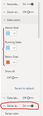
Put the measures into the Values/Secondary values pane separately, then close the legend, set the color of [Above Goal] and [Running Sales] to the same, and turn on the "Series labels" option.
Then the final result will be:
If the problem is still not resolved, please provide detailed error information or the expected result you expect. Let me know immediately, looking forward to your reply.
Best Regards,
Winniz
If this post helps, then please consider Accept it as the solution to help the other members find it more quickly.
- Mark as New
- Bookmark
- Subscribe
- Mute
- Subscribe to RSS Feed
- Permalink
- Report Inappropriate Content
I'm not trying to get one line with two colors; I actually was trying to force one line to be conditional on if we're above goal on the max day we're filtered to, and the other to be conditional on if we're below goal.
Which ever is true, would draw the line - and because its two measures, I can manually set the color of each.
All the following is being manually manipulated by me; but is how I would envision this working. But I understand if this is not a feature yet.
Above Goal:
Below Goal:
The problem I am currently running into, is that instead of the entire series of dates being calculated by each measure; the measures are only calculating when that day is above/below goal:
- Mark as New
- Bookmark
- Subscribe
- Mute
- Subscribe to RSS Feed
- Permalink
- Report Inappropriate Content
Please provide sanitized sample data that fully covers your issue. Paste the data into a table in your post or use one of the file services. Please show the expected outcome.
Helpful resources

Power BI Dataviz World Championships
The Power BI Data Visualization World Championships is back! Get ahead of the game and start preparing now!

| User | Count |
|---|---|
| 39 | |
| 37 | |
| 33 | |
| 32 | |
| 29 |
| User | Count |
|---|---|
| 132 | |
| 88 | |
| 82 | |
| 68 | |
| 64 |


