Fabric Data Days starts November 4th!
Advance your Data & AI career with 50 days of live learning, dataviz contests, hands-on challenges, study groups & certifications and more!
Get registered- Power BI forums
- Get Help with Power BI
- Desktop
- Service
- Report Server
- Power Query
- Mobile Apps
- Developer
- DAX Commands and Tips
- Custom Visuals Development Discussion
- Health and Life Sciences
- Power BI Spanish forums
- Translated Spanish Desktop
- Training and Consulting
- Instructor Led Training
- Dashboard in a Day for Women, by Women
- Galleries
- Data Stories Gallery
- Themes Gallery
- Contests Gallery
- QuickViz Gallery
- Quick Measures Gallery
- Visual Calculations Gallery
- Notebook Gallery
- Translytical Task Flow Gallery
- TMDL Gallery
- R Script Showcase
- Webinars and Video Gallery
- Ideas
- Custom Visuals Ideas (read-only)
- Issues
- Issues
- Events
- Upcoming Events
Get Fabric Certified for FREE during Fabric Data Days. Don't miss your chance! Request now
- Power BI forums
- Forums
- Get Help with Power BI
- Desktop
- Turning numerical slicer into custom ranges
- Subscribe to RSS Feed
- Mark Topic as New
- Mark Topic as Read
- Float this Topic for Current User
- Bookmark
- Subscribe
- Printer Friendly Page
- Mark as New
- Bookmark
- Subscribe
- Mute
- Subscribe to RSS Feed
- Permalink
- Report Inappropriate Content
Turning numerical slicer into custom ranges
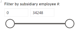
Hello, I currently have a slicer based on employee numbers:
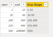
But I'd like to turn this into custom ranges, e.g. 1-19, 20-99, 100-249, 250-499, 500+.
I read through some posts in the past that first suggested to create a new table with ranges as follows:
but after this, i'm not sure what to do so that when i add a new slicer using Emp. range, every visual on my dashboard page would filter out data that do not belong to the selected employment category?
Thanks for your help.
Solved! Go to Solution.
- Mark as New
- Bookmark
- Subscribe
- Mute
- Subscribe to RSS Feed
- Permalink
- Report Inappropriate Content
Write a Switch statement to group your Firms by Employee range
Condition Column
= Switch(
True(),
Employees <20, "1-19",
Employees <100, "20-99",
etc.
Then use your new conditional column as your slicer.
**note the switch statement above isn't correctly formatted, just as a reference. If you need help writing it, reply to this message and I can help you with it
- Mark as New
- Bookmark
- Subscribe
- Mute
- Subscribe to RSS Feed
- Permalink
- Report Inappropriate Content
Hi,
Share some data, describe the question and show the expected result.
Regards,
Ashish Mathur
http://www.ashishmathur.com
https://www.linkedin.com/in/excelenthusiasts/
- Mark as New
- Bookmark
- Subscribe
- Mute
- Subscribe to RSS Feed
- Permalink
- Report Inappropriate Content
Hi,
suppose I currently have firm level data as in the following table. I would like to create a dashboard with individual firm data plotted on a map and some bar charts, where users can filter all elements in the dashboard by industry, revenue, location and employee slicers. but for the employee slicer specifically, i would prefer to show a slicer with custom ranges of employees like this:
so that if a user were to select employment range 100-249 first box, then only those firms with employees in that category will appear in the dashboard map, graphs, etc.. thanks for your help.
| Firm name | | Employees | | location | | revenue | | industry |
| a | 96 | |||
| b | 6 | |||
| c | 550 | |||
| d | 45 | |||
| e | 122 | |||
| f | 5 | |||
| g | 65 | |||
| h | 2 | |||
| i | 2343 | |||
| j | 5 | |||
| k | 55 | |||
| l | 5 | |||
| aa | 111 | |||
| bb | 10 | |||
| ab | 5 |
- Mark as New
- Bookmark
- Subscribe
- Mute
- Subscribe to RSS Feed
- Permalink
- Report Inappropriate Content
Write a Switch statement to group your Firms by Employee range
Condition Column
= Switch(
True(),
Employees <20, "1-19",
Employees <100, "20-99",
etc.
Then use your new conditional column as your slicer.
**note the switch statement above isn't correctly formatted, just as a reference. If you need help writing it, reply to this message and I can help you with it
- Mark as New
- Bookmark
- Subscribe
- Mute
- Subscribe to RSS Feed
- Permalink
- Report Inappropriate Content
Thank you so so much!!! I did a search on this topic and tried various different suggestions made by people in the past and scratched my head for an embarrassing amount of time but then your suggestion solved my problem in a matter of a couple of minutes!! I've never heard of a switch statement, does it essentially fill a new column with descriptions in quotation marks based on the 'if' like statement preceding it? Thanks again.
- Mark as New
- Bookmark
- Subscribe
- Mute
- Subscribe to RSS Feed
- Permalink
- Report Inappropriate Content
Correct. It would be the same a nested if statement or a case/when statement in SQL:
Switch(
True(),
If these conditions are met, then return this,
If these, then this,
If these, then this,
else do this.
The return value can be a text, number, or any other value you can write in DAX
Helpful resources

Fabric Data Days
Advance your Data & AI career with 50 days of live learning, contests, hands-on challenges, study groups & certifications and more!

Power BI Monthly Update - October 2025
Check out the October 2025 Power BI update to learn about new features.


