New Offer! Become a Certified Fabric Data Engineer
Check your eligibility for this 50% exam voucher offer and join us for free live learning sessions to get prepared for Exam DP-700.
Get Started- Power BI forums
- Get Help with Power BI
- Desktop
- Service
- Report Server
- Power Query
- Mobile Apps
- Developer
- DAX Commands and Tips
- Custom Visuals Development Discussion
- Health and Life Sciences
- Power BI Spanish forums
- Translated Spanish Desktop
- Training and Consulting
- Instructor Led Training
- Dashboard in a Day for Women, by Women
- Galleries
- Community Connections & How-To Videos
- COVID-19 Data Stories Gallery
- Themes Gallery
- Data Stories Gallery
- R Script Showcase
- Webinars and Video Gallery
- Quick Measures Gallery
- 2021 MSBizAppsSummit Gallery
- 2020 MSBizAppsSummit Gallery
- 2019 MSBizAppsSummit Gallery
- Events
- Ideas
- Custom Visuals Ideas
- Issues
- Issues
- Events
- Upcoming Events
Don't miss out! 2025 Microsoft Fabric Community Conference, March 31 - April 2, Las Vegas, Nevada. Use code MSCUST for a $150 discount. Prices go up February 11th. Register now.
- Power BI forums
- Forums
- Get Help with Power BI
- Desktop
- Trying to make a Pareto chart
- Subscribe to RSS Feed
- Mark Topic as New
- Mark Topic as Read
- Float this Topic for Current User
- Bookmark
- Subscribe
- Printer Friendly Page
- Mark as New
- Bookmark
- Subscribe
- Mute
- Subscribe to RSS Feed
- Permalink
- Report Inappropriate Content
Trying to make a Pareto chart
Hello!
I am trying to make a Pareto chart in PowerBI for some ticket analysis however I am having some difficulties. Ive watched a couple youtube videos however they dont seem to apply well to the datasets I have so Im hoping I could have some assistance.
I have a table with 3 Columns, Ticket #, Ticket Category, ResolutionCode and im trying to do the pareto analysis with the ticket category.
Any recomendations would be greatly appreciated!
Solved! Go to Solution.
- Mark as New
- Bookmark
- Subscribe
- Mute
- Subscribe to RSS Feed
- Permalink
- Report Inappropriate Content
Hi @Anonymous,
Attached please find a sample pbix, that I believe will get you what you are looking for:
Steps:
- Create a summary table for your pareto analysis
- include counts and deterministic ranking column
- create a cummulative % measure, that divides the rolling sum by the total count of tickets.
Calc table, columns and measures all included in the pbix.
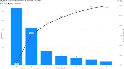
results in
hope this heps you out
I hope this helps,
Richard
Did I answer your question? Mark my post as a solution! Kudos Appreciated!
Proud to be a Super User!
- Mark as New
- Bookmark
- Subscribe
- Mute
- Subscribe to RSS Feed
- Permalink
- Report Inappropriate Content
Hi @Anonymous,
Are you able to provide some sample data?
Thanks,
I hope this helps,
Richard
Did I answer your question? Mark my post as a solution! Kudos Appreciated!
Proud to be a Super User!
- Mark as New
- Bookmark
- Subscribe
- Mute
- Subscribe to RSS Feed
- Permalink
- Report Inappropriate Content
@Anonymous , Assuming you are using count ot #ticket and axis is ticket category
then a measure as a line in clustered line visual
measure = calculate(count(Table[#ticket]), filter(allselected(Table), [ticket category] = max([ticket category])) )
- Mark as New
- Bookmark
- Subscribe
- Mute
- Subscribe to RSS Feed
- Permalink
- Report Inappropriate Content
Hi!
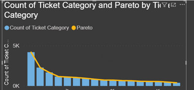
Thank you for this, I was able to add the measure as a line however do you know if it is possible to show the percentages on the line for the Pareto Analysis?
- Mark as New
- Bookmark
- Subscribe
- Mute
- Subscribe to RSS Feed
- Permalink
- Report Inappropriate Content
Hi @Anonymous,
Attached please find a sample pbix, that I believe will get you what you are looking for:
Steps:
- Create a summary table for your pareto analysis
- include counts and deterministic ranking column
- create a cummulative % measure, that divides the rolling sum by the total count of tickets.
Calc table, columns and measures all included in the pbix.
results in
hope this heps you out
I hope this helps,
Richard
Did I answer your question? Mark my post as a solution! Kudos Appreciated!
Proud to be a Super User!
Helpful resources

Join us at the Microsoft Fabric Community Conference
March 31 - April 2, 2025, in Las Vegas, Nevada. Use code MSCUST for a $150 discount! Prices go up Feb. 11th.

Join our Community Sticker Challenge 2025
If you love stickers, then you will definitely want to check out our Community Sticker Challenge!

Power BI Monthly Update - January 2025
Check out the January 2025 Power BI update to learn about new features in Reporting, Modeling, and Data Connectivity.

| User | Count |
|---|---|
| 144 | |
| 72 | |
| 62 | |
| 51 | |
| 48 |
| User | Count |
|---|---|
| 204 | |
| 86 | |
| 62 | |
| 59 | |
| 56 |


