FabCon is coming to Atlanta
Join us at FabCon Atlanta from March 16 - 20, 2026, for the ultimate Fabric, Power BI, AI and SQL community-led event. Save $200 with code FABCOMM.
Register now!- Power BI forums
- Get Help with Power BI
- Desktop
- Service
- Report Server
- Power Query
- Mobile Apps
- Developer
- DAX Commands and Tips
- Custom Visuals Development Discussion
- Health and Life Sciences
- Power BI Spanish forums
- Translated Spanish Desktop
- Training and Consulting
- Instructor Led Training
- Dashboard in a Day for Women, by Women
- Galleries
- Data Stories Gallery
- Themes Gallery
- Contests Gallery
- QuickViz Gallery
- Quick Measures Gallery
- Visual Calculations Gallery
- Notebook Gallery
- Translytical Task Flow Gallery
- TMDL Gallery
- R Script Showcase
- Webinars and Video Gallery
- Ideas
- Custom Visuals Ideas (read-only)
- Issues
- Issues
- Events
- Upcoming Events
The Power BI Data Visualization World Championships is back! Get ahead of the game and start preparing now! Learn more
- Power BI forums
- Forums
- Get Help with Power BI
- Desktop
- Trying to create a visuals to compare survey resul...
- Subscribe to RSS Feed
- Mark Topic as New
- Mark Topic as Read
- Float this Topic for Current User
- Bookmark
- Subscribe
- Printer Friendly Page
- Mark as New
- Bookmark
- Subscribe
- Mute
- Subscribe to RSS Feed
- Permalink
- Report Inappropriate Content
Trying to create a visuals to compare survey results between groups
Hi all
Summary:
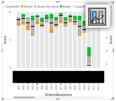
How can we replicate Image:01 using Power bi
Background:
I and my colleague have been given a task to try to replicate a survey data visual where scores are marked from 0 to 10 .
Below is the visual that we are trying to replicate in Power BI
Image:01 |
We were unable to find any visuals in the marketplace that matches it.
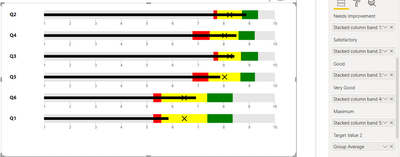
Through trial and error, we produced the following visual from a line and stacked column chart.
Image:02
Unfortunately, although this gets us really close, we are unable to rotate the line and stacked column chart. The banding was made with the stacked columns to highlight the recorded score range fron all groups and the line value in black your group score.
Request:
We would be grateful if someone could suggest a visual or an alternative method that it gets us as to as close as possible to replicating Image:01 visual.
Solved! Go to Solution.
- Mark as New
- Bookmark
- Subscribe
- Mute
- Subscribe to RSS Feed
- Permalink
- Report Inappropriate Content
Sample data
The key data is in column 'scores(1-10)' which gets standardised and Zscored to allow us to view how well any group has performed in relation to all the other group question scores (worse, aboutTheSame, Better).
Table
| QuestionsID | Scores(1-10) | Stacked column band 1: min | Stacked column band 2: Worse | Stacked column band 3: aboutTheSame | Stacked column band 4: Better | Stacked column band 5: UpTo10 | Group Max | Group Average |
| Q1 | 5.84 | 5.26 | 0.31 | 1.80 | 0.99 | 1.64 | 8.36 | 6.47 |
| Q2 | 8.88 | 7.61 | 0.14 | 0.97 | 0.63 | 0.65 | 9.35 | 8.24 |
| Q3 | 8.41 | 7.61 | 0.18 | 0.89 | 0.67 | 0.65 | 9.35 | 8.24 |
| Q4 | 8.49 | 6.79 | 0.67 | 1.13 | 0.63 | 0.77 | 9.23 | 8.04 |
| Q5 | 7.86 | 6.79 | 0.62 | 1.25 | 0.57 | 0.77 | 9.23 | 8.04 |
| Q6 | 6.92 | 5.26 | 0.32 | 1.79 | 1.00 | 1.64 | 8.36 | 6.47 |
Here the paramenters used to create line and stacked column chart in Image:02, but we could not find out how rotate this visual, so are looking for an alterntive method to try and replicate Image:01.
- Mark as New
- Bookmark
- Subscribe
- Mute
- Subscribe to RSS Feed
- Permalink
- Report Inappropriate Content
hmm, difficult one, unfortuntely I dont know how to get your visual to do exactly what you want. With the default Power BI visuals it is not possible. You can explore some custom visuals I have had a quick look but didn't see anything obvious. I added a few into the attached power bi.
In the customer visuals you can rotate the bar however there is no secondary axis for both the banded values and the average and max aggregations on the horizontal bar.
The one issue with the data you have given me is that if that is how your data is modelled you would probably get better flexibility in how you place is on a visual if you unpivot the values. I attach the power bi i created and the table unpivoted is how i remodelled your data, and pivoted is your original.
Also a few pages of different visuals but not achieving in full what you need.
If I took the time to answer your question and I came up with a solution, please mark my post as a solution and /or give kudos freely for the effort 🙂 Thank you!
Proud to be a Super User!
- Mark as New
- Bookmark
- Subscribe
- Mute
- Subscribe to RSS Feed
- Permalink
- Report Inappropriate Content
Update
The Microsoft bullet chart below is the closest attempt we have made to replicating what was outlined in the specification of a survey results visual.
The only issue is that we wish there was a way to remove the black bar individual
- Mark as New
- Bookmark
- Subscribe
- Mute
- Subscribe to RSS Feed
- Permalink
- Report Inappropriate Content
hmm, difficult one, unfortuntely I dont know how to get your visual to do exactly what you want. With the default Power BI visuals it is not possible. You can explore some custom visuals I have had a quick look but didn't see anything obvious. I added a few into the attached power bi.
In the customer visuals you can rotate the bar however there is no secondary axis for both the banded values and the average and max aggregations on the horizontal bar.
The one issue with the data you have given me is that if that is how your data is modelled you would probably get better flexibility in how you place is on a visual if you unpivot the values. I attach the power bi i created and the table unpivoted is how i remodelled your data, and pivoted is your original.
Also a few pages of different visuals but not achieving in full what you need.
If I took the time to answer your question and I came up with a solution, please mark my post as a solution and /or give kudos freely for the effort 🙂 Thank you!
Proud to be a Super User!
- Mark as New
- Bookmark
- Subscribe
- Mute
- Subscribe to RSS Feed
- Permalink
- Report Inappropriate Content
Thank you.
I really wasn't expecting someone to create an actual power BI file, I would have been more than happy with a few hints and tips thanks for all the hard work.
- Mark as New
- Bookmark
- Subscribe
- Mute
- Subscribe to RSS Feed
- Permalink
- Report Inappropriate Content
can you give an example of what you are expecting? its hard to understand what you are asking without more context. Are you looking for the top version?
can you provide any dummy data?
If I took the time to answer your question and I came up with a solution, please mark my post as a solution and /or give kudos freely for the effort 🙂 Thank you!
Proud to be a Super User!
- Mark as New
- Bookmark
- Subscribe
- Mute
- Subscribe to RSS Feed
- Permalink
- Report Inappropriate Content
Sample data
The key data is in column 'scores(1-10)' which gets standardised and Zscored to allow us to view how well any group has performed in relation to all the other group question scores (worse, aboutTheSame, Better).
Table
| QuestionsID | Scores(1-10) | Stacked column band 1: min | Stacked column band 2: Worse | Stacked column band 3: aboutTheSame | Stacked column band 4: Better | Stacked column band 5: UpTo10 | Group Max | Group Average |
| Q1 | 5.84 | 5.26 | 0.31 | 1.80 | 0.99 | 1.64 | 8.36 | 6.47 |
| Q2 | 8.88 | 7.61 | 0.14 | 0.97 | 0.63 | 0.65 | 9.35 | 8.24 |
| Q3 | 8.41 | 7.61 | 0.18 | 0.89 | 0.67 | 0.65 | 9.35 | 8.24 |
| Q4 | 8.49 | 6.79 | 0.67 | 1.13 | 0.63 | 0.77 | 9.23 | 8.04 |
| Q5 | 7.86 | 6.79 | 0.62 | 1.25 | 0.57 | 0.77 | 9.23 | 8.04 |
| Q6 | 6.92 | 5.26 | 0.32 | 1.79 | 1.00 | 1.64 | 8.36 | 6.47 |
Here the paramenters used to create line and stacked column chart in Image:02, but we could not find out how rotate this visual, so are looking for an alterntive method to try and replicate Image:01.
Helpful resources

Power BI Monthly Update - November 2025
Check out the November 2025 Power BI update to learn about new features.

Fabric Data Days
Advance your Data & AI career with 50 days of live learning, contests, hands-on challenges, study groups & certifications and more!

| User | Count |
|---|---|
| 58 | |
| 45 | |
| 40 | |
| 21 | |
| 18 |


