FabCon is coming to Atlanta
Join us at FabCon Atlanta from March 16 - 20, 2026, for the ultimate Fabric, Power BI, AI and SQL community-led event. Save $200 with code FABCOMM.
Register now!- Power BI forums
- Get Help with Power BI
- Desktop
- Service
- Report Server
- Power Query
- Mobile Apps
- Developer
- DAX Commands and Tips
- Custom Visuals Development Discussion
- Health and Life Sciences
- Power BI Spanish forums
- Translated Spanish Desktop
- Training and Consulting
- Instructor Led Training
- Dashboard in a Day for Women, by Women
- Galleries
- Data Stories Gallery
- Themes Gallery
- Contests Gallery
- QuickViz Gallery
- Quick Measures Gallery
- Visual Calculations Gallery
- Notebook Gallery
- Translytical Task Flow Gallery
- TMDL Gallery
- R Script Showcase
- Webinars and Video Gallery
- Ideas
- Custom Visuals Ideas (read-only)
- Issues
- Issues
- Events
- Upcoming Events
The Power BI Data Visualization World Championships is back! Get ahead of the game and start preparing now! Learn more
- Power BI forums
- Forums
- Get Help with Power BI
- Desktop
- Trying to build a vertical line graph
- Subscribe to RSS Feed
- Mark Topic as New
- Mark Topic as Read
- Float this Topic for Current User
- Bookmark
- Subscribe
- Printer Friendly Page
- Mark as New
- Bookmark
- Subscribe
- Mute
- Subscribe to RSS Feed
- Permalink
- Report Inappropriate Content
Trying to build a vertical line graph
I am very very new to Power BI and am having trouble trying to figure out what to do to generate the kind of graph I needed. I am able to generate the graph in Excel with no problem but it takes alot of time so I was hoping Power BI will be an easier option but it's quite confusing for me to figure it out.
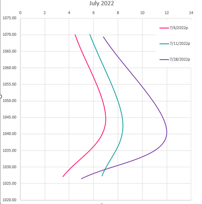
What I am trying to do is build a vertical line graph of a vertical profile of a lake. The data sets are different by day of sampling the lake so for a month there will be several lines graphed from the data sets.
Below is the example produced with an with Excel. the chart I used in excel is the scattere chart with lines. I can't seem to find the exact replica in Power BI
| Sample ID | Date | Elevation (M) | TP results (ppb) |
| top | 07/06/2022 | 1070 | 3.65 |
| mid | 07/06/2022 | 1043 | 4.5 |
| bottom | 07/06/2022 | 1027 | 3.5 |
| top | 07/11/2022 | 1070 | 2.5 |
| mid | 07/11/2022 | 1043 | 2 |
| bottom | 07/11/2022 | 1027 | 2.7 |
| top | 07/28/2022 | 1070 | 4.1 |
| mid | 07/28/2022 | 1043 | 3.7 |
| bottom | 07/28/2022 | 1027 | 4 |
- Mark as New
- Bookmark
- Subscribe
- Mute
- Subscribe to RSS Feed
- Permalink
- Report Inappropriate Content
Hi , @lwblee Based on the line chart effect provided by your sample data and implemented in Excel, I tested it on the official line chart provided by Power BI, and I found that if you place a non-date type on the X-axis of the line chart, you cannot successfully connect the scatter points in the line chart, and you cannot adjust various format settings.
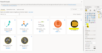
After searching in custom visual, I found that you can try this custom visual: "Charturo Interactive Line Chart"
According to the custom visual description and the example image, it at least supports the X and Y axes in the line chart, which matches the example image you provided, so you can try it first:
Thank you for your time and sharing, and thank you for your support and understanding of PowerBI!
Best Regards,
Aniya Zhang
If this post helps, then please consider Accept it as the solution to help the other members find it more quickly
- Mark as New
- Bookmark
- Subscribe
- Mute
- Subscribe to RSS Feed
- Permalink
- Report Inappropriate Content
Thank you for the help, however I still cannot get that visual to work ask you had worked out. I tried to play around with it too and it is not working still.
Helpful resources

Power BI Dataviz World Championships
The Power BI Data Visualization World Championships is back! Get ahead of the game and start preparing now!

| User | Count |
|---|---|
| 40 | |
| 39 | |
| 34 | |
| 29 | |
| 24 |
| User | Count |
|---|---|
| 122 | |
| 111 | |
| 83 | |
| 69 | |
| 68 |


