Join us at the 2025 Microsoft Fabric Community Conference
Microsoft Fabric Community Conference 2025, March 31 - April 2, Las Vegas, Nevada. Use code MSCUST for a $150 discount.
Register now- Power BI forums
- Get Help with Power BI
- Desktop
- Service
- Report Server
- Power Query
- Mobile Apps
- Developer
- DAX Commands and Tips
- Custom Visuals Development Discussion
- Health and Life Sciences
- Power BI Spanish forums
- Translated Spanish Desktop
- Training and Consulting
- Instructor Led Training
- Dashboard in a Day for Women, by Women
- Galleries
- Webinars and Video Gallery
- Data Stories Gallery
- Themes Gallery
- Contests Gallery
- Quick Measures Gallery
- R Script Showcase
- COVID-19 Data Stories Gallery
- Community Connections & How-To Videos
- 2021 MSBizAppsSummit Gallery
- 2020 MSBizAppsSummit Gallery
- 2019 MSBizAppsSummit Gallery
- Events
- Ideas
- Custom Visuals Ideas
- Issues
- Issues
- Events
- Upcoming Events
The Power BI DataViz World Championships are on! With four chances to enter, you could win a spot in the LIVE Grand Finale in Las Vegas. Show off your skills.
- Power BI forums
- Forums
- Get Help with Power BI
- Desktop
- Re: Trend Lines
- Subscribe to RSS Feed
- Mark Topic as New
- Mark Topic as Read
- Float this Topic for Current User
- Bookmark
- Subscribe
- Printer Friendly Page
- Mark as New
- Bookmark
- Subscribe
- Mute
- Subscribe to RSS Feed
- Permalink
- Report Inappropriate Content
Trend Lines
Is it possible to add trendlines to a scatter graph, like you can in Excel.
One example would be adding a linear trendline and being able to see the equation to get correlation coefficients.
Another example would just be to add a linear/exponential etc. trendline to a time series graph, giving the ability to project forward in time.
Thanks
Benj
- Mark as New
- Bookmark
- Subscribe
- Mute
- Subscribe to RSS Feed
- Permalink
- Report Inappropriate Content
Hello all
If we want to have a trendline on categorical view, than we should start voting more on below idea.
Thanks
- Mark as New
- Bookmark
- Subscribe
- Mute
- Subscribe to RSS Feed
- Permalink
- Report Inappropriate Content
Hello Benj,
I have the same need about trend lines equations.
Did you get any responses since ?
Maybe is there a DAX formula which could heps us ?
Best regards
- Mark as New
- Bookmark
- Subscribe
- Mute
- Subscribe to RSS Feed
- Permalink
- Report Inappropriate Content
Currently, as of version 2.47.4766.801 64-bit June,2017 (and perhaps before), you can use a Date field, but NOT a Date Hierarchy to display trend lines.
You change this by:
1. Changing the 'Modeling'/'Data type' on your field to 'Date' in the 'Data' area (far left)
2. In 'Report' area (far left), select the object which needs to have the trend line
3. Add the Date as the Shared Axis (if using Line and Clustered Column Chart)
4. In the 'Fields' for the object, click the down arrow next to your Date shared axis
5. Select the field's name, and NOT Date Heirarchy
6. Click 'Analytics' and 'Trend Line' is suddenly available
- Mark as New
- Bookmark
- Subscribe
- Mute
- Subscribe to RSS Feed
- Permalink
- Report Inappropriate Content
Oddly PowerBIs auto generated insights has this in its visuals but I can find no way of doing this with your own data. Am I doing something wrong?
- Mark as New
- Bookmark
- Subscribe
- Mute
- Subscribe to RSS Feed
- Permalink
- Report Inappropriate Content
Guys,
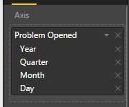
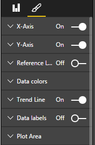
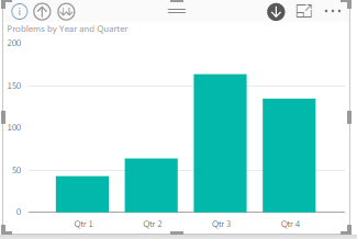
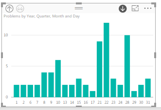
I am new to power bi and having an issue with Trend Lines. I have a dataset that has a date column and covers about 3 years of data. When I create a Clustered Column chart using the date the first visualization shows 3 columns one for each year where you can click each to drilldown if you want to month, etc. My issue is when viewing the initial chart with years I have the Trend Line option and can turn it on but when I drill down to the Month level it goes away....I really want it at the month level so tried removing Year and quarter from the Date Hierarchy so only Month is left but in this configuration I don't even have the trend as an option.
Please let me know what am I doing wrong?
- Mark as New
- Bookmark
- Subscribe
- Mute
- Subscribe to RSS Feed
- Permalink
- Report Inappropriate Content
@phillip786 as noted earlier in this thread, the x-axis must be a numeric value for trend lines to work currently. Month name is text.
Did I answer your question? Mark my post as a solution!
Proud to be a Super User!
- Mark as New
- Bookmark
- Subscribe
- Mute
- Subscribe to RSS Feed
- Permalink
- Report Inappropriate Content
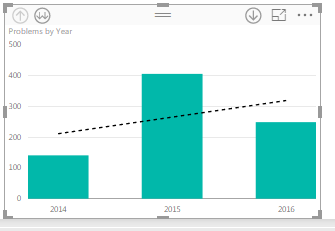
Thanks for the reply...so you say that on the chart itself the category being a date type but displaying a month name which it does automatically it can't trend across that? Seems like you are saying that once I drilldown from Years I have to have the months displayed as 1,2,3,4,etc... makes no sense because if you then drilldown to days which are 1 - 30 it stil doesn't work.
I am not using a lookup that has month names in it it is just a Date column that automatically gets the date hierarchy see below how it disappears:

- Mark as New
- Bookmark
- Subscribe
- Mute
- Subscribe to RSS Feed
- Permalink
- Report Inappropriate Content
you can use trend line on quarter level just with Quarter number.
- Mark as New
- Bookmark
- Subscribe
- Mute
- Subscribe to RSS Feed
- Permalink
- Report Inappropriate Content
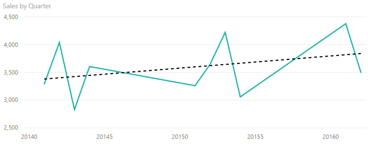
@Anonymous sure technically you can but it's ugly at best, and worthless if you're looking at more than one year. You have to set the x-axis to "continuous" for trendlines to work, so the chart will only show auto-generated increments on that axis rather than the actual quarters.
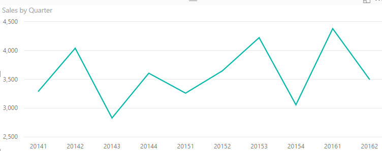
As you can see, Acme Inc. was doing really well in Quarter Zero of 2016, a major improvement over the nosedive they took in Quarter Five of 2015.
Not to mention how bad it would look even if you could see the individual quarters labeled on the x-axis.
If I labeled quarters like that in a report that my execs have to show to other people, they would start wondering what they pay me for. But labeling it this way disables the trendline feature anyway, so fortunately it isn't even an option.
Good thing there are ways of manually calculating trendlines, because this feature is still mostly useless.
Did I answer your question? Mark my post as a solution!
Proud to be a Super User!
- Mark as New
- Bookmark
- Subscribe
- Mute
- Subscribe to RSS Feed
- Permalink
- Report Inappropriate Content
@KHorseman yes, I know is ugly and that it cannot be used as something that you can show to top management. And as well as all the facts that you have described below.
I've just wanted to show that Quarters (as numbers) is working and with quarter labels as we all know it is not working. Because of this issue our customer will not use Power BI vizualization, but Excel chart.
I am looking forward to solution of the issue.
- Mark as New
- Bookmark
- Subscribe
- Mute
- Subscribe to RSS Feed
- Permalink
- Report Inappropriate Content
@Anonymous yeah I didn't mean to just turn my nose up at your idea. It's just frustrating because your suggestion highlights the fact that trendlines are a functional feature, but they are only half-implemented. Sometimes I'd rather the developers wait a little longer and release a more finished feature.
Did I answer your question? Mark my post as a solution!
Proud to be a Super User!
- Mark as New
- Bookmark
- Subscribe
- Mute
- Subscribe to RSS Feed
- Permalink
- Report Inappropriate Content
@KHorseman - There have been some significant changes to the analytics in the August update, you might want to check again. Although you still need the X-Axis to be set to Continuous and not Categorical.
Can you just turn off the X-Axis and label it with text boxes the way that you want it to look? Something else to think about, you could pick a date for each quarter and have a calculated column to assign that date, so Q1 2015 could be 1/1/2016, Q2 could be 1/2/2016 and so on. Create your line chart using that date as your X-Axis. Now you can set it to continuous. Turn off the X-Axis so that it doesn't display. Create the labels that you want with text boxes.
Follow on LinkedIn
@ me in replies or I'll lose your thread!!!
Instead of a Kudo, please vote for this idea
Become an expert!: Enterprise DNA
External Tools: MSHGQM
YouTube Channel!: Microsoft Hates Greg
Latest book!: Power BI Cookbook Third Edition (Color)
DAX is easy, CALCULATE makes DAX hard...
- Mark as New
- Bookmark
- Subscribe
- Mute
- Subscribe to RSS Feed
- Permalink
- Report Inappropriate Content
@Greg_Deckler text boxes could work for some cases, but they wouldn't help if you needed drilldown on a date hierarchy, and even if not you would still need to go in every quarter and rearrange the chart to add a new text box. But as a short-term solution it's not bad. Anyway my end users are picky about the height of tiles in their dashboards; labeling quarters in some style other than "Q1 2015" will definitely be met with "The report is fine. Fix the quarterly chart and we'll start using it."
As for the August update, I gather you're talking about the new Analytics Pane? Looks cool. It all seems to work even on a text axis, so that's progress. No trend option though. I just gave it a quick look though, so maybe I missed something. I'll have to check it out in more detail next week. I haven't had much of a chance to play around lately. I'm getting buried alive by this monster data model that they keep radically changing the requirements on. The relationship window is starting to look like a plate of spaghetti and it takes three minutes just to add a new measure. I'm scrapping it completely and starting over clean today. Oh look, the August update has auto-recovery. I could have used that a couple of days ago...
Did I answer your question? Mark my post as a solution!
Proud to be a Super User!
- Mark as New
- Bookmark
- Subscribe
- Mute
- Subscribe to RSS Feed
- Permalink
- Report Inappropriate Content
No problem, we're all crazy busy it seems. The trend line is there in the Analytics pane, but it only shows up if the x-axis is set to Continuous, sort of like before. And I completely agree that a hack of a solution is really no solution at all!!
Follow on LinkedIn
@ me in replies or I'll lose your thread!!!
Instead of a Kudo, please vote for this idea
Become an expert!: Enterprise DNA
External Tools: MSHGQM
YouTube Channel!: Microsoft Hates Greg
Latest book!: Power BI Cookbook Third Edition (Color)
DAX is easy, CALCULATE makes DAX hard...
- Mark as New
- Bookmark
- Subscribe
- Mute
- Subscribe to RSS Feed
- Permalink
- Report Inappropriate Content
@phillip786 trend lines won't work below a text level in a hierarchy either. It will only work at the top level if the top level is a numeric value, and if any level below that is not a numeric value it will stop working for that level and all below it. It's pretty much all or nothing. You can't use the default hierarchy for dates; I suppose you'd have to construct your own fully numeric hierarchy. Hopefully this will be remedied in the future but for now that's how it is.
Did I answer your question? Mark my post as a solution!
Proud to be a Super User!
- Mark as New
- Bookmark
- Subscribe
- Mute
- Subscribe to RSS Feed
- Permalink
- Report Inappropriate Content
@KHorseman Thanks for the info, I got it to work by creating a new measure that was just the =Month() of the date column and used that in my trend by month chart. I hope they get this fixed or be able to have a Value/Label pair so we can have Month names while still keeping the trend line.
- Mark as New
- Bookmark
- Subscribe
- Mute
- Subscribe to RSS Feed
- Permalink
- Report Inappropriate Content
@phillip786 as far as I can tell the current trend lines are just the initial implementation, not the complete support they eventually plan. Seems to be the pattern with Power BI development: they release a feature as soon as the minimum usable version of it is ready rather than waiting until they have a more finished product. It's good because new features show up relatively quickly and we can provide feedback earlier in the development process, but bad because now I have a program full of half-features that I want but can't use yet.
Did I answer your question? Mark my post as a solution!
Proud to be a Super User!
- Mark as New
- Bookmark
- Subscribe
- Mute
- Subscribe to RSS Feed
- Permalink
- Report Inappropriate Content
I am not aware of that capability, you can check out the custom visual gallery or check Ideas section.
Follow on LinkedIn
@ me in replies or I'll lose your thread!!!
Instead of a Kudo, please vote for this idea
Become an expert!: Enterprise DNA
External Tools: MSHGQM
YouTube Channel!: Microsoft Hates Greg
Latest book!: Power BI Cookbook Third Edition (Color)
DAX is easy, CALCULATE makes DAX hard...
- Mark as New
- Bookmark
- Subscribe
- Mute
- Subscribe to RSS Feed
- Permalink
- Report Inappropriate Content
included in the latest awesomness: https://powerbi.microsoft.com/en-us/blog/power-bi-desktop-april-update-feature-summary/
Imke Feldmann (The BIccountant)
If you liked my solution, please give it a thumbs up. And if I did answer your question, please mark this post as a solution. Thanks!
How to integrate M-code into your solution -- How to get your questions answered quickly -- How to provide sample data -- Check out more PBI- learning resources here -- Performance Tipps for M-queries
- Mark as New
- Bookmark
- Subscribe
- Mute
- Subscribe to RSS Feed
- Permalink
- Report Inappropriate Content
Nice one @ImkeF, I just found that today and was planning on updating my oh-so-dated knowledge!
Follow on LinkedIn
@ me in replies or I'll lose your thread!!!
Instead of a Kudo, please vote for this idea
Become an expert!: Enterprise DNA
External Tools: MSHGQM
YouTube Channel!: Microsoft Hates Greg
Latest book!: Power BI Cookbook Third Edition (Color)
DAX is easy, CALCULATE makes DAX hard...
Helpful resources
| User | Count |
|---|---|
| 121 | |
| 72 | |
| 71 | |
| 57 | |
| 50 |
| User | Count |
|---|---|
| 167 | |
| 83 | |
| 68 | |
| 65 | |
| 55 |
