Join us at FabCon Vienna from September 15-18, 2025
The ultimate Fabric, Power BI, SQL, and AI community-led learning event. Save €200 with code FABCOMM.
Get registered- Power BI forums
- Get Help with Power BI
- Desktop
- Service
- Report Server
- Power Query
- Mobile Apps
- Developer
- DAX Commands and Tips
- Custom Visuals Development Discussion
- Health and Life Sciences
- Power BI Spanish forums
- Translated Spanish Desktop
- Training and Consulting
- Instructor Led Training
- Dashboard in a Day for Women, by Women
- Galleries
- Data Stories Gallery
- Themes Gallery
- Contests Gallery
- Quick Measures Gallery
- Notebook Gallery
- Translytical Task Flow Gallery
- TMDL Gallery
- R Script Showcase
- Webinars and Video Gallery
- Ideas
- Custom Visuals Ideas (read-only)
- Issues
- Issues
- Events
- Upcoming Events
Enhance your career with this limited time 50% discount on Fabric and Power BI exams. Ends September 15. Request your voucher.
- Power BI forums
- Forums
- Get Help with Power BI
- Desktop
- Transfer excel text formats such symbols, conditio...
- Subscribe to RSS Feed
- Mark Topic as New
- Mark Topic as Read
- Float this Topic for Current User
- Bookmark
- Subscribe
- Printer Friendly Page
- Mark as New
- Bookmark
- Subscribe
- Mute
- Subscribe to RSS Feed
- Permalink
- Report Inappropriate Content
Transfer excel text formats such symbols, conditional colors into Power BI matrix
Hi all,
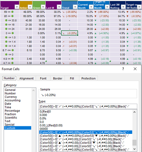
How can I maintain these format such symbols, conditional colors,,
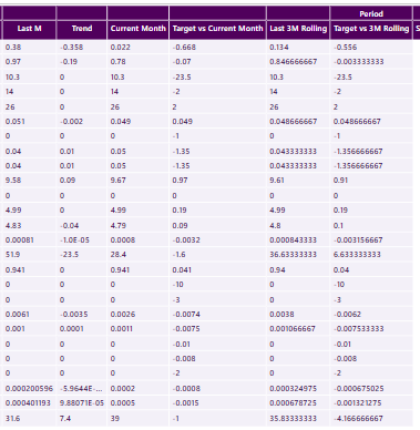
when I fetch them to Power BI, the symbols and colors gone as it is only in excel formats,,
fyi, it has 2 types of KPI, one is the higher the better(0<gap=green),
the other ones the lower the better(0>gap=green)
1. So how can I make new colums or measure DAX for this?
and really would like to maintain bracket "( )" to differenciate to parent values as it is a gap value.
2. Or if there's any way capture excel screena and just display it on PBI?
Please help me on this this will be very appreciated 🙂
In excel
In PBI
P.S can we change the color of these arrows? like Green and Red? there's no choice for colors...
- Mark as New
- Bookmark
- Subscribe
- Mute
- Subscribe to RSS Feed
- Permalink
- Report Inappropriate Content
@jeongkim , you have to format the number,
refer
https://learn.microsoft.com/en-us/power-bi/create-reports/desktop-custom-format-strings
For conditional formatting
How to do conditional formatting by measure and apply it on pie?
https://www.youtube.com/watch?v=RqBb5eBf_I4&list=PLPaNVDMhUXGYo50Ajmr4SgSV9HIQLxc8L
https://community.powerbi.com/t5/Community-Blog/Power-BI-Conditional-formatting-the-Pie-Visual/ba-p/...
https://amitchandak.medium.com/power-bi-where-is-the-conditional-formatting-option-in-new-format-pan...
Helpful resources
| User | Count |
|---|---|
| 59 | |
| 55 | |
| 53 | |
| 49 | |
| 30 |
| User | Count |
|---|---|
| 177 | |
| 88 | |
| 70 | |
| 48 | |
| 48 |


