Join us at FabCon Vienna from September 15-18, 2025
The ultimate Fabric, Power BI, SQL, and AI community-led learning event. Save €200 with code FABCOMM.
Get registered- Power BI forums
- Get Help with Power BI
- Desktop
- Service
- Report Server
- Power Query
- Mobile Apps
- Developer
- DAX Commands and Tips
- Custom Visuals Development Discussion
- Health and Life Sciences
- Power BI Spanish forums
- Translated Spanish Desktop
- Training and Consulting
- Instructor Led Training
- Dashboard in a Day for Women, by Women
- Galleries
- Data Stories Gallery
- Themes Gallery
- Contests Gallery
- Quick Measures Gallery
- Notebook Gallery
- Translytical Task Flow Gallery
- TMDL Gallery
- R Script Showcase
- Webinars and Video Gallery
- Ideas
- Custom Visuals Ideas (read-only)
- Issues
- Issues
- Events
- Upcoming Events
Compete to become Power BI Data Viz World Champion! First round ends August 18th. Get started.
- Power BI forums
- Forums
- Get Help with Power BI
- Desktop
- Timeline Storyteller not interpreting dates correc...
- Subscribe to RSS Feed
- Mark Topic as New
- Mark Topic as Read
- Float this Topic for Current User
- Bookmark
- Subscribe
- Printer Friendly Page
- Mark as New
- Bookmark
- Subscribe
- Mute
- Subscribe to RSS Feed
- Permalink
- Report Inappropriate Content
Timeline Storyteller not interpreting dates correctly
Hello all,
I'm having a problem getting Timeline Storyteller to interpret/display my start and end dates correctly.
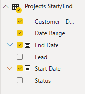
I have the following fields in use:
In the query editor, the Start Date and End Date fields are formatted as Date:
In the visualization fields list, the date fields are NOT designated as "Date Hierarchy":
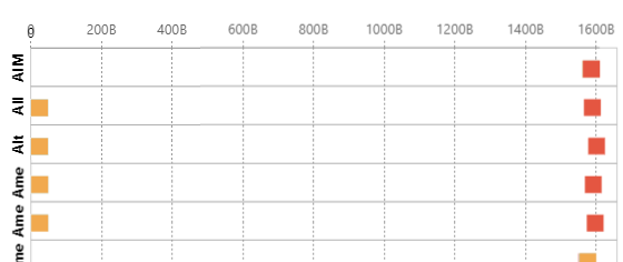
The problem is that Timeline Storyteller formats the X-axis incorrectly, with this strange Zero-to-1600B range:
Any suggestions as to how to get Timeline Storyteller to format the X-axis correctly with regard to these Start and End Dates?
Thanks for any help!
Joseph
- Mark as New
- Bookmark
- Subscribe
- Mute
- Subscribe to RSS Feed
- Permalink
- Report Inappropriate Content
In case of date hierarchy is not created refer : https://community.powerbi.com/t5/Desktop/Date-Hierarchy-Not-Available/m-p/490683
I do see the option on right-click for date hierarchy, try that.
It is better to create a calendar table and join it with your dates. and you can choose the date you want using use relation.
Example :HR-Analytics-Active-Employee-Hire-and-Termination-trend
To get the best of the time intelligence function. Make sure you have a date calendar and it has been marked as the date in model view. Also, join it with the date column of your fact/s.
Refer
https://radacad.com/creating-calendar-table-in-power-bi-using-dax-functions
https://www.archerpoint.com/blog/Posts/creating-date-table-power-bi
https://www.sqlbi.com/articles/creating-a-simple-date-table-in-dax/
Appreciate your Kudos. In case, this is the solution you are looking for, mark it as the Solution. In case it does not help, please provide additional information and mark me with @
Thanks. My Recent Blog -
Winner-Topper-on-Map-How-to-Color-States-on-a-Map-with-Winners , HR-Analytics-Active-Employee-Hire-and-Termination-trend
Power-BI-Working-with-Non-Standard-Time-Periods And Comparing-Data-Across-Date-Ranges
Connect on Linkedin


