FabCon is coming to Atlanta
Join us at FabCon Atlanta from March 16 - 20, 2026, for the ultimate Fabric, Power BI, AI and SQL community-led event. Save $200 with code FABCOMM.
Register now!- Power BI forums
- Get Help with Power BI
- Desktop
- Service
- Report Server
- Power Query
- Mobile Apps
- Developer
- DAX Commands and Tips
- Custom Visuals Development Discussion
- Health and Life Sciences
- Power BI Spanish forums
- Translated Spanish Desktop
- Training and Consulting
- Instructor Led Training
- Dashboard in a Day for Women, by Women
- Galleries
- Data Stories Gallery
- Themes Gallery
- Contests Gallery
- QuickViz Gallery
- Quick Measures Gallery
- Visual Calculations Gallery
- Notebook Gallery
- Translytical Task Flow Gallery
- TMDL Gallery
- R Script Showcase
- Webinars and Video Gallery
- Ideas
- Custom Visuals Ideas (read-only)
- Issues
- Issues
- Events
- Upcoming Events
The Power BI Data Visualization World Championships is back! Get ahead of the game and start preparing now! Learn more
- Power BI forums
- Forums
- Get Help with Power BI
- Desktop
- Timeline/Schedule Milestone Comparison
- Subscribe to RSS Feed
- Mark Topic as New
- Mark Topic as Read
- Float this Topic for Current User
- Bookmark
- Subscribe
- Printer Friendly Page
- Mark as New
- Bookmark
- Subscribe
- Mute
- Subscribe to RSS Feed
- Permalink
- Report Inappropriate Content
Timeline/Schedule Milestone Comparison
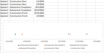
Hello community, Power BI novice here, hoping to get some help creating a timeline style visual. I am trying to create a visualization that illustrates date shift on major milestones from a construction schedule. I've trid using the Microsoft Gantt chart visualization, Timeline Basic, & Craydec Timelines. I also tried creating a scatter plot but couldn't quite get that to work either. Ideally I'd like to be able to customize the markers or at least colors.
Any tips, third party visualizations, or tutorial links would be helpful. Thanks much!
This is a simplified version of what I'm looking for created in Excel using a scatter plot.
Solved! Go to Solution.
- Mark as New
- Bookmark
- Subscribe
- Mute
- Subscribe to RSS Feed
- Permalink
- Report Inappropriate Content
Hi @CCI_Dev
Based on your description, i create a visual use scatter plot in Power BI, you can refer it.
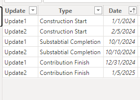
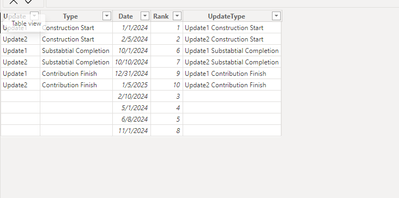
Sample data
1.Create two calculated columns in table.
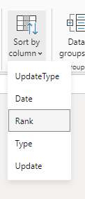
Rank = RANKX('Table',[Date],,ASC)UpdateType = [Update]&" "&[Type]
Then select the UpdateType column and select sort by rank column
2.Create a measure
Measure = 1
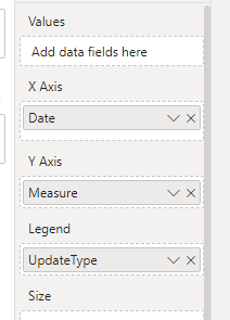
Then put the date to x-axis, put the measure to y-axis, and put the UpdateType column to legend.
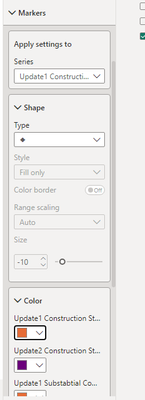
Then you can set the mark in properities.
Output
Best Regards!
Yolo Zhu
If this post helps, then please consider Accept it as the solution to help the other members find it more quickly.
- Mark as New
- Bookmark
- Subscribe
- Mute
- Subscribe to RSS Feed
- Permalink
- Report Inappropriate Content
Hi @CCI_Dev
If you want to achieve this, you can create the following field that the update field is blank, but the date field is not, you can refer to the following picture.
Then modifty the measure to the following
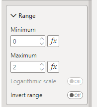
Measure = IF(MAX('Table'[Update])=BLANK(),-1,1)Then set the min and max value of the y-axis.
Output
Best Regards!
Yolo Zhu
If this post helps, then please consider Accept it as the solution to help the other members find it more quickly.
- Mark as New
- Bookmark
- Subscribe
- Mute
- Subscribe to RSS Feed
- Permalink
- Report Inappropriate Content
Thank you so much for your expertise!
- Mark as New
- Bookmark
- Subscribe
- Mute
- Subscribe to RSS Feed
- Permalink
- Report Inappropriate Content
Thank you Yolo! That is exactly what I'm looking for. The only thing would be I need the dates to plot relatively, not evenly spaced out. Is that an option?
- Mark as New
- Bookmark
- Subscribe
- Mute
- Subscribe to RSS Feed
- Permalink
- Report Inappropriate Content
Hi @CCI_Dev
If you want to achieve this, you can create the following field that the update field is blank, but the date field is not, you can refer to the following picture.
Then modifty the measure to the following
Measure = IF(MAX('Table'[Update])=BLANK(),-1,1)Then set the min and max value of the y-axis.
Output
Best Regards!
Yolo Zhu
If this post helps, then please consider Accept it as the solution to help the other members find it more quickly.
- Mark as New
- Bookmark
- Subscribe
- Mute
- Subscribe to RSS Feed
- Permalink
- Report Inappropriate Content
Hi @CCI_Dev
Based on your description, i create a visual use scatter plot in Power BI, you can refer it.
Sample data
1.Create two calculated columns in table.
Rank = RANKX('Table',[Date],,ASC)UpdateType = [Update]&" "&[Type]
Then select the UpdateType column and select sort by rank column
2.Create a measure
Measure = 1
Then put the date to x-axis, put the measure to y-axis, and put the UpdateType column to legend.
Then you can set the mark in properities.
Output
Best Regards!
Yolo Zhu
If this post helps, then please consider Accept it as the solution to help the other members find it more quickly.
Helpful resources

Power BI Dataviz World Championships
The Power BI Data Visualization World Championships is back! Get ahead of the game and start preparing now!

| User | Count |
|---|---|
| 38 | |
| 36 | |
| 33 | |
| 32 | |
| 28 |
| User | Count |
|---|---|
| 129 | |
| 88 | |
| 79 | |
| 68 | |
| 63 |
