FabCon is coming to Atlanta
Join us at FabCon Atlanta from March 16 - 20, 2026, for the ultimate Fabric, Power BI, AI and SQL community-led event. Save $200 with code FABCOMM.
Register now!- Power BI forums
- Get Help with Power BI
- Desktop
- Service
- Report Server
- Power Query
- Mobile Apps
- Developer
- DAX Commands and Tips
- Custom Visuals Development Discussion
- Health and Life Sciences
- Power BI Spanish forums
- Translated Spanish Desktop
- Training and Consulting
- Instructor Led Training
- Dashboard in a Day for Women, by Women
- Galleries
- Data Stories Gallery
- Themes Gallery
- Contests Gallery
- QuickViz Gallery
- Quick Measures Gallery
- Visual Calculations Gallery
- Notebook Gallery
- Translytical Task Flow Gallery
- TMDL Gallery
- R Script Showcase
- Webinars and Video Gallery
- Ideas
- Custom Visuals Ideas (read-only)
- Issues
- Issues
- Events
- Upcoming Events
The Power BI Data Visualization World Championships is back! Get ahead of the game and start preparing now! Learn more
- Power BI forums
- Forums
- Get Help with Power BI
- Desktop
- Time on Y-Axis
- Subscribe to RSS Feed
- Mark Topic as New
- Mark Topic as Read
- Float this Topic for Current User
- Bookmark
- Subscribe
- Printer Friendly Page
- Mark as New
- Bookmark
- Subscribe
- Mute
- Subscribe to RSS Feed
- Permalink
- Report Inappropriate Content
Time on Y-Axis
Thought I would show a simple solution for adding time format to Y-Axis of charts as I couldn't find a solution for this -
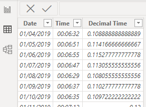
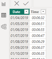
starting with a simple dataset below - (time is in time format HH:MM:SS)
Step 1 -
Add a new column turning time into a decimal in hours e.g. 01:30:00 = 1.5 hours
using formula -


Step 5 -
Add HH:MM:SS measure into Y-Axis of chart and Date column into X-Axis.
Step 6 -
Change Y-Axis display units to None as in the below -

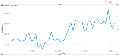
The result should be something similar to the below -

Also works with bar charts. Hope this helps anyone struggling with getting time on the Y-Axis.
- Mark as New
- Bookmark
- Subscribe
- Mute
- Subscribe to RSS Feed
- Permalink
- Report Inappropriate Content
Hi @RobertDosek. I usually create a second measure and use FORMAT to show the time as mm:ss. This doesnt work in a chart because its essentially a text value, but you can put it in a table, matrix or card visual and use it as a tooltip on the chart.
- Mark as New
- Bookmark
- Subscribe
- Mute
- Subscribe to RSS Feed
- Permalink
- Report Inappropriate Content
Great find! However, the axis isn't quite correct if I apply this solution, as it treats the time as integers it doesn't "stop" at 60, but goes through to 100. For example: a time of 00:18:54 is plotted about halfway between 18 and 19, while it should be very close to the 19 min line.
After trying out several things including dynamic format string, I still find myself reverting back to using minutes as a decimal number on the axis, and creating a custom tooltip that shows the correctly formatted time.
Very annoying that PowerBi doesn't offer a better solution for this. Please vote for the idea below if you're also looking for this!
- Mark as New
- Bookmark
- Subscribe
- Mute
- Subscribe to RSS Feed
- Permalink
- Report Inappropriate Content
Hello, I agree... What do you mean by "creating a custom tooltip that shows the correctly formatted time"?
Thanks
Helpful resources

Power BI Dataviz World Championships
The Power BI Data Visualization World Championships is back! Get ahead of the game and start preparing now!

| User | Count |
|---|---|
| 39 | |
| 38 | |
| 38 | |
| 28 | |
| 27 |
| User | Count |
|---|---|
| 124 | |
| 88 | |
| 73 | |
| 66 | |
| 65 |


