Join us at FabCon Vienna from September 15-18, 2025
The ultimate Fabric, Power BI, SQL, and AI community-led learning event. Save €200 with code FABCOMM.
Get registered- Power BI forums
- Get Help with Power BI
- Desktop
- Service
- Report Server
- Power Query
- Mobile Apps
- Developer
- DAX Commands and Tips
- Custom Visuals Development Discussion
- Health and Life Sciences
- Power BI Spanish forums
- Translated Spanish Desktop
- Training and Consulting
- Instructor Led Training
- Dashboard in a Day for Women, by Women
- Galleries
- Data Stories Gallery
- Themes Gallery
- Contests Gallery
- Quick Measures Gallery
- Notebook Gallery
- Translytical Task Flow Gallery
- TMDL Gallery
- R Script Showcase
- Webinars and Video Gallery
- Ideas
- Custom Visuals Ideas (read-only)
- Issues
- Issues
- Events
- Upcoming Events
Enhance your career with this limited time 50% discount on Fabric and Power BI exams. Ends September 15. Request your voucher.
- Power BI forums
- Forums
- Get Help with Power BI
- Desktop
- Time/hours dimension table not working
- Subscribe to RSS Feed
- Mark Topic as New
- Mark Topic as Read
- Float this Topic for Current User
- Bookmark
- Subscribe
- Printer Friendly Page
- Mark as New
- Bookmark
- Subscribe
- Mute
- Subscribe to RSS Feed
- Permalink
- Report Inappropriate Content
Time/hours dimension table not working
Hi experts,
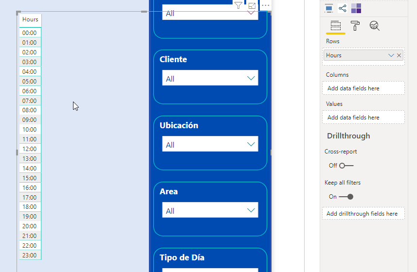
I am preparing a dashboard for controlling car park operations. I would like to put in a matrix visual that has hours (00:00 - 23:00) on the vertical axxis and Days on the horizontal one. That way I can create a kind of heatmap with repsect to (un)popular times.
I have created a time dim table (00:00 - 23:00) formatted HH:mm) that is linked to my fact table that also has a column where i converted the entry times into full hours by rounding down. That way i get a 1:many relationsship with a cross filter direction "both" (I have tried "Single" too without success.
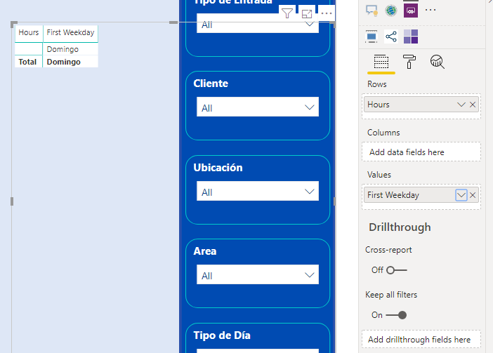
My issue is that once I put data from my fact table into the matrix, the vertical axis with the hours disapppears. I have added a few screenshots below.
I am sure something is off with the relationships.
Thanks a lot!
Regards, Sven
- Mark as New
- Bookmark
- Subscribe
- Mute
- Subscribe to RSS Feed
- Permalink
- Report Inappropriate Content
Hi @SvenP ,
What is First Weekday in your second screenshot, a measure?
Better to share your pbix to us if you don't have any Confidential Information.
Best Regards,
Jay
Community Support Team _ Jay Wang
If this post helps, then please consider Accept it as the solution to help the other members find it more quickly.
- Mark as New
- Bookmark
- Subscribe
- Mute
- Subscribe to RSS Feed
- Permalink
- Report Inappropriate Content
THanks for your response @Anonymous !
Unfortunately, I cannot share the data for confidentiality reasons.
The "First Weekday" is just a column from my dataset that shows the weekday of a record. So it is not a measure.


