Join us at the 2025 Microsoft Fabric Community Conference
March 31 - April 2, 2025, in Las Vegas, Nevada. Use code MSCUST for a $150 discount! Early bird discount ends December 31.
Register Now- Power BI forums
- Get Help with Power BI
- Desktop
- Service
- Report Server
- Power Query
- Mobile Apps
- Developer
- DAX Commands and Tips
- Custom Visuals Development Discussion
- Health and Life Sciences
- Power BI Spanish forums
- Translated Spanish Desktop
- Training and Consulting
- Instructor Led Training
- Dashboard in a Day for Women, by Women
- Galleries
- Community Connections & How-To Videos
- COVID-19 Data Stories Gallery
- Themes Gallery
- Data Stories Gallery
- R Script Showcase
- Webinars and Video Gallery
- Quick Measures Gallery
- 2021 MSBizAppsSummit Gallery
- 2020 MSBizAppsSummit Gallery
- 2019 MSBizAppsSummit Gallery
- Events
- Ideas
- Custom Visuals Ideas
- Issues
- Issues
- Events
- Upcoming Events
Be one of the first to start using Fabric Databases. View on-demand sessions with database experts and the Microsoft product team to learn just how easy it is to get started. Watch now
- Power BI forums
- Forums
- Get Help with Power BI
- Desktop
- Re: Time-Series Line chart multi-year grouping (Up...
- Subscribe to RSS Feed
- Mark Topic as New
- Mark Topic as Read
- Float this Topic for Current User
- Bookmark
- Subscribe
- Printer Friendly Page
- Mark as New
- Bookmark
- Subscribe
- Mute
- Subscribe to RSS Feed
- Permalink
- Report Inappropriate Content
Time-Series Line chart multi-year grouping (Updated)
I'll preface this with I'm still learning Power BI so this may be one of those issues that you've seen a million times. I hope so because it's bugging me.
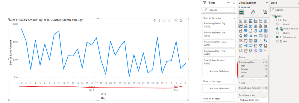
The situation is that I have multi-year data, let's say 2018, 2019, and 2020 and it's at a daily granularity. I put the date in the x-axis of the line chart. The date is formated as a date and it has the hierarchy. I put the Total Sales on the y-axis.
When I drill down to month level it shows the sum of all sales in January, February, etc adding together all the years for that month instead of showing monthly datapoints from starting in 2018 and ending in 2020.
Same thing happens when I drill down to Day. My x-axis goes from 1 to 31 instead of giving me a daily totals spanning the three years. **Data at Bottom**
What am I missing?
I appreciate any help on this. I couldn't think of a good way to Google it
| Year | Quarter | Month | Day | Sales Amount |
| 2018 | Qtr 1 | March | 1 | $186.75 |
| 2018 | Qtr 1 | March | 2 | $153.13 |
| 2018 | Qtr 1 | March | 3 | $72.86 |
| 2018 | Qtr 1 | March | 4 | $154.97 |
| 2018 | Qtr 1 | March | 5 | $83.64 |
| 2018 | Qtr 1 | March | 6 | $144.19 |
| 2018 | Qtr 1 | March | 7 | $99.87 |
| 2018 | Qtr 1 | March | 8 | $171.03 |
| 2018 | Qtr 1 | March | 9 | $180.55 |
| 2018 | Qtr 1 | March | 10 | $73.33 |
| 2018 | Qtr 1 | March | 11 | $111.19 |
| 2018 | Qtr 1 | March | 12 | $110.37 |
| 2018 | Qtr 1 | March | 13 | $130.29 |
| 2018 | Qtr 1 | March | 14 | $76.29 |
| 2018 | Qtr 1 | March | 15 | $149.85 |
| 2018 | Qtr 1 | March | 16 | $140.71 |
| 2018 | Qtr 1 | March | 17 | $161.84 |
| 2018 | Qtr 1 | March | 18 | $98.14 |
| 2018 | Qtr 1 | March | 19 | $58.54 |
| 2018 | Qtr 1 | March | 20 | $152.28 |
| 2018 | Qtr 1 | March | 21 | $112.55 |
| 2018 | Qtr 1 | March | 22 | $135.49 |
| 2018 | Qtr 1 | March | 23 | $152.94 |
| 2018 | Qtr 1 | March | 24 | $51.80 |
| 2018 | Qtr 1 | March | 25 | $114.37 |
| 2018 | Qtr 1 | March | 26 | $67.47 |
| 2018 | Qtr 1 | March | 27 | $119.64 |
| 2018 | Qtr 1 | March | 28 | $61.97 |
| 2018 | Qtr 1 | March | 29 | $73.50 |
| 2018 | Qtr 1 | March | 30 | $163.32 |
| 2018 | Qtr 1 | March | 31 | $61.67 |
| 2018 | Qtr 2 | April | 1 | $95.03 |
| 2018 | Qtr 2 | April | 2 | $97.50 |
| 2018 | Qtr 2 | April | 3 | $151.31 |
| 2018 | Qtr 2 | April | 4 | $74.47 |
| 2018 | Qtr 2 | April | 5 | $89.43 |
Solved! Go to Solution.
- Mark as New
- Bookmark
- Subscribe
- Mute
- Subscribe to RSS Feed
- Permalink
- Report Inappropriate Content
I recommend you invest in a proper calendar table.
- Mark as New
- Bookmark
- Subscribe
- Mute
- Subscribe to RSS Feed
- Permalink
- Report Inappropriate Content
Hi @KierONeil ,
Please navigate to Format pane and change Type as "Category" in X-axis option.
Best Regards
If this post helps, then please consider Accept it as the solution to help the other members find it more quickly.
- Mark as New
- Bookmark
- Subscribe
- Mute
- Subscribe to RSS Feed
- Permalink
- Report Inappropriate Content
You were right that I did have the x-axis set as Continuous and I changed it to Category and it looks like the image you show.
Unfortunately, It doesn't resolve the issue that I'm having.
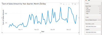
What I expect to see is a line chart of daily sales from the start to the end like this example below. What I'm getting is the sum of sales on individual day numbers across the duration which isn't useful to me.
I looked at the x-axis on this chart and it's set to Continuous, if it matters. Other than that, it's the same as the chart I'm having issues with.
- Mark as New
- Bookmark
- Subscribe
- Mute
- Subscribe to RSS Feed
- Permalink
- Report Inappropriate Content
Do you have active relationship between Purchasing Date and sales table?
Did you mark your Purchasing Date table as date table?
- Mark as New
- Bookmark
- Subscribe
- Mute
- Subscribe to RSS Feed
- Permalink
- Report Inappropriate Content
Online Sales is a standalone table. The only connection is to a Geo table. It does not have a date table only the Purchasing Date field which is formatted as a date.
- Mark as New
- Bookmark
- Subscribe
- Mute
- Subscribe to RSS Feed
- Permalink
- Report Inappropriate Content
I recommend you invest in a proper calendar table.
- Mark as New
- Bookmark
- Subscribe
- Mute
- Subscribe to RSS Feed
- Permalink
- Report Inappropriate Content
I don't have the underlying data in this visual to test it but I think you may be right about the need for a sales table. I will test this out the next opportunity I get.
We can consider this issue closed. I appreciate the time and help.
- Mark as New
- Bookmark
- Subscribe
- Mute
- Subscribe to RSS Feed
- Permalink
- Report Inappropriate Content
Please provide sample data that covers your issue or question completely, in a usable format (not as a screenshot).
Do not include sensitive information or anything not related to the issue or question.
If you are unsure how to upload data please refer to https://community.fabric.microsoft.com/t5/Community-Blog/How-to-provide-sample-data-in-the-Power-BI-...
Please show the expected outcome based on the sample data you provided.
Want faster answers? https://community.fabric.microsoft.com/t5/Desktop/How-to-Get-Your-Question-Answered-Quickly/m-p/1447...
- Mark as New
- Bookmark
- Subscribe
- Mute
- Subscribe to RSS Feed
- Permalink
- Report Inappropriate Content
I updated the issue and added images and data.
- Mark as New
- Bookmark
- Subscribe
- Mute
- Subscribe to RSS Feed
- Permalink
- Report Inappropriate Content
The date is formated as a date and it has the hierarchy. I recommend you invest in a proper calendar table. Don't use auto date/time or any other hierarchies. The visual will automatically do that for you.
- Mark as New
- Bookmark
- Subscribe
- Mute
- Subscribe to RSS Feed
- Permalink
- Report Inappropriate Content
Can you share your current output screenshot and some sample data? If possible, could please explain the expected output in detail?
- Mark as New
- Bookmark
- Subscribe
- Mute
- Subscribe to RSS Feed
- Permalink
- Report Inappropriate Content
I updated the issue and added images and data.
Helpful resources

Join us at the Microsoft Fabric Community Conference
March 31 - April 2, 2025, in Las Vegas, Nevada. Use code MSCUST for a $150 discount!

We want your feedback!
Your insights matter. That’s why we created a quick survey to learn about your experience finding answers to technical questions.

Microsoft Fabric Community Conference 2025
Arun Ulag shares exciting details about the Microsoft Fabric Conference 2025, which will be held in Las Vegas, NV.

| User | Count |
|---|---|
| 119 | |
| 88 | |
| 73 | |
| 67 | |
| 49 |
| User | Count |
|---|---|
| 199 | |
| 141 | |
| 97 | |
| 79 | |
| 68 |


