Party with Power BI’s own Guy in a Cube
Power BI is turning 10! Tune in for a special live episode on July 24 with behind-the-scenes stories, product evolution highlights, and a sneak peek at what’s in store for the future.
Save the date- Power BI forums
- Get Help with Power BI
- Desktop
- Service
- Report Server
- Power Query
- Mobile Apps
- Developer
- DAX Commands and Tips
- Custom Visuals Development Discussion
- Health and Life Sciences
- Power BI Spanish forums
- Translated Spanish Desktop
- Training and Consulting
- Instructor Led Training
- Dashboard in a Day for Women, by Women
- Galleries
- Webinars and Video Gallery
- Data Stories Gallery
- Themes Gallery
- Contests Gallery
- Quick Measures Gallery
- Notebook Gallery
- Translytical Task Flow Gallery
- R Script Showcase
- Ideas
- Custom Visuals Ideas (read-only)
- Issues
- Issues
- Events
- Upcoming Events
Enhance your career with this limited time 50% discount on Fabric and Power BI exams. Ends August 31st. Request your voucher.
- Power BI forums
- Forums
- Get Help with Power BI
- Desktop
- Time Format in a Visualization
- Subscribe to RSS Feed
- Mark Topic as New
- Mark Topic as Read
- Float this Topic for Current User
- Bookmark
- Subscribe
- Printer Friendly Page
- Mark as New
- Bookmark
- Subscribe
- Mute
- Subscribe to RSS Feed
- Permalink
- Report Inappropriate Content
Time Format in a Visualization
Hi!
I´ve a problem with a report that i´m trying to build. I´m currently using an Table from Access for this report, in this table comes info about how long did it take to finish a series of tasks.
I need to make some visualizations that shows the average time by certain categories. The problem is basicly that if I keep the time format (hh:mm:ss) Power BI don´t allow me to use the Average function.
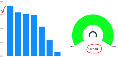
The only way that I can use this info is if I transform that format (using Power Query) in alphanumeric (as I show in the screenshot)
Do somebody know if there is a way that in the visualization I could see the time format?
Solved! Go to Solution.
- Mark as New
- Bookmark
- Subscribe
- Mute
- Subscribe to RSS Feed
- Permalink
- Report Inappropriate Content
Hi @Anonymous,
You can calculate the average time as:
let
    Source = Table.FromRows(Json.Document(Binary.Decompress(Binary.FromText("i45WMjSwMgIhJR0lQyB2VIrViVYyMLUCihsbAQWM4IKGpkARoDhQwBih0hIuaALETjCVpmYQQVOIYCwA", BinaryEncoding.Base64), Compression.Deflate)), let _t = ((type nullable text) meta [Serialized.Text = true]) in type table [Time = _t, #"Call number" = _t, Sector = _t]),
    #"Changed Type" = Table.TransformColumnTypes(Source,{{"Time", type time}}),
    #"Grouped Rows" = Table.Group(#"Changed Type", {"Sector"}, {{"Avg_Time", each List.Average([Time]), type nullable time}}),
    #"Changed Type1" = Table.TransformColumnTypes(#"Grouped Rows",{{"Avg_Time", type time}})
in
    #"Changed Type1"
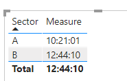
You can also create measure as:
Measure =
CALCULATE(
    FORMAT(AVERAGE('Table'[Time]),"HH:MM:SS"),
    FILTER(
        ALL('Table'),
        'Table'[Sector]=MAX('Table'[Sector])))
But it is not supported to display time in Y-axis as you expected.
Maybe you can vote here.
As a workaround, you can convert the averge time to time duration.
In this case, you can display the time duration in Y-axis.
Please refer this:https://radacad.com/calculate-duration-in-days-hours-minutes-and-seconds-dynamically-in-power-bi-using-dax
Best Regards,
Link
If this post helps then please consider Accept it as the solution to help the other members find it more quickly.
- Mark as New
- Bookmark
- Subscribe
- Mute
- Subscribe to RSS Feed
- Permalink
- Report Inappropriate Content
You can use a decimal number data type for your time column, do your average or other math, and then just use a custom format string to display it as a time/duration. Or you can wrap your AVERAGE with FORMAT( ).
Use custom format strings in Power BI Desktop - Power BI | Microsoft Docs
Pat
Did I answer your question? Mark my post as a solution! Kudos are also appreciated!
To learn more about Power BI, follow me on Twitter or subscribe on YouTube.
@mahoneypa HoosierBI on YouTube
- Mark as New
- Bookmark
- Subscribe
- Mute
- Subscribe to RSS Feed
- Permalink
- Report Inappropriate Content
Hi @Anonymous
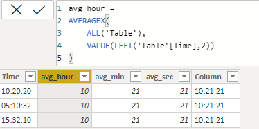
Maybe you can manually calculate average as:
Then create column as:
Column =
FORMAT(CONCATENATE(CONCATENATE(CONCATENATE(CONCATENATE('Table'[avg_hour],":"),'Table'[avg_min]),":"),'Table'[avg_sec]),"HH:MM:SS")
As workaround, you can calculate the average first and then use text format to represent value in time format.
The pbix is attached.
Best Regards,
Link
If this post helps then please consider Accept it as the solution to help the other members find it more quickly.
- Mark as New
- Bookmark
- Subscribe
- Mute
- Subscribe to RSS Feed
- Permalink
- Report Inappropriate Content
First of all thank you very much for your help! I've tried to use your solution and it doesn´t work for what I need to do with Power BI.
I´ve tried also to use your table in PBI to make a visualization and it doesn´t work the way I need it to.
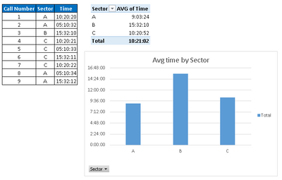
Just to show you what I really need to do I had use your table in Excel and add one column with the data of the sector that have made that call (and add also more lines)... The final result is this:
I need that PBI could do exactly the same... but there is a problem with the time format/duration. As if PBI dont recognize this.
- Mark as New
- Bookmark
- Subscribe
- Mute
- Subscribe to RSS Feed
- Permalink
- Report Inappropriate Content
Hi @Anonymous,
You can calculate the average time as:
let
    Source = Table.FromRows(Json.Document(Binary.Decompress(Binary.FromText("i45WMjSwMgIhJR0lQyB2VIrViVYyMLUCihsbAQWM4IKGpkARoDhQwBih0hIuaALETjCVpmYQQVOIYCwA", BinaryEncoding.Base64), Compression.Deflate)), let _t = ((type nullable text) meta [Serialized.Text = true]) in type table [Time = _t, #"Call number" = _t, Sector = _t]),
    #"Changed Type" = Table.TransformColumnTypes(Source,{{"Time", type time}}),
    #"Grouped Rows" = Table.Group(#"Changed Type", {"Sector"}, {{"Avg_Time", each List.Average([Time]), type nullable time}}),
    #"Changed Type1" = Table.TransformColumnTypes(#"Grouped Rows",{{"Avg_Time", type time}})
in
    #"Changed Type1"
You can also create measure as:
Measure =
CALCULATE(
    FORMAT(AVERAGE('Table'[Time]),"HH:MM:SS"),
    FILTER(
        ALL('Table'),
        'Table'[Sector]=MAX('Table'[Sector])))
But it is not supported to display time in Y-axis as you expected.
Maybe you can vote here.
As a workaround, you can convert the averge time to time duration.
In this case, you can display the time duration in Y-axis.
Please refer this:https://radacad.com/calculate-duration-in-days-hours-minutes-and-seconds-dynamically-in-power-bi-using-dax
Best Regards,
Link
If this post helps then please consider Accept it as the solution to help the other members find it more quickly.
- Mark as New
- Bookmark
- Subscribe
- Mute
- Subscribe to RSS Feed
- Permalink
- Report Inappropriate Content
Thank you very much for your help but it didn't work for my visualization. I've tried to split the time field in three columns and put each one of these fields in a Smart Card.... and it didn't go very well.
I will mark your post as a solution hoping that Microsoft allows us to use te duration format in a visualization.
PD: I've allready vote!
Helpful resources

Power BI Monthly Update - July 2025
Check out the July 2025 Power BI update to learn about new features.

Join our Fabric User Panel
This is your chance to engage directly with the engineering team behind Fabric and Power BI. Share your experiences and shape the future.

| User | Count |
|---|---|
| 72 | |
| 67 | |
| 51 | |
| 38 | |
| 26 |
| User | Count |
|---|---|
| 89 | |
| 52 | |
| 45 | |
| 39 | |
| 38 |


