FabCon is coming to Atlanta
Join us at FabCon Atlanta from March 16 - 20, 2026, for the ultimate Fabric, Power BI, AI and SQL community-led event. Save $200 with code FABCOMM.
Register now!- Power BI forums
- Get Help with Power BI
- Desktop
- Service
- Report Server
- Power Query
- Mobile Apps
- Developer
- DAX Commands and Tips
- Custom Visuals Development Discussion
- Health and Life Sciences
- Power BI Spanish forums
- Translated Spanish Desktop
- Training and Consulting
- Instructor Led Training
- Dashboard in a Day for Women, by Women
- Galleries
- Data Stories Gallery
- Themes Gallery
- Contests Gallery
- QuickViz Gallery
- Quick Measures Gallery
- Visual Calculations Gallery
- Notebook Gallery
- Translytical Task Flow Gallery
- TMDL Gallery
- R Script Showcase
- Webinars and Video Gallery
- Ideas
- Custom Visuals Ideas (read-only)
- Issues
- Issues
- Events
- Upcoming Events
The Power BI Data Visualization World Championships is back! Get ahead of the game and start preparing now! Learn more
- Power BI forums
- Forums
- Get Help with Power BI
- Desktop
- Time Durations in a Visual/Column Chart
- Subscribe to RSS Feed
- Mark Topic as New
- Mark Topic as Read
- Float this Topic for Current User
- Bookmark
- Subscribe
- Printer Friendly Page
- Mark as New
- Bookmark
- Subscribe
- Mute
- Subscribe to RSS Feed
- Permalink
- Report Inappropriate Content
Time Durations in a Visual/Column Chart
Hi,
I want to be able to display time durations hh:mm:ss in a visual like a bar chart.
The reason for this is we track our sales team on call times and we want to be able to track it month on month, year on year, day on day etc, and I feel like the best way to do that would be to use a bar chart. Currently the only way to show the data is in a Card and I feel they're fairly limited in their capabilities.
I have created a measure that shows the average and that's what I want, no problems there. I am just having problems displaying that data
I'll include a PBIX file with some test data.
https://www.dropbox.com/s/4pbc79tpo9yg59a/help.pbix?dl=0
Any help appreicated
Thanks,
Mike
Solved! Go to Solution.
- Mark as New
- Bookmark
- Subscribe
- Mute
- Subscribe to RSS Feed
- Permalink
- Report Inappropriate Content
https://community.powerbi.com/t5/Quick-Measures-Gallery/Chelsie-Eiden-s-Duration/td-p/793639
Follow on LinkedIn
@ me in replies or I'll lose your thread!!!
Instead of a Kudo, please vote for this idea
Become an expert!: Enterprise DNA
External Tools: MSHGQM
YouTube Channel!: Microsoft Hates Greg
Latest book!: DAX For Humans
DAX is easy, CALCULATE makes DAX hard...
- Mark as New
- Bookmark
- Subscribe
- Mute
- Subscribe to RSS Feed
- Permalink
- Report Inappropriate Content
This formula does not work for the purposes of displaying durations in a chart. It converts minutes into hundreds and hours into ten-thousands for the purposes of displaying a whole number in 00:00:00 format, but there are not 100 seconds in a minute or 100 minutes in an hour, so the representation of relative durations on a chart will be incorrect - shorter durations will appear too small and longer ones too big.
- Mark as New
- Bookmark
- Subscribe
- Mute
- Subscribe to RSS Feed
- Permalink
- Report Inappropriate Content
https://community.powerbi.com/t5/Quick-Measures-Gallery/Chelsie-Eiden-s-Duration/td-p/793639
Follow on LinkedIn
@ me in replies or I'll lose your thread!!!
Instead of a Kudo, please vote for this idea
Become an expert!: Enterprise DNA
External Tools: MSHGQM
YouTube Channel!: Microsoft Hates Greg
Latest book!: DAX For Humans
DAX is easy, CALCULATE makes DAX hard...
- Mark as New
- Bookmark
- Subscribe
- Mute
- Subscribe to RSS Feed
- Permalink
- Report Inappropriate Content
Cheers @Greg_Deckler
That looks good! Just so I'm right, does that mean I need to break up my current column from hh:mm:ss into seconds and then build it back up into hh:mm:ss?
If so, how would I go about breaking it down?
- Mark as New
- Bookmark
- Subscribe
- Mute
- Subscribe to RSS Feed
- Permalink
- Report Inappropriate Content
Hi @michael_knight ,
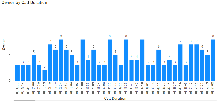
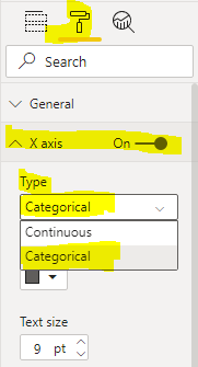
Do you mean like this? If so, you could try to change the type of X asix to Categorical.
Please see the attachment for more details.
Xue Ding
If this post helps, then please consider Accept it as the solution to help the other members find it more quickly.
- Mark as New
- Bookmark
- Subscribe
- Mute
- Subscribe to RSS Feed
- Permalink
- Report Inappropriate Content
Hi @v-xuding-msft ,
No, I don't mean like that.
I mean like on the X axis it's dates like Monday, Tuesday Wednesday etc, or January Febraury March etc, and then the Y Axis the call times from that period of time
Cheers
Helpful resources

Power BI Dataviz World Championships
The Power BI Data Visualization World Championships is back! Get ahead of the game and start preparing now!

| User | Count |
|---|---|
| 38 | |
| 36 | |
| 33 | |
| 32 | |
| 29 |
| User | Count |
|---|---|
| 129 | |
| 88 | |
| 79 | |
| 68 | |
| 63 |


