FabCon is coming to Atlanta
Join us at FabCon Atlanta from March 16 - 20, 2026, for the ultimate Fabric, Power BI, AI and SQL community-led event. Save $200 with code FABCOMM.
Register now!- Power BI forums
- Get Help with Power BI
- Desktop
- Service
- Report Server
- Power Query
- Mobile Apps
- Developer
- DAX Commands and Tips
- Custom Visuals Development Discussion
- Health and Life Sciences
- Power BI Spanish forums
- Translated Spanish Desktop
- Training and Consulting
- Instructor Led Training
- Dashboard in a Day for Women, by Women
- Galleries
- Data Stories Gallery
- Themes Gallery
- Contests Gallery
- Quick Measures Gallery
- Notebook Gallery
- Translytical Task Flow Gallery
- TMDL Gallery
- R Script Showcase
- Webinars and Video Gallery
- Ideas
- Custom Visuals Ideas (read-only)
- Issues
- Issues
- Events
- Upcoming Events
Calling all Data Engineers! Fabric Data Engineer (Exam DP-700) live sessions are back! Starting October 16th. Sign up.
- Power BI forums
- Forums
- Get Help with Power BI
- Desktop
- Table with accumulated is not displayed correctly ...
- Subscribe to RSS Feed
- Mark Topic as New
- Mark Topic as Read
- Float this Topic for Current User
- Bookmark
- Subscribe
- Printer Friendly Page
- Mark as New
- Bookmark
- Subscribe
- Mute
- Subscribe to RSS Feed
- Permalink
- Report Inappropriate Content
Table with accumulated is not displayed correctly in Shape Map
Good everyone.
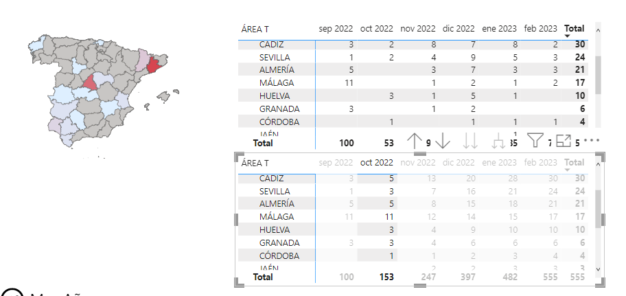
I have the following problem: I have a measure that calculates the accumulated by months. The problem comes from putting in a shape map in values the measure of the accumulated, instead of showing it correctly by months, what it shows me is the count.
I've been thinking about it for days, but I can't figure out how to correct it so that it appears in the right way.
Attached a screenshot, the table below shows the accumulated and the top the count. If you look, for example for Granada in October, it should be colored since the accumulated shows a value equal to 3 instead it comes out without color as if the value took it from the count table
- Mark as New
- Bookmark
- Subscribe
- Mute
- Subscribe to RSS Feed
- Permalink
- Report Inappropriate Content
Hi @Syndicate_Admin ,
What does your source data look like?
Sorry for that the information you have provided is not making the problem clear to me. Can you please share more details to help us clarify your scenario?
Please provide me with more details about your table and your problem or share me with your pbix file after removing sensitive data.
Refer to:
How to provide sample data in the Power BI Forum
How to Get Your Question Answered Quickly
Best Regards,
Jianbo Li
If this post helps, then please consider Accept it as the solution to help the other members find it more quickly.


