Join us at the 2025 Microsoft Fabric Community Conference
Microsoft Fabric Community Conference 2025, March 31 - April 2, Las Vegas, Nevada. Use code FABINSIDER for a $400 discount.
Register now- Power BI forums
- Get Help with Power BI
- Desktop
- Service
- Report Server
- Power Query
- Mobile Apps
- Developer
- DAX Commands and Tips
- Custom Visuals Development Discussion
- Health and Life Sciences
- Power BI Spanish forums
- Translated Spanish Desktop
- Training and Consulting
- Instructor Led Training
- Dashboard in a Day for Women, by Women
- Galleries
- Webinars and Video Gallery
- Data Stories Gallery
- Themes Gallery
- Power BI DataViz World Championships Gallery
- Quick Measures Gallery
- R Script Showcase
- COVID-19 Data Stories Gallery
- Community Connections & How-To Videos
- 2021 MSBizAppsSummit Gallery
- 2020 MSBizAppsSummit Gallery
- 2019 MSBizAppsSummit Gallery
- Events
- Ideas
- Custom Visuals Ideas (read-only)
- Issues
- Issues
- Events
- Upcoming Events
The Power BI DataViz World Championships are on! With four chances to enter, you could win a spot in the LIVE Grand Finale in Las Vegas. Show off your skills.
- Power BI forums
- Forums
- Get Help with Power BI
- Desktop
- Re: Surpress Zero values in Charts
- Subscribe to RSS Feed
- Mark Topic as New
- Mark Topic as Read
- Float this Topic for Current User
- Bookmark
- Subscribe
- Printer Friendly Page
- Mark as New
- Bookmark
- Subscribe
- Mute
- Subscribe to RSS Feed
- Permalink
- Report Inappropriate Content
Surpress Zero values in Charts
How do I get the x axis lables disapprear from the chart when values are zero. I can't really filter out when loading data, as these lables are from a calculated column.
- Mark as New
- Bookmark
- Subscribe
- Mute
- Subscribe to RSS Feed
- Permalink
- Report Inappropriate Content
Hi everyone,
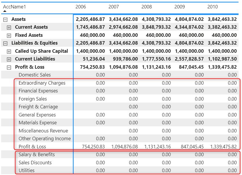
I have the same issue with the matrix chart. I created a measure to calculate, so on the chart showing zero value. I want to suppress zero value (red color box below)
Thank you!
- Mark as New
- Bookmark
- Subscribe
- Mute
- Subscribe to RSS Feed
- Permalink
- Report Inappropriate Content
I had the same problem and just replaced the 0 values with null in the power query. It works for me!
- Mark as New
- Bookmark
- Subscribe
- Mute
- Subscribe to RSS Feed
- Permalink
- Report Inappropriate Content
This was the perfect solution! Thank you!
- Mark as New
- Bookmark
- Subscribe
- Mute
- Subscribe to RSS Feed
- Permalink
- Report Inappropriate Content
@Romeshpsl you can change the position of the data label to Inside End. Simple but effective.
- Mark as New
- Bookmark
- Subscribe
- Mute
- Subscribe to RSS Feed
- Permalink
- Report Inappropriate Content
GREAT SOLUTION
- Mark as New
- Bookmark
- Subscribe
- Mute
- Subscribe to RSS Feed
- Permalink
- Report Inappropriate Content
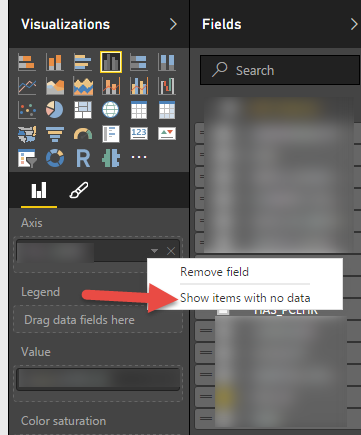
@Romeshpsl for fields dropped onto visual you also have option to specify show items with no data which will take away blanks.
- Mark as New
- Bookmark
- Subscribe
- Mute
- Subscribe to RSS Feed
- Permalink
- Report Inappropriate Content
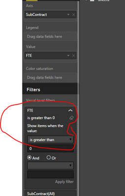
Thanks guys. I tried the "show item with no data" but didn't work. I think it is because there are data but the amount is zero. So did bit of search and found another solution (similar to creating a measure, but without creating one) by applying a filter to show valvue greater than 0. See below.
- Mark as New
- Bookmark
- Subscribe
- Mute
- Subscribe to RSS Feed
- Permalink
- Report Inappropriate Content
We can apply filters to the values if they are not measures or calculated fields.
However , in the same example had there been "Average fte" instead of just "fte" this method wont work or will give incorrect results.
One can always write DAX if-else queries to get results as desired but I am looking for a less complex solution.
- Mark as New
- Bookmark
- Subscribe
- Mute
- Subscribe to RSS Feed
- Permalink
- Report Inappropriate Content
This solution works if the field is taken as is.
However if the filter or the data values is a measure/calculated field , this method does not work.
Lets say instead of "fte", had it been Avegrage fte then it will take that calculated measure and if you try to filter it with "greater then 0" it will give incorrect results.
The intent is to get the supressed values as input at first place and then doing average of that.
Is there a solution for that?
One can always write if-else DAX query but I am looking for a less complex solution.
- Mark as New
- Bookmark
- Subscribe
- Mute
- Subscribe to RSS Feed
- Permalink
- Report Inappropriate Content
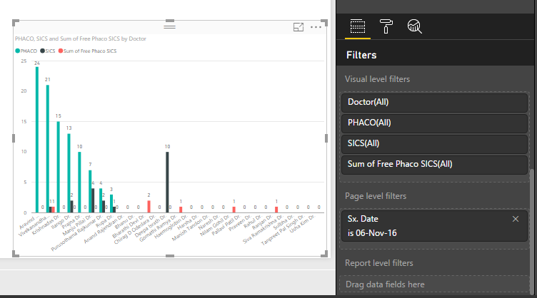
I am plotting a clustered column charts for various surgeries performed by a group of doctors for a particular day.
Its not mandatory that all the doctors will perform all types of surgeries in a day.
If I apply filters to suppress Zero values on all types of surgeries, the chart goes blank.
How do i achieve it?
- Mark as New
- Bookmark
- Subscribe
- Mute
- Subscribe to RSS Feed
- Permalink
- Report Inappropriate Content
Create a new measure something like below , add it to your chart
Measure = CALCULATE(SUM(Table1[Value]),Table1[Value]>0)
- Mark as New
- Bookmark
- Subscribe
- Mute
- Subscribe to RSS Feed
- Permalink
- Report Inappropriate Content
This worked perfect, thank you!! I'd like to add a word of caution though, I had to change the > to <> otherwise it bypassed negative values on a few months where we had negative sales due to Returns.
Helpful resources

Join us at the Microsoft Fabric Community Conference
March 31 - April 2, 2025, in Las Vegas, Nevada. Use code MSCUST for a $150 discount!

Power BI Monthly Update - February 2025
Check out the February 2025 Power BI update to learn about new features.

| User | Count |
|---|---|
| 86 | |
| 78 | |
| 54 | |
| 39 | |
| 35 |
| User | Count |
|---|---|
| 102 | |
| 84 | |
| 48 | |
| 48 | |
| 48 |


