Join us at the 2025 Microsoft Fabric Community Conference
Microsoft Fabric Community Conference 2025, March 31 - April 2, Las Vegas, Nevada. Use code MSCUST for a $150 discount.
Register now- Power BI forums
- Get Help with Power BI
- Desktop
- Service
- Report Server
- Power Query
- Mobile Apps
- Developer
- DAX Commands and Tips
- Custom Visuals Development Discussion
- Health and Life Sciences
- Power BI Spanish forums
- Translated Spanish Desktop
- Training and Consulting
- Instructor Led Training
- Dashboard in a Day for Women, by Women
- Galleries
- Webinars and Video Gallery
- Data Stories Gallery
- Themes Gallery
- Contests Gallery
- Quick Measures Gallery
- R Script Showcase
- COVID-19 Data Stories Gallery
- Community Connections & How-To Videos
- 2021 MSBizAppsSummit Gallery
- 2020 MSBizAppsSummit Gallery
- 2019 MSBizAppsSummit Gallery
- Events
- Ideas
- Custom Visuals Ideas
- Issues
- Issues
- Events
- Upcoming Events
The Power BI DataViz World Championships are on! With four chances to enter, you could win a spot in the LIVE Grand Finale in Las Vegas. Show off your skills.
- Power BI forums
- Forums
- Get Help with Power BI
- Desktop
- Re: Struggling to replicate mental picture of visu...
- Subscribe to RSS Feed
- Mark Topic as New
- Mark Topic as Read
- Float this Topic for Current User
- Bookmark
- Subscribe
- Printer Friendly Page
- Mark as New
- Bookmark
- Subscribe
- Mute
- Subscribe to RSS Feed
- Permalink
- Report Inappropriate Content
Struggling to replicate mental picture of visual
Hi,
Having an issue creating a visual which I can picture in my mind... I will try to explain as simply as possible.
3 vertical columns of data Project Name (text), Rank (text and numbers), Program (text).
I want to have a visual or table where it goes like this
Rank A Rank B Rank C
Project X Project Y Project Z
Project G Project H Project I
Want to colour coordinate the projects based on the Program (conditionally format)
Have tried to create a different table to do this view and have tried to concatenatex but to no avail.
Kind regards,
Priyan
Solved! Go to Solution.
- Mark as New
- Bookmark
- Subscribe
- Mute
- Subscribe to RSS Feed
- Permalink
- Report Inappropriate Content
Hi @pd4000
Please refer to my pbix
Create a measure (data type is number) to define color rule
Measure-color = SWITCH(MAX([por]),"red",1,"blue",2,"green",3,"grey",4)
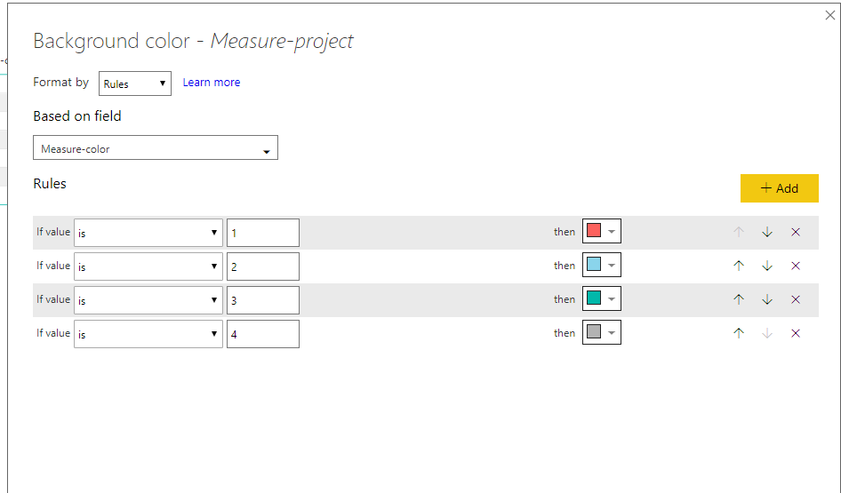
Then select"format"->"conditional formatting", select the column [project] (in my test, i create a measure [Measure-project] to show the same value as this column), then select "background color".
- Mark as New
- Bookmark
- Subscribe
- Mute
- Subscribe to RSS Feed
- Permalink
- Report Inappropriate Content
Hi @pd4000
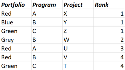
Assume your table is like
Create a matrix, so that to get a similar layout as you expected
Measure created
Measure-project = MAX([Project])
Then create a measure of "program" as number type
Measure-program = SWITCH(MAX([Program]),"A",1,"B",2,"C",3)
Then use it as a rule in the conditional formatting
Best Regards
Maggie
- Mark as New
- Bookmark
- Subscribe
- Mute
- Subscribe to RSS Feed
- Permalink
- Report Inappropriate Content
Hi Maggie,
Thanks for your reply.
Your solution definitely solves part of my problem.
The table is the first image and the visual is the second image.


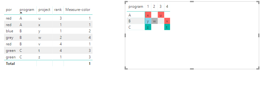
The issue is that I would like to have the projects displayed in a column format. The program is not really useful in this calculation/for this visual. The reason why your solution only partly works for me is that if I am using the Portfolio level to colour there is more than 1 result for the projects per portfolio and therefore, the 'max' function doesn't work.
Hope this makes sense and regards,
Priyan
- Mark as New
- Bookmark
- Subscribe
- Mute
- Subscribe to RSS Feed
- Permalink
- Report Inappropriate Content
Hi @pd4000
I am not clear with the rule of coloring the project?
From your "required visual", i can't associate it with the "table structure" above.
Additionaly, my formula using 'max" function doesn't mean to get the max value, it just catch each value of each row.
Please let me know expected result based on your example table.
Best Regards
maggie
- Mark as New
- Bookmark
- Subscribe
- Mute
- Subscribe to RSS Feed
- Permalink
- Report Inappropriate Content
Hello @v-juanli-msft
Hopefully, this image helps. I have placed the table of data on the left and the tabular/matrix style visual on the right...
Please let me know if this doesn't help.
Kind regards,
Priyan
- Mark as New
- Bookmark
- Subscribe
- Mute
- Subscribe to RSS Feed
- Permalink
- Report Inappropriate Content
Hi @pd4000
Please refer to my pbix
Create a measure (data type is number) to define color rule
Measure-color = SWITCH(MAX([por]),"red",1,"blue",2,"green",3,"grey",4)
Then select"format"->"conditional formatting", select the column [project] (in my test, i create a measure [Measure-project] to show the same value as this column), then select "background color".
- Mark as New
- Bookmark
- Subscribe
- Mute
- Subscribe to RSS Feed
- Permalink
- Report Inappropriate Content
This works well, however, I kind of don't want it to be associated by the 'Program' column.
So it would look like the table in the attached Excel. So, basically have all the projects in the ranks without relation to the program.
Kind regards,
Priyan
- Mark as New
- Bookmark
- Subscribe
- Mute
- Subscribe to RSS Feed
- Permalink
- Report Inappropriate Content
Hi @pd4000
As tested, if you use matrix visual, it impossible to get this visual as you expected, when losing program in row, then the project only shows the first one by default.
Best Reagrds
maggie
- Mark as New
- Bookmark
- Subscribe
- Mute
- Subscribe to RSS Feed
- Permalink
- Report Inappropriate Content
Hi @v-juanli-msft,
Understandable. Thanks for the accepted solution though, much appreciated!
Kind regards,
Priyan


