Get Fabric certified for FREE!
Don't miss your chance to take the Fabric Data Engineer (DP-700) exam on us!
Learn more- Power BI forums
- Get Help with Power BI
- Desktop
- Service
- Report Server
- Power Query
- Mobile Apps
- Developer
- DAX Commands and Tips
- Custom Visuals Development Discussion
- Health and Life Sciences
- Power BI Spanish forums
- Translated Spanish Desktop
- Training and Consulting
- Instructor Led Training
- Dashboard in a Day for Women, by Women
- Galleries
- Data Stories Gallery
- Themes Gallery
- Contests Gallery
- QuickViz Gallery
- Quick Measures Gallery
- Visual Calculations Gallery
- Notebook Gallery
- Translytical Task Flow Gallery
- TMDL Gallery
- R Script Showcase
- Webinars and Video Gallery
- Ideas
- Custom Visuals Ideas (read-only)
- Issues
- Issues
- Events
- Upcoming Events
The FabCon + SQLCon recap series starts April 14th at 8am Pacific. If you’re tracking where AI is going inside Fabric, this first session is a can't miss. Register now
- Power BI forums
- Forums
- Get Help with Power BI
- Desktop
- Stacked area chart using dynamic date range
- Subscribe to RSS Feed
- Mark Topic as New
- Mark Topic as Read
- Float this Topic for Current User
- Bookmark
- Subscribe
- Printer Friendly Page
- Mark as New
- Bookmark
- Subscribe
- Mute
- Subscribe to RSS Feed
- Permalink
- Report Inappropriate Content
Stacked area chart using dynamic date range
All,
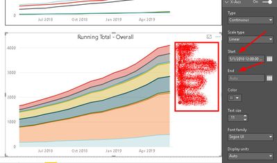
I am showing a running total of counts for the past 2 years. The chart is getting too wide for my customer. I need to keep the totals based on the entire time period. But I would like to only show the last 12 months. The X-axis has a Start and End Date but I don't see a way to make it dynamic based on my live data. I could hard code the dates but then I would have to change it manually each month as I am in the screen shot below.
Any ideas? Or different charts I should use?
I am using the latest PBIRS (on premises).
Thanks in advance, Scott
Solved! Go to Solution.
- Mark as New
- Bookmark
- Subscribe
- Mute
- Subscribe to RSS Feed
- Permalink
- Report Inappropriate Content
Hi @wskallmeyer
You may create a measure like below and use it in visual level filter and set it =1.
Last 12 Month =
VAR EndThisMonth =
    DATE ( YEAR ( TODAY () ), MONTH ( TODAY () ), 31 )
VAR Enddate_LastMonth =
    EDATE ( EndThisMonth, -1 )
RETURN
    IF (
        MAX ( 'Date'[Date] ) <= Enddate_LastMonth
            && MAX ( 'Date'[Date] ) > EDATE ( EndThisMonth, -13 ),
        1
    )
Regards,
If this post helps, then please consider Accept it as the solution to help the other members find it more quickly.
Helpful resources

New to Fabric Survey
If you have recently started exploring Fabric, we'd love to hear how it's going. Your feedback can help with product improvements.

Power BI DataViz World Championships - June 2026
A new Power BI DataViz World Championship is coming this June! Don't miss out on submitting your entry.

Join our Fabric User Panel
Share feedback directly with Fabric product managers, participate in targeted research studies and influence the Fabric roadmap.

| User | Count |
|---|---|
| 53 | |
| 40 | |
| 38 | |
| 19 | |
| 18 |
| User | Count |
|---|---|
| 69 | |
| 68 | |
| 34 | |
| 33 | |
| 30 |

