FabCon is coming to Atlanta
Join us at FabCon Atlanta from March 16 - 20, 2026, for the ultimate Fabric, Power BI, AI and SQL community-led event. Save $200 with code FABCOMM.
Register now!- Power BI forums
- Get Help with Power BI
- Desktop
- Service
- Report Server
- Power Query
- Mobile Apps
- Developer
- DAX Commands and Tips
- Custom Visuals Development Discussion
- Health and Life Sciences
- Power BI Spanish forums
- Translated Spanish Desktop
- Training and Consulting
- Instructor Led Training
- Dashboard in a Day for Women, by Women
- Galleries
- Data Stories Gallery
- Themes Gallery
- Contests Gallery
- Quick Measures Gallery
- Notebook Gallery
- Translytical Task Flow Gallery
- TMDL Gallery
- R Script Showcase
- Webinars and Video Gallery
- Ideas
- Custom Visuals Ideas (read-only)
- Issues
- Issues
- Events
- Upcoming Events
To celebrate FabCon Vienna, we are offering 50% off select exams. Ends October 3rd. Request your discount now.
- Power BI forums
- Forums
- Get Help with Power BI
- Desktop
- Stacked Measures / Multiple Charts in One (Migrati...
- Subscribe to RSS Feed
- Mark Topic as New
- Mark Topic as Read
- Float this Topic for Current User
- Bookmark
- Subscribe
- Printer Friendly Page
- Mark as New
- Bookmark
- Subscribe
- Mute
- Subscribe to RSS Feed
- Permalink
- Report Inappropriate Content
Stacked Measures / Multiple Charts in One (Migrating from Tableau)
Hi All,
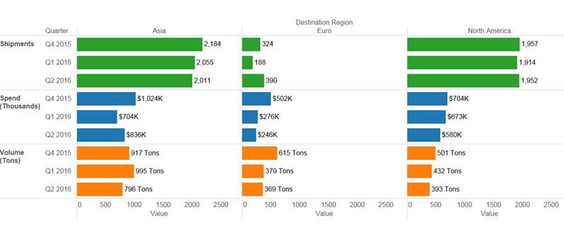
I've been able to generate this chart as per below in Tablaeu. I'd like to do this in Power BI instead. The table I used is small and just tags the final data point as one of the 3 catagory types, quarter and region (i.e. summary data only). It seemed to work out to a nice combination chart very easily in Tableau after some initial research by playing with measures and values settings with the way that program works.
I can't seem to find a similar way to do so in Power BI however. If you see, it's 3 charts in one sharing the same regions (Region for vertical segments, catagory types for horizontal segments and the values dropped into place with bars and data labels, with nice scales for each at the bottom.
Can anyone suggest a way to achieve or is it not possible without particular modifications with scripting/templates.
- Mark as New
- Bookmark
- Subscribe
- Mute
- Subscribe to RSS Feed
- Permalink
- Report Inappropriate Content
Hi @tjman84,
As far as I know, there is no any native visuals or custom visuals in Gallery can achieve this currently. I would suggest you submit your requirement on Power BI Ideas to improve Power BI on this feature. ![]()
Regards
- Mark as New
- Bookmark
- Subscribe
- Mute
- Subscribe to RSS Feed
- Permalink
- Report Inappropriate Content
Hi V-ljerr-msft, Thank you very much!
- Mark as New
- Bookmark
- Subscribe
- Mute
- Subscribe to RSS Feed
- Permalink
- Report Inappropriate Content
Hi there,
A version of this is now possible in Power BI: http://www.decisivedata.net/blog/small-multiples-/-trellis-bar-charts-in-power-bi
Check out the post to build one yourself.
Best,
Jake


