FabCon is coming to Atlanta
Join us at FabCon Atlanta from March 16 - 20, 2026, for the ultimate Fabric, Power BI, AI and SQL community-led event. Save $200 with code FABCOMM.
Register now!- Power BI forums
- Get Help with Power BI
- Desktop
- Service
- Report Server
- Power Query
- Mobile Apps
- Developer
- DAX Commands and Tips
- Custom Visuals Development Discussion
- Health and Life Sciences
- Power BI Spanish forums
- Translated Spanish Desktop
- Training and Consulting
- Instructor Led Training
- Dashboard in a Day for Women, by Women
- Galleries
- Data Stories Gallery
- Themes Gallery
- Contests Gallery
- QuickViz Gallery
- Quick Measures Gallery
- Visual Calculations Gallery
- Notebook Gallery
- Translytical Task Flow Gallery
- TMDL Gallery
- R Script Showcase
- Webinars and Video Gallery
- Ideas
- Custom Visuals Ideas (read-only)
- Issues
- Issues
- Events
- Upcoming Events
Get Fabric Certified for FREE during Fabric Data Days. Don't miss your chance! Request now
- Power BI forums
- Forums
- Get Help with Power BI
- Desktop
- Stacked Graph (Not 100% Chart) X-Axis Percentage o...
- Subscribe to RSS Feed
- Mark Topic as New
- Mark Topic as Read
- Float this Topic for Current User
- Bookmark
- Subscribe
- Printer Friendly Page
- Mark as New
- Bookmark
- Subscribe
- Mute
- Subscribe to RSS Feed
- Permalink
- Report Inappropriate Content
Stacked Graph (Not 100% Chart) X-Axis Percentage of column
I am looking for a solution to view percentage of column total (even if it has been filtered) on a stacked bar chart tooltip. I have implemented many different solutions I have come across but to no avail.
Previous solution suggested:
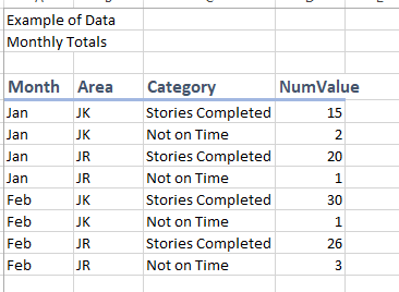
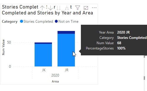
This solution for me is parsing the percentage across the entire chart instead of breaking based on x-axis categories. Is this the intention and/or is it possible to get it to break down by the x-axis values? For instance in my chart I break it down by group, and am needing to look at what percentage each group has for stories that are completed vs not. I would expect my Stories Completed to be showing 90 some percent for each JK and JR Stories Completed relative to their column.
- Mark as New
- Bookmark
- Subscribe
- Mute
- Subscribe to RSS Feed
- Permalink
- Report Inappropriate Content
- Mark as New
- Bookmark
- Subscribe
- Mute
- Subscribe to RSS Feed
- Permalink
- Report Inappropriate Content
That solution then results in each tooltip being %100 no matter which Category you are hovering over.
- Mark as New
- Bookmark
- Subscribe
- Mute
- Subscribe to RSS Feed
- Permalink
- Report Inappropriate Content
Correction I was using the DAX of

- Mark as New
- Bookmark
- Subscribe
- Mute
- Subscribe to RSS Feed
- Permalink
- Report Inappropriate Content
HI @degnek ,
Maybe you can try to use the below formula, it will calculate the aggregate value of the current category with the total value.
PercentageStories =
DIVIDE (
    CALCULATE (
        SUM ( 'Monthly Totals'[Num Value] ),
        ALLSELECTED ( 'Monthly Totals' ),
        VALUES ( 'Monthly Totals'[Category] )
    ),
    CALCULATE (
        SUM ( 'Monthly Totals'[Num Value] ),
        ALLSELECTED ( 'Monthly Totals' )
    ),
    0
)
Regards,
Xiaoxin Sheng
- Mark as New
- Bookmark
- Subscribe
- Mute
- Subscribe to RSS Feed
- Permalink
- Report Inappropriate Content
@Anonymous ,
Thanks for the suggestion but unfortunately that still provides a split percentage over the whole instead of parsing it out per column. This resulted in respective Stories Completed being the same 55% and 38%, which does not allow for the knowledge that each group got over 90 percent of their stories completed on time.
- Mark as New
- Bookmark
- Subscribe
- Mute
- Subscribe to RSS Feed
- Permalink
- Report Inappropriate Content
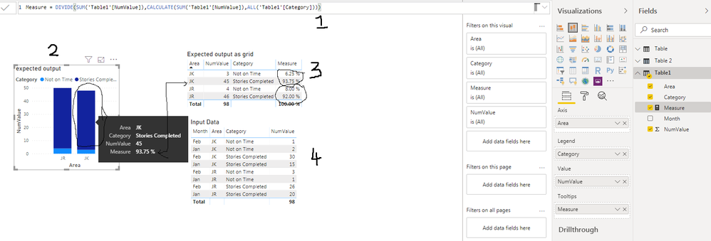
If my understanding is correct, the DAX I gave you should have worked.
1. The Measure that shows the % for each column.
2. Expected graph...I hoved over JK and Stories Completed. It show 93.75%.
3. Same graph in step 2 but displayed as table. Now you see the % in JK and JR add upto 100%.
4. Input data as a single table.
Other than that, I see year 2020 in your graph. Where does it comes from?
Are you using the right syntax for DAX?
If this helps, mark it as a solution.
Kudos are nice too.
- Mark as New
- Bookmark
- Subscribe
- Mute
- Subscribe to RSS Feed
- Permalink
- Report Inappropriate Content
I am not sure where my calculations are going wrong. I filter some additional categories but have tried the measure with nothing filtered and it is still resulting in each section getting 100%.
Helpful resources

Power BI Monthly Update - November 2025
Check out the November 2025 Power BI update to learn about new features.

Fabric Data Days
Advance your Data & AI career with 50 days of live learning, contests, hands-on challenges, study groups & certifications and more!

| User | Count |
|---|---|
| 103 | |
| 79 | |
| 57 | |
| 51 | |
| 46 |


