Join us at FabCon Vienna from September 15-18, 2025
The ultimate Fabric, Power BI, SQL, and AI community-led learning event. Save €200 with code FABCOMM.
Get registered- Power BI forums
- Get Help with Power BI
- Desktop
- Service
- Report Server
- Power Query
- Mobile Apps
- Developer
- DAX Commands and Tips
- Custom Visuals Development Discussion
- Health and Life Sciences
- Power BI Spanish forums
- Translated Spanish Desktop
- Training and Consulting
- Instructor Led Training
- Dashboard in a Day for Women, by Women
- Galleries
- Data Stories Gallery
- Themes Gallery
- Contests Gallery
- Quick Measures Gallery
- Notebook Gallery
- Translytical Task Flow Gallery
- TMDL Gallery
- R Script Showcase
- Webinars and Video Gallery
- Ideas
- Custom Visuals Ideas (read-only)
- Issues
- Issues
- Events
- Upcoming Events
Enhance your career with this limited time 50% discount on Fabric and Power BI exams. Ends August 31st. Request your voucher.
- Power BI forums
- Forums
- Get Help with Power BI
- Desktop
- Stacked Columns not showing all data labels
- Subscribe to RSS Feed
- Mark Topic as New
- Mark Topic as Read
- Float this Topic for Current User
- Bookmark
- Subscribe
- Printer Friendly Page
- Mark as New
- Bookmark
- Subscribe
- Mute
- Subscribe to RSS Feed
- Permalink
- Report Inappropriate Content
Stacked Columns not showing all data labels
Hello,
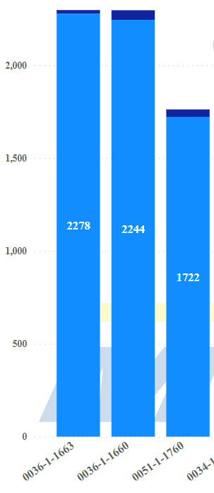
I'm new to Power Bi and am having an issue with showing some data labels off of a stacked column chart that I have.
The labels appear as expected within the larger portion of the graph, but I would like to also show the amount of the smaller, less visible portion on the top.
Is there a way that I could show the labels outside the columns for the dark blue sections?
Any help would be appreciated
Solved! Go to Solution.
- Mark as New
- Bookmark
- Subscribe
- Mute
- Subscribe to RSS Feed
- Permalink
- Report Inappropriate Content
No, at least not for that visual. Pie chart or donut charts do offer you the possibility to place them "outside end" but not stacked column charts. Indeed is a gap. You can workaround it with a tooltip if the options I suggested you does not fit your need.
- Mark as New
- Bookmark
- Subscribe
- Mute
- Subscribe to RSS Feed
- Permalink
- Report Inappropriate Content
Scale & size of the visual matters a lot when putting data labels. Since the dark blue portion of the column is quite small, labels will never fit, even if you try to reduce to the minimum the data label size.
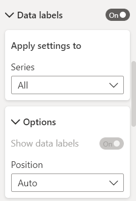
Try playing a bit with the data lebel options per series:
Or switch the visual to a stacked bar chart, clustered bar chart or clustered column chart. Hope this helps.
- Mark as New
- Bookmark
- Subscribe
- Mute
- Subscribe to RSS Feed
- Permalink
- Report Inappropriate Content
Thanks for your input.
Is there really no way to do this? Even having the data labels outside of the dark blue section would be fine. This seems to be a considerable oversight on the part of the developers.
- Mark as New
- Bookmark
- Subscribe
- Mute
- Subscribe to RSS Feed
- Permalink
- Report Inappropriate Content
No, at least not for that visual. Pie chart or donut charts do offer you the possibility to place them "outside end" but not stacked column charts. Indeed is a gap. You can workaround it with a tooltip if the options I suggested you does not fit your need.


