FabCon is coming to Atlanta
Join us at FabCon Atlanta from March 16 - 20, 2026, for the ultimate Fabric, Power BI, AI and SQL community-led event. Save $200 with code FABCOMM.
Register now!- Power BI forums
- Get Help with Power BI
- Desktop
- Service
- Report Server
- Power Query
- Mobile Apps
- Developer
- DAX Commands and Tips
- Custom Visuals Development Discussion
- Health and Life Sciences
- Power BI Spanish forums
- Translated Spanish Desktop
- Training and Consulting
- Instructor Led Training
- Dashboard in a Day for Women, by Women
- Galleries
- Data Stories Gallery
- Themes Gallery
- Contests Gallery
- QuickViz Gallery
- Quick Measures Gallery
- Visual Calculations Gallery
- Notebook Gallery
- Translytical Task Flow Gallery
- TMDL Gallery
- R Script Showcase
- Webinars and Video Gallery
- Ideas
- Custom Visuals Ideas (read-only)
- Issues
- Issues
- Events
- Upcoming Events
The Power BI Data Visualization World Championships is back! Get ahead of the game and start preparing now! Learn more
- Power BI forums
- Forums
- Get Help with Power BI
- Desktop
- Stacked Clustered Column Chart
- Subscribe to RSS Feed
- Mark Topic as New
- Mark Topic as Read
- Float this Topic for Current User
- Bookmark
- Subscribe
- Printer Friendly Page
- Mark as New
- Bookmark
- Subscribe
- Mute
- Subscribe to RSS Feed
- Permalink
- Report Inappropriate Content
Stacked Clustered Column Chart
Hi All,
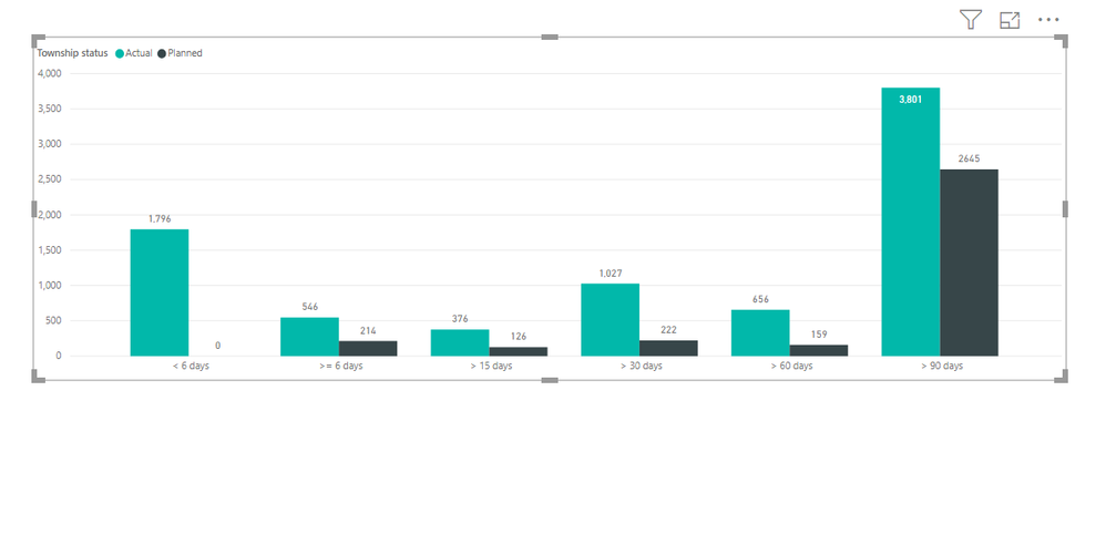
Please see below graph :
I cannot add any column to the legend field since I have given two aggregations in the value field. Is there any way to do that or any other visual available which can act as a combination of clustered and Stacked column chart.
- Mark as New
- Bookmark
- Subscribe
- Mute
- Subscribe to RSS Feed
- Permalink
- Report Inappropriate Content
There is a trick you can do to make this work 🙂
I've created the solution in this blogpost
https://www.villezekeviking.com/how-to-combine-a-clustered-and-stacked-chart-in-power-bi
- Mark as New
- Bookmark
- Subscribe
- Mute
- Subscribe to RSS Feed
- Permalink
- Report Inappropriate Content
Hi @Anonymous ,
In Power BI Desktop, it’s not possible to create a chart which can combine both Clustered and Stacked column chart together. Because it can’t determine which group of series need to be “clustered”, which group of series need to be “stacked”. And it’s still not supported to add multiple fields into Legend of a chart. For your requirement, I suggest you to add a column to assign types, then build a hierarchy. Put the hierarchy on X-axis, you suppose to drill down the detail level.
You can also refer the following similar cases that could help you:
- https://community.powerbi.com/t5/Desktop/Double-Stacked-Column-Chart-Combination-of-Stacked-and-Column/td-p/456690
- https://community.powerbi.com/t5/Desktop/Stacked-amp-Cluster-bar-chart/td-p/501432
Best Regards,
Yingjie Li
If this post helps then please consider Accept it as the solution to help the other members find it more quickly.
- Mark as New
- Bookmark
- Subscribe
- Mute
- Subscribe to RSS Feed
- Permalink
- Report Inappropriate Content
That doesn't make any sense. If I select one of the categories from another visual, Power BI is perfectly capable of representing it's proportion in my clustered column chart.
Helpful resources

Power BI Dataviz World Championships
The Power BI Data Visualization World Championships is back! Get ahead of the game and start preparing now!

| User | Count |
|---|---|
| 39 | |
| 37 | |
| 33 | |
| 32 | |
| 29 |
| User | Count |
|---|---|
| 133 | |
| 88 | |
| 85 | |
| 68 | |
| 64 |


