FabCon is coming to Atlanta
Join us at FabCon Atlanta from March 16 - 20, 2026, for the ultimate Fabric, Power BI, AI and SQL community-led event. Save $200 with code FABCOMM.
Register now!- Power BI forums
- Get Help with Power BI
- Desktop
- Service
- Report Server
- Power Query
- Mobile Apps
- Developer
- DAX Commands and Tips
- Custom Visuals Development Discussion
- Health and Life Sciences
- Power BI Spanish forums
- Translated Spanish Desktop
- Training and Consulting
- Instructor Led Training
- Dashboard in a Day for Women, by Women
- Galleries
- Data Stories Gallery
- Themes Gallery
- Contests Gallery
- Quick Measures Gallery
- Notebook Gallery
- Translytical Task Flow Gallery
- TMDL Gallery
- R Script Showcase
- Webinars and Video Gallery
- Ideas
- Custom Visuals Ideas (read-only)
- Issues
- Issues
- Events
- Upcoming Events
Join the Fabric FabCon Global Hackathon—running virtually through Nov 3. Open to all skill levels. $10,000 in prizes! Register now.
- Power BI forums
- Forums
- Get Help with Power BI
- Desktop
- Stacked Chart in a Waterfall
- Subscribe to RSS Feed
- Mark Topic as New
- Mark Topic as Read
- Float this Topic for Current User
- Bookmark
- Subscribe
- Printer Friendly Page
- Mark as New
- Bookmark
- Subscribe
- Mute
- Subscribe to RSS Feed
- Permalink
- Report Inappropriate Content
Stacked Chart in a Waterfall
Is it possible to do a stacked chart within a waterfall?
For instance, I currently have a waterfall separated into 3 buckets (the number of devices detected in less than 30 days, the number of devices detected within 30-90 Days and the number of devices detected more than 90 days ago). I want to add a third dimension to see the type of devices each of these buckets contain (i.e. I want to see if the device is a mobile or laptop within the less than 30 day bucket). Is this possible?
Solved! Go to Solution.
- Mark as New
- Bookmark
- Subscribe
- Mute
- Subscribe to RSS Feed
- Permalink
- Report Inappropriate Content
Hi, @Anonymous
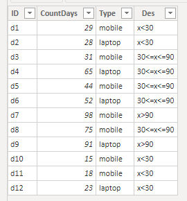
Based on my research, I created data to reproduce your scenario.
Then you may create a measure as follows.
CountNum = COUNT('Table'[ID])
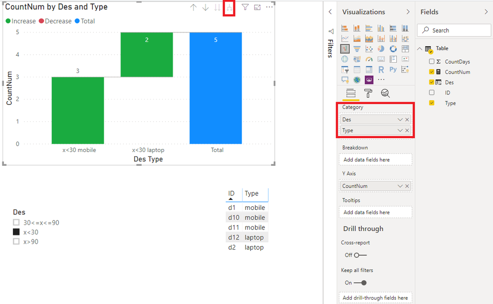
Result:
Best Regards
Allan
If this post helps, then please consider Accept it as the solution to help the other members find it more quickly.
- Mark as New
- Bookmark
- Subscribe
- Mute
- Subscribe to RSS Feed
- Permalink
- Report Inappropriate Content
Hi, @Anonymous
If you take the answer of someone, please mark it as the solution to help the other members who have same problems find it more quickly. If not, let me know and I'll try to help you further. Thanks.
Best Regards
Allan
- Mark as New
- Bookmark
- Subscribe
- Mute
- Subscribe to RSS Feed
- Permalink
- Report Inappropriate Content
Hi, @Anonymous
Based on my research, I created data to reproduce your scenario.
Then you may create a measure as follows.
CountNum = COUNT('Table'[ID])
Result:
Best Regards
Allan
If this post helps, then please consider Accept it as the solution to help the other members find it more quickly.


