Join us at the 2025 Microsoft Fabric Community Conference
Microsoft Fabric Community Conference 2025, March 31 - April 2, Las Vegas, Nevada. Use code MSCUST for a $150 discount.
Register now- Power BI forums
- Get Help with Power BI
- Desktop
- Service
- Report Server
- Power Query
- Mobile Apps
- Developer
- DAX Commands and Tips
- Custom Visuals Development Discussion
- Health and Life Sciences
- Power BI Spanish forums
- Translated Spanish Desktop
- Training and Consulting
- Instructor Led Training
- Dashboard in a Day for Women, by Women
- Galleries
- Webinars and Video Gallery
- Data Stories Gallery
- Themes Gallery
- Power BI DataViz World Championships Gallery
- Quick Measures Gallery
- R Script Showcase
- COVID-19 Data Stories Gallery
- Community Connections & How-To Videos
- 2021 MSBizAppsSummit Gallery
- 2020 MSBizAppsSummit Gallery
- 2019 MSBizAppsSummit Gallery
- Events
- Ideas
- Custom Visuals Ideas
- Issues
- Issues
- Events
- Upcoming Events
- Power BI forums
- Forums
- Get Help with Power BI
- Desktop
- Re: Space between value and percentage sign
- Subscribe to RSS Feed
- Mark Topic as New
- Mark Topic as Read
- Float this Topic for Current User
- Bookmark
- Subscribe
- Printer Friendly Page
- Mark as New
- Bookmark
- Subscribe
- Mute
- Subscribe to RSS Feed
- Permalink
- Report Inappropriate Content
Space between value and percentage sign
Hello folks,
I hope this is the right category for my question, if not, please direct me towards the correct section.
I recently started to use Power BI desktop and I've got a lot to learn, but I'm getting there slowly by simply trying to push myself daily.
However, I am stuck.
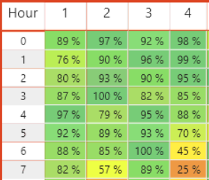
I've created an heatmap that shows every day in the month selected, with all the hours of the day. So the column header is the day, and the row header is the hour. Within the cells then, my company shows how many calls we've recieved during these hours, this in order to simply plan out the staffing of the day seeing as we can tell when we're the most busy. That was easy enough, but my second task was to have an identical heatmap show how many of these calls get answered in percentage, compared to how many leaves - This to show the planning department if the staff we have is suffecient in terms of Workload vs Resources.
One big issue here is that the table itself is quite big in the visual department. I've had to select font size 8 to try and fit it all, but I'd love for the option to go lower than that. To be fair, there is no **bleep** sense in having font 8 as the minimum size in a world where we need to fix certain layouts and have limited space - but that is a rant for another day...
My issue here is that when using %, my table shows the value, without decimals (as intended) and then there is a space between the Value and the Percentage sign. When watching others use %, I don't see this space, and it seems like I'm too daft to find out how to remove this space on my own. Sure, I could probably make this a textfield, and simply trim the space. But that seems to be the wrong way to go about this, so I am simply looking for the correct way.
My measure is simply a divide between two integers, nothing else. And the look of it is this:
(This is 4 days, and hours 0-7 in the morning)
In order to save space, I simply want to remove this **bleep** space. Any hints or clues would be greatly appreciated.
Solved! Go to Solution.
- Mark as New
- Bookmark
- Subscribe
- Mute
- Subscribe to RSS Feed
- Permalink
- Report Inappropriate Content
Go to the modeling tab and select the measure you are showing. Under formatting change it to custom and use "0.00%"
- Mark as New
- Bookmark
- Subscribe
- Mute
- Subscribe to RSS Feed
- Permalink
- Report Inappropriate Content
I had the same issue with a card visual.
Solution which worked for me:
Select the measure, and open the measure tools tab, there use Format = percentage. Do not select the dollar, select percentage, select and deselect the comma.
For some reason if the comma is selected there will be a space in between the value and the percentage 🙄
- Mark as New
- Bookmark
- Subscribe
- Mute
- Subscribe to RSS Feed
- Permalink
- Report Inappropriate Content
Go to the modeling tab and select the measure you are showing. Under formatting change it to custom and use "0.00%"
- Mark as New
- Bookmark
- Subscribe
- Mute
- Subscribe to RSS Feed
- Permalink
- Report Inappropriate Content
Hello @MCornish,
Thanks for your help.
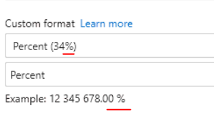
I've however already tried setting it as such:
Still, no luck. As you can see here, custom format is selected to be "XX%", and the example below still shows a space inbetween the value and the %. Now, one could assume that there are some local delimiter rules, or spacing rules. Just as some countries use dots to increment between thousands, and some use spaces.
Could this issue be related to that in any way, and if so, where would one edit that?
- Mark as New
- Bookmark
- Subscribe
- Mute
- Subscribe to RSS Feed
- Permalink
- Report Inappropriate Content
Now I set it manually as 0%, and it seems to be working. While I do think this is an acceptable workaround, it seems like an workaround. Is there no way to change the default behaviour of said kind of value?
- Mark as New
- Bookmark
- Subscribe
- Mute
- Subscribe to RSS Feed
- Permalink
- Report Inappropriate Content
Its going to be a system locale setting, which you won't be able to change on your tennant anyway
- Mark as New
- Bookmark
- Subscribe
- Mute
- Subscribe to RSS Feed
- Permalink
- Report Inappropriate Content
Well, locale settings can be set through our organization. So I would not be so sure about that, but in the end, locale settings really ruin layouts. Boo. Thanks for the response though.
Helpful resources

Join us at the Microsoft Fabric Community Conference
March 31 - April 2, 2025, in Las Vegas, Nevada. Use code MSCUST for a $150 discount!

Power BI Monthly Update - February 2025
Check out the February 2025 Power BI update to learn about new features.

Join our Community Sticker Challenge 2025
If you love stickers, then you will definitely want to check out our Community Sticker Challenge!

| User | Count |
|---|---|
| 102 | |
| 70 | |
| 68 | |
| 54 | |
| 41 |
| User | Count |
|---|---|
| 153 | |
| 83 | |
| 65 | |
| 62 | |
| 61 |


