FabCon is coming to Atlanta
Join us at FabCon Atlanta from March 16 - 20, 2026, for the ultimate Fabric, Power BI, AI and SQL community-led event. Save $200 with code FABCOMM.
Register now!- Power BI forums
- Get Help with Power BI
- Desktop
- Service
- Report Server
- Power Query
- Mobile Apps
- Developer
- DAX Commands and Tips
- Custom Visuals Development Discussion
- Health and Life Sciences
- Power BI Spanish forums
- Translated Spanish Desktop
- Training and Consulting
- Instructor Led Training
- Dashboard in a Day for Women, by Women
- Galleries
- Data Stories Gallery
- Themes Gallery
- Contests Gallery
- Quick Measures Gallery
- Notebook Gallery
- Translytical Task Flow Gallery
- TMDL Gallery
- R Script Showcase
- Webinars and Video Gallery
- Ideas
- Custom Visuals Ideas (read-only)
- Issues
- Issues
- Events
- Upcoming Events
Calling all Data Engineers! Fabric Data Engineer (Exam DP-700) live sessions are back! Starting October 16th. Sign up.
- Power BI forums
- Forums
- Get Help with Power BI
- Desktop
- Sorting week numbers in Chart in a different order
- Subscribe to RSS Feed
- Mark Topic as New
- Mark Topic as Read
- Float this Topic for Current User
- Bookmark
- Subscribe
- Printer Friendly Page
- Mark as New
- Bookmark
- Subscribe
- Mute
- Subscribe to RSS Feed
- Permalink
- Report Inappropriate Content
Sorting week numbers in Chart in a different order
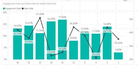
Greetings. I am trying to display clicks and engagement rate of a DRIP campaign sent to customers on a specific weeks. I have linked a sample file with test data. In this chart I would want to show all the weeks the emails were sent (not showing gaps) along with the click and engagement rate. I switched to categorical view and I have achieved most of this except I cannot sort the weeks to start with week # 1. My questions are:
1) How do I sort weeks in ascending order? I have tried sorting at the data layer and also clicking on the elipse and choosing "sort by week email sent" but no luck
2) Can I control the thickness of the display bars?
3) I noticed that there are dual axis for Y. This is great, but how do I turn that on and off?
Thank you in advance for your help!
Here is the link to the file: https://www.dropbox.com/s/wykantoalhfmb0p/email%20weeks.pbix?dl=0
Solved! Go to Solution.
- Mark as New
- Bookmark
- Subscribe
- Mute
- Subscribe to RSS Feed
- Permalink
- Report Inappropriate Content
Hi @Anonymous,
Regarding all this options they are available in different parts of the visual:
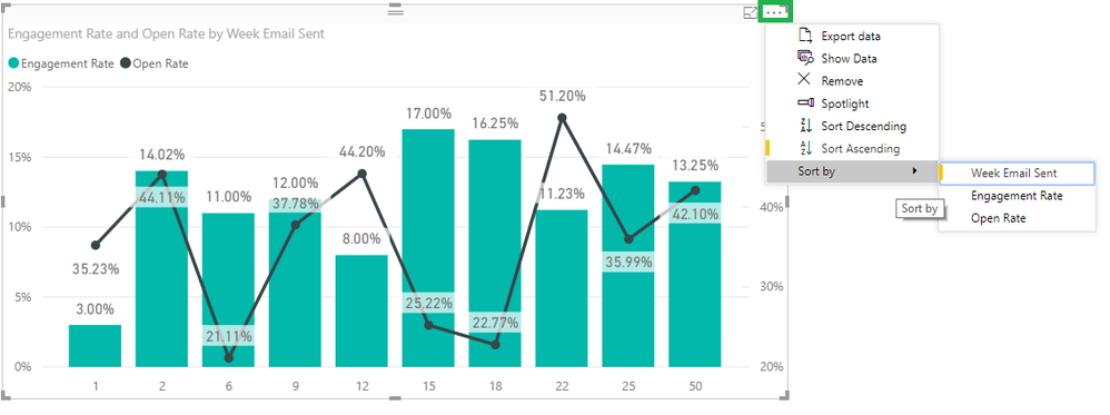
1) Choose the 3 dots on top of the visual and then Sort By Week mail sent - Ascending
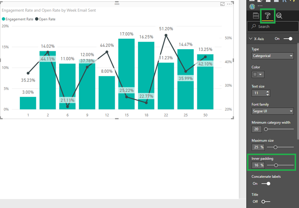
2) On x-axis go to the Inner padding option and select the % you want for the spaces between columns
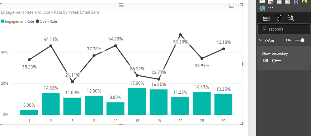
3) On the option on select Y-Axis then search for secondary Y axis and turn it on or off and confirgure the other options also
Regards,
MFelix
Regards
Miguel Félix
Did I answer your question? Mark my post as a solution!
Proud to be a Super User!
Check out my blog: Power BI em Português- Mark as New
- Bookmark
- Subscribe
- Mute
- Subscribe to RSS Feed
- Permalink
- Report Inappropriate Content
Hi @Anonymous,
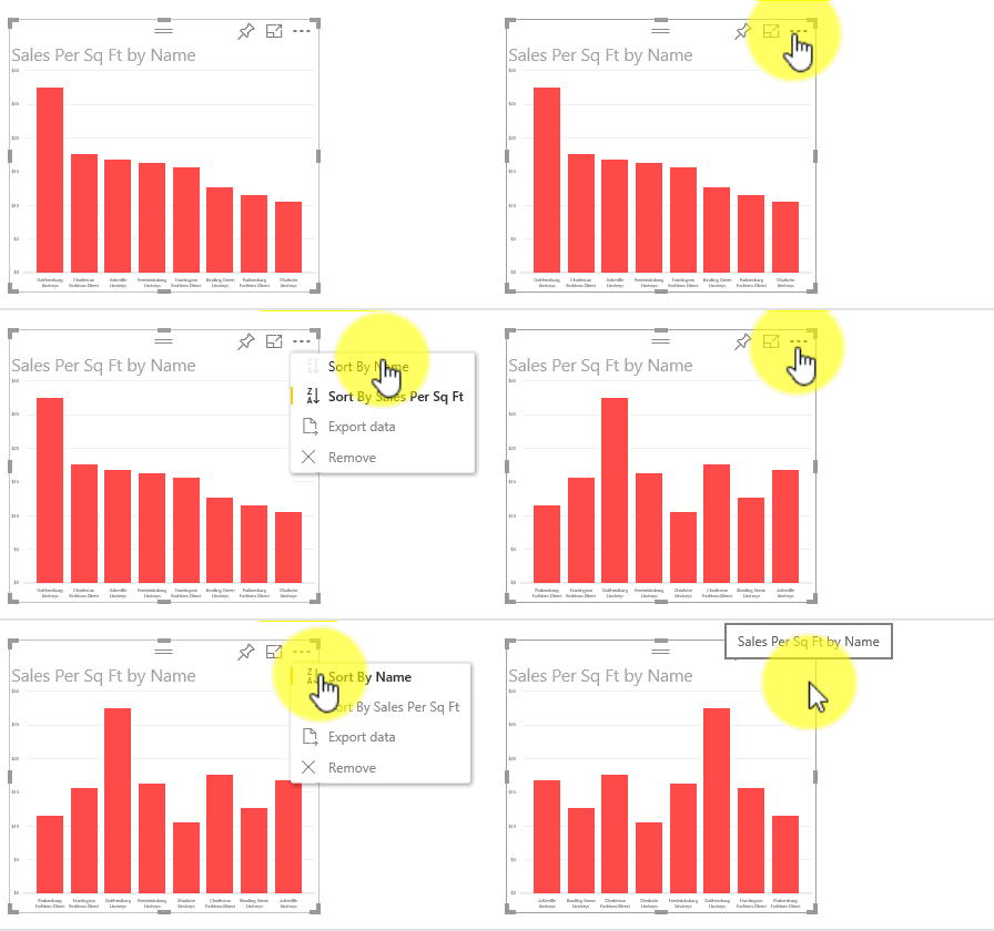
On the July version you need also to click on the 3 dots but them select the e-mail week, then click on the A-Z on the left side and you will get the same result of my image.
The image below was taken from micrsoft documentation and has the old visualizaiton sorting.
The latest version as a lot of changes so you can upgrade.
regards,
MFelix
Regards
Miguel Félix
Did I answer your question? Mark my post as a solution!
Proud to be a Super User!
Check out my blog: Power BI em Português- Mark as New
- Bookmark
- Subscribe
- Mute
- Subscribe to RSS Feed
- Permalink
- Report Inappropriate Content
Hi @Anonymous,
Regarding all this options they are available in different parts of the visual:
1) Choose the 3 dots on top of the visual and then Sort By Week mail sent - Ascending
2) On x-axis go to the Inner padding option and select the % you want for the spaces between columns
3) On the option on select Y-Axis then search for secondary Y axis and turn it on or off and confirgure the other options also
Regards,
MFelix
Regards
Miguel Félix
Did I answer your question? Mark my post as a solution!
Proud to be a Super User!
Check out my blog: Power BI em Português- Mark as New
- Bookmark
- Subscribe
- Mute
- Subscribe to RSS Feed
- Permalink
- Report Inappropriate Content
Hi @MFelix
Thank you for your timely response. I was able to replicate #2 and # 3. However, my options under the ... menu are not similar to what you are showing. I am using Power BI July 2018 version, not sure if that makes a difference. Any suggestions other than updating the desktop to the current version?
- Mark as New
- Bookmark
- Subscribe
- Mute
- Subscribe to RSS Feed
- Permalink
- Report Inappropriate Content
Hi @Anonymous,
On the July version you need also to click on the 3 dots but them select the e-mail week, then click on the A-Z on the left side and you will get the same result of my image.
The image below was taken from micrsoft documentation and has the old visualizaiton sorting.
The latest version as a lot of changes so you can upgrade.
regards,
MFelix
Regards
Miguel Félix
Did I answer your question? Mark my post as a solution!
Proud to be a Super User!
Check out my blog: Power BI em Português- Mark as New
- Bookmark
- Subscribe
- Mute
- Subscribe to RSS Feed
- Permalink
- Report Inappropriate Content
Uggh.. how did I miss that. I literally had to click on the left portion of the selection and that did the trick. Thanks again for your help. Much appreciated!
Helpful resources

FabCon Global Hackathon
Join the Fabric FabCon Global Hackathon—running virtually through Nov 3. Open to all skill levels. $10,000 in prizes!

Power BI Monthly Update - September 2025
Check out the September 2025 Power BI update to learn about new features.

