New Offer! Become a Certified Fabric Data Engineer
Check your eligibility for this 50% exam voucher offer and join us for free live learning sessions to get prepared for Exam DP-700.
Get Started- Power BI forums
- Get Help with Power BI
- Desktop
- Service
- Report Server
- Power Query
- Mobile Apps
- Developer
- DAX Commands and Tips
- Custom Visuals Development Discussion
- Health and Life Sciences
- Power BI Spanish forums
- Translated Spanish Desktop
- Training and Consulting
- Instructor Led Training
- Dashboard in a Day for Women, by Women
- Galleries
- Community Connections & How-To Videos
- COVID-19 Data Stories Gallery
- Themes Gallery
- Data Stories Gallery
- R Script Showcase
- Webinars and Video Gallery
- Quick Measures Gallery
- 2021 MSBizAppsSummit Gallery
- 2020 MSBizAppsSummit Gallery
- 2019 MSBizAppsSummit Gallery
- Events
- Ideas
- Custom Visuals Ideas
- Issues
- Issues
- Events
- Upcoming Events
Don't miss out! 2025 Microsoft Fabric Community Conference, March 31 - April 2, Las Vegas, Nevada. Use code MSCUST for a $150 discount. Prices go up February 11th. Register now.
- Power BI forums
- Forums
- Get Help with Power BI
- Desktop
- Re: Sorting a stacked bar chat by total sales
- Subscribe to RSS Feed
- Mark Topic as New
- Mark Topic as Read
- Float this Topic for Current User
- Bookmark
- Subscribe
- Printer Friendly Page
- Mark as New
- Bookmark
- Subscribe
- Mute
- Subscribe to RSS Feed
- Permalink
- Report Inappropriate Content
Sorting a stacked bar chat by total sales
Hi,
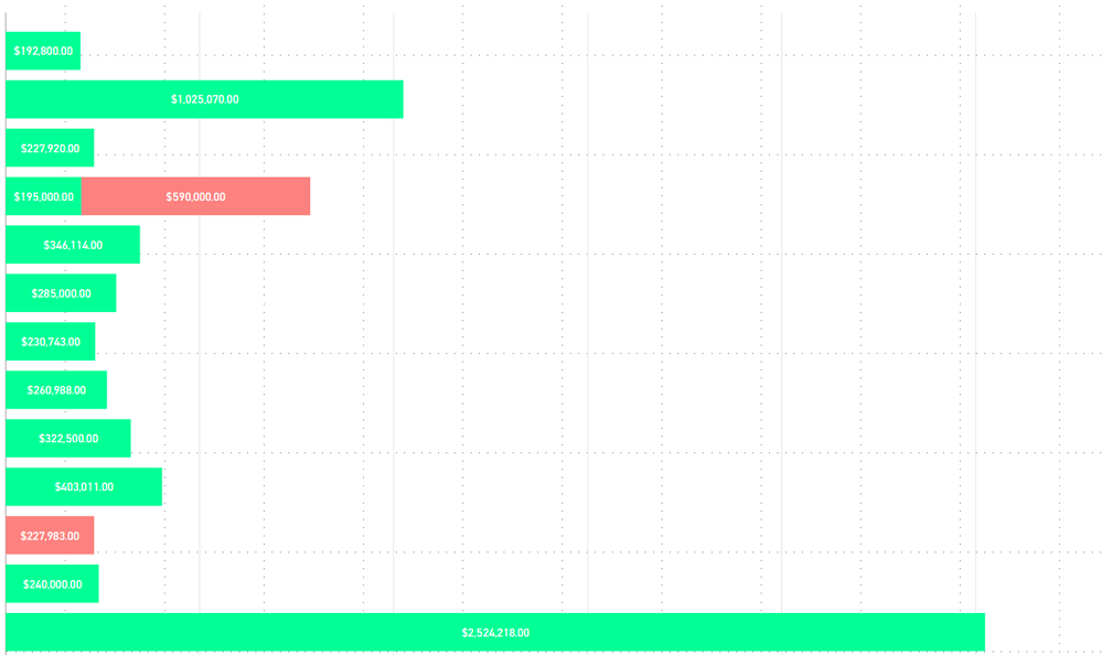
I have a stacked bar chart with 2 sales values. I made a calculated column that adds the 2 together and I want to sort by that total number. I attempted to sort the sales agent by the total volume column that I made, but it just throws an error.
I also tried changing my calculation to SUM(Val 1) + SUM(val 2) and then changing the sales agent to sort on that, but that also isn't coming out right.
This is what I am working with:
Thoughts?
- Mark as New
- Bookmark
- Subscribe
- Mute
- Subscribe to RSS Feed
- Permalink
- Report Inappropriate Content
I just found this video from Guy in a Cube: https://www.youtube.com/watch?v=1bp_e-ik7aA
It shows how you can resolve this by adding another series to the tooltip of your visual.
You can than hit the ellipsis of your visual and click Sort By, then you select the series you just added.
Just create a measure Total Sales (in your case), you'll probably need it in your data model anyway.
Good luck!
- Mark as New
- Bookmark
- Subscribe
- Mute
- Subscribe to RSS Feed
- Permalink
- Report Inappropriate Content
Great tip @MurphyMcM! I had the same problem presented above. Then, I saw your comment and tried adding a measure with the total value to the tooltip and it worked! Now this column appears in the visual's options > sort by. Thanks!!
- Mark as New
- Bookmark
- Subscribe
- Mute
- Subscribe to RSS Feed
- Permalink
- Report Inappropriate Content
I solved his for my viz by a "hack". I am using a horizontal stacked bar chart.
I had a separate measure of sum of all other values. I added this as the LAST item in the stacked chart (so it would be all the way on the right). I sorted the chart by this measure. I then went into Formatting settings and made that data value the same colour as the background. Voila, we now have the correcct sorting AND the sum of all visible values appears to the right of the stacked columns. Two birds, one hack 😉
😉
- Mark as New
- Bookmark
- Subscribe
- Mute
- Subscribe to RSS Feed
- Permalink
- Report Inappropriate Content
Could you provide some more detail on how you did this? Thanks 🙂
- Mark as New
- Bookmark
- Subscribe
- Mute
- Subscribe to RSS Feed
- Permalink
- Report Inappropriate Content
- Mark as New
- Bookmark
- Subscribe
- Mute
- Subscribe to RSS Feed
- Permalink
- Report Inappropriate Content
Hi @cdelladonna
Are the colors two measures stocked on top of the other or just one measure with legends?
Would you mind posting a dummy data?
Did I answer your question? Mark my post as a solution!
Proud to be a Super User!
"Tell me and I’ll forget; show me and I may remember; involve me and I’ll understand."
Need Power BI consultation, get in touch with me on LinkedIn or hire me on UpWork.
Learn with me on YouTube @DAXJutsu or follow my page on Facebook @DAXJutsuPBI.
- Mark as New
- Bookmark
- Subscribe
- Mute
- Subscribe to RSS Feed
- Permalink
- Report Inappropriate Content
I played around with the line and bar chart but didn't like the look with the stupid line. Further the labels clutter everything up. What I ended up doing was adding a measure with my total value divided by 10,000 (or any number that makes the value very small so it is not visible on the stacks. You can then add this item to the values and then sort by it.
Only down side is it still shows up in the legend. Haven't figured out how to get it out of there yet.
- Mark as New
- Bookmark
- Subscribe
- Mute
- Subscribe to RSS Feed
- Permalink
- Report Inappropriate Content
Did you find any other way? I got into same problem and using your technique.
- Mark as New
- Bookmark
- Subscribe
- Mute
- Subscribe to RSS Feed
- Permalink
- Report Inappropriate Content
You can do this by using a line and stacked columm chart visual, adding the total of your stacks as a line value and then sorting by that.
- Mark as New
- Bookmark
- Subscribe
- Mute
- Subscribe to RSS Feed
- Permalink
- Report Inappropriate Content
Hi @cdelladonna,
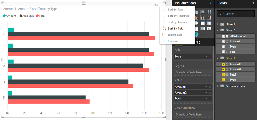
You can use clustered bar chart to achieve your requiremnet:
Regards,
Xiaoxin sheng
If this post helps, please consider accept as solution to help other members find it more quickly.
- Mark as New
- Bookmark
- Subscribe
- Mute
- Subscribe to RSS Feed
- Permalink
- Report Inappropriate Content
I think that the stacked bar chart is a better visual for what I am trying to show.
- Mark as New
- Bookmark
- Subscribe
- Mute
- Subscribe to RSS Feed
- Permalink
- Report Inappropriate Content
Use CONCATENATE function to combine both the volumes column and sort the data based on that.
Bhavesh
Love the Self Service BI.
Please use the 'Mark as answer' link to mark a post that answers your question. If you find a reply helpful, please remember to give Kudos.
- Mark as New
- Bookmark
- Subscribe
- Mute
- Subscribe to RSS Feed
- Permalink
- Report Inappropriate Content
It will not let me sort Agent by concatenate(vol1, vol2) I still want the values to appear seperately in the report.
- Mark as New
- Bookmark
- Subscribe
- Mute
- Subscribe to RSS Feed
- Permalink
- Report Inappropriate Content
Any update on this? Still have not found a viable solution. Thank you
Helpful resources

Join us at the Microsoft Fabric Community Conference
March 31 - April 2, 2025, in Las Vegas, Nevada. Use code MSCUST for a $150 discount!

Power BI Monthly Update - January 2025
Check out the January 2025 Power BI update to learn about new features in Reporting, Modeling, and Data Connectivity.

| User | Count |
|---|---|
| 124 | |
| 79 | |
| 50 | |
| 38 | |
| 38 |
| User | Count |
|---|---|
| 195 | |
| 80 | |
| 70 | |
| 51 | |
| 42 |


