Get Fabric certified for FREE!
Don't miss your chance to take the Fabric Data Engineer (DP-700) exam on us!
Learn more- Power BI forums
- Get Help with Power BI
- Desktop
- Service
- Report Server
- Power Query
- Mobile Apps
- Developer
- DAX Commands and Tips
- Custom Visuals Development Discussion
- Health and Life Sciences
- Power BI Spanish forums
- Translated Spanish Desktop
- Training and Consulting
- Instructor Led Training
- Dashboard in a Day for Women, by Women
- Galleries
- Data Stories Gallery
- Themes Gallery
- Contests Gallery
- QuickViz Gallery
- Quick Measures Gallery
- Visual Calculations Gallery
- Notebook Gallery
- Translytical Task Flow Gallery
- TMDL Gallery
- R Script Showcase
- Webinars and Video Gallery
- Ideas
- Custom Visuals Ideas (read-only)
- Issues
- Issues
- Events
- Upcoming Events
We've captured the moments from FabCon & SQLCon that everyone is talking about, and we are bringing them to the community, live and on-demand. Starts on April 14th. Register now
- Power BI forums
- Forums
- Get Help with Power BI
- Desktop
- Slicers as input for Python script
- Subscribe to RSS Feed
- Mark Topic as New
- Mark Topic as Read
- Float this Topic for Current User
- Bookmark
- Subscribe
- Printer Friendly Page
- Mark as New
- Bookmark
- Subscribe
- Mute
- Subscribe to RSS Feed
- Permalink
- Report Inappropriate Content
Slicers as input for Python script
Hi everyone -
I have a python network script visual in Power BI.
I am looking to apply a slicer (instead of hard-coding the teams - tm1 and tm2 ) in the python script below.
How can be this be done?
Thank you in advance!
# The following code to create a dataframe and remove duplicated rows is always executed and acts as a preamble for your script:

# dataset = pandas.DataFrame(TmName, OppName)
# dataset = dataset.drop_duplicates()

# Paste or type your script code here:
import networkx
import matplotlib.pyplot as plt

tm1 = 'Villanova'
tm2 = 'Cal Poly SLO'

# load edges file from csv
left = list(dataset.TmName)
right = list(dataset.OppName)
graph = networkx.Graph()
graph.add_edges_from(list(zip(left, right)))

# Test single path
shortest_path = networkx.shortest_path(graph, tm1, tm2)
#
edges_2team = dataset[dataset.TmName.isin(shortest_path)]
left_2team= list(edges_2team['TmName'])
right_2team = list(edges_2team['OppName'])
graph_2team = networkx.Graph()
graph_2team.add_edges_from(list(zip(left_2team, right_2team)))
networkx.draw(graph_2team, with_labels=True)
plt.show()
Solved! Go to Solution.
- Mark as New
- Bookmark
- Subscribe
- Mute
- Subscribe to RSS Feed
- Permalink
- Report Inappropriate Content
Hey @jmarcrum ,
this code is maybe doing what you are looking for:
# The following code to create a dataframe and remove duplicated rows is always executed and acts as a preamble for your script:

# dataset = pandas.DataFrame(TmName, OppName, Selection1, Selection2)
# dataset = dataset.drop_duplicates()

# Paste or type your script code here:
import networkx
import matplotlib.pyplot as plt

tm1_l = list(dataset.Selection1)
tm1 = tm1_l[1]
tm2_l = list(dataset.Selection2)
tm2 = tm2_l[1]

# load edges file from csv
left = list(dataset.TmName)
right = list(dataset.OppName)
graph = networkx.Graph()
graph.add_edges_from(list(zip(left, right)))

# Test single path
shortest_path = networkx.shortest_path(graph, tm1, tm2)

edges_2team = dataset[dataset.TmName.isin(shortest_path)]
left_2team= list(edges_2team['TmName'])
right_2team = list(edges_2team['OppName'])
graph_2team = networkx.Graph()
graph_2team.add_edges_from(list(zip(left_2team, right_2team)))
plt.title(tm1 + " " + tm2)
networkx.draw(graph_2team, with_labels=True)
plt.show()
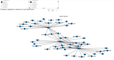
as it allows to create this chart:
Be aware of this line:
networkx.draw(graph_2team, with_labels=True)
Hopefully, this is what you are looking for.
Regards,
Tom
Did I answer your question? Mark my post as a solution, this will help others!
Proud to be a Super User!
I accept Kudos 😉
Hamburg, Germany
- Mark as New
- Bookmark
- Subscribe
- Mute
- Subscribe to RSS Feed
- Permalink
- Report Inappropriate Content
Hey everyone, just want to check with you is you networkx python script working when the report be published to server?
I'm facing a problem that the python script works well in desktop, and it works in my gateway server too. But when I publish the report to server with using the same gateway server to support refresh.
The python script fails with the following error:
Script Runtime Error
[S-8b0f9ca0-eb61-491c-a98d-cc6bf0c07d18][S-8b0f9ca0-eb61-491c-a98d-cc6bf0c07d18]ModuleNotFoundError: No module named 'networkx'
Thansk.
- Mark as New
- Bookmark
- Subscribe
- Mute
- Subscribe to RSS Feed
- Permalink
- Report Inappropriate Content
I could be mistaken but I am pretty sure that python visuals interact with other visuals so a slicer should pre-filter the dataframe coming into the python visual...
Follow on LinkedIn
@ me in replies or I'll lose your thread!!!
Instead of a Kudo, please vote for this idea
Become an expert!: Enterprise DNA
External Tools: MSHGQM
YouTube Channel!: Microsoft Hates Greg
Latest book!: DAX For Humans
DAX is easy, CALCULATE makes DAX hard...
- Mark as New
- Bookmark
- Subscribe
- Mute
- Subscribe to RSS Feed
- Permalink
- Report Inappropriate Content
I guess i don't really want to filter the dataframe coming in. I really want to pass in a parameter... like allow the user to select a team 1 and a team 2 that I can then pass in to the python script and use in place of the tm1 and tm2 hard-coded values.
Does that make sense? How would I do that?
- Mark as New
- Bookmark
- Subscribe
- Mute
- Subscribe to RSS Feed
- Permalink
- Report Inappropriate Content
Hey @jmarcrum ,
you can add the column that "feeds" the slicer to the python script values.
Another option is to create a measure using DAX if the column originates from an unrelated table. You can use SELECTEDVALUE('<tablename>'[columname] , <defaultvalue>), see here: https://dax.guide/selectedvalue/
Hopefully, this provides some ideas to tackle your challenge.
Regards,
Tom
Stay safe, stay healthy
Did I answer your question? Mark my post as a solution, this will help others!
Proud to be a Super User!
I accept Kudos 😉
Hamburg, Germany
- Mark as New
- Bookmark
- Subscribe
- Mute
- Subscribe to RSS Feed
- Permalink
- Report Inappropriate Content
Hi Tom -
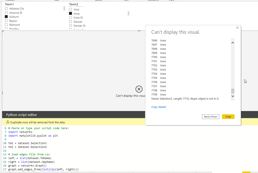
I went the second route, using DAX on the disconnected table, but I'm getting an error. Do you know what might be wrong?
You can see the edited code as well as the error in the middle. It think my imported measures aren't objects?
My pbix file is here:
https://www.dropbox.com/s/1qm5b3l73c01tbr/To_Publish4.pbix?dl=0
- Mark as New
- Bookmark
- Subscribe
- Mute
- Subscribe to RSS Feed
- Permalink
- Report Inappropriate Content
Hey @jmarcrum ,
please provide a pbix that creates a working network graph, without trying to incorporate the unrelated table or SELECTEDVALUE solutions that I mentioned.
Regards,
Tom
Did I answer your question? Mark my post as a solution, this will help others!
Proud to be a Super User!
I accept Kudos 😉
Hamburg, Germany
- Mark as New
- Bookmark
- Subscribe
- Mute
- Subscribe to RSS Feed
- Permalink
- Report Inappropriate Content
Hey @jmarcrum ,
I couldn't resist 🙂
this code
# Paste or type your script code here:
import networkx
import matplotlib.pyplot as plt

tm1_l = list(dataset.Selection1)
tm1 = tm1_l[1]
tm2_l = list(dataset.Selection2)
tm2 = tm2_l[1]

# load edges file from csv
left = list(dataset.TmName)
right = list(dataset.OppName)
graph = networkx.Graph()
graph.add_edges_from(list(zip(left, right)))

# Test single path
# shortest_path = networkx.shortest_path(graph, tm1, tm2)
#
#edges_2team = dataset[dataset.TmName.isin(shortest_path)]
#left_2team= list(edges_2team['TmName'])
#right_2team = list(edges_2team['OppName'])
#graph_2team = networkx.Graph()
#graph_2team.add_edges_from(list(zip(left_2team, right_2team)))
plt.title(tm1 + " " + tm2)
networkx.draw(graph, with_labels=False)
plt.show()
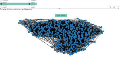
Creates this chart (the green rectangles are added using snagit 🙂
As you can see the measures are working to select something.
Please be aware that my code above is transforming the dataframe columns to a list, to select the 1st value to create the title.
I'm using plt.title as .draw() turns off the axis, where .draw_newtworkx() is not doing this.
Hopefully, this provides some ideas about what is causing the issues
Regards,
Tom
Did I answer your question? Mark my post as a solution, this will help others!
Proud to be a Super User!
I accept Kudos 😉
Hamburg, Germany
- Mark as New
- Bookmark
- Subscribe
- Mute
- Subscribe to RSS Feed
- Permalink
- Report Inappropriate Content
Hey @jmarcrum ,
this code is maybe doing what you are looking for:
# The following code to create a dataframe and remove duplicated rows is always executed and acts as a preamble for your script:

# dataset = pandas.DataFrame(TmName, OppName, Selection1, Selection2)
# dataset = dataset.drop_duplicates()

# Paste or type your script code here:
import networkx
import matplotlib.pyplot as plt

tm1_l = list(dataset.Selection1)
tm1 = tm1_l[1]
tm2_l = list(dataset.Selection2)
tm2 = tm2_l[1]

# load edges file from csv
left = list(dataset.TmName)
right = list(dataset.OppName)
graph = networkx.Graph()
graph.add_edges_from(list(zip(left, right)))

# Test single path
shortest_path = networkx.shortest_path(graph, tm1, tm2)

edges_2team = dataset[dataset.TmName.isin(shortest_path)]
left_2team= list(edges_2team['TmName'])
right_2team = list(edges_2team['OppName'])
graph_2team = networkx.Graph()
graph_2team.add_edges_from(list(zip(left_2team, right_2team)))
plt.title(tm1 + " " + tm2)
networkx.draw(graph_2team, with_labels=True)
plt.show()
as it allows to create this chart:
Be aware of this line:
networkx.draw(graph_2team, with_labels=True)
Hopefully, this is what you are looking for.
Regards,
Tom
Did I answer your question? Mark my post as a solution, this will help others!
Proud to be a Super User!
I accept Kudos 😉
Hamburg, Germany
- Mark as New
- Bookmark
- Subscribe
- Mute
- Subscribe to RSS Feed
- Permalink
- Report Inappropriate Content
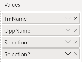
Hey, what are Selection1 and Selection2? Are they column names or something else?
Helpful resources

New to Fabric Survey
If you have recently started exploring Fabric, we'd love to hear how it's going. Your feedback can help with product improvements.

Power BI DataViz World Championships - June 2026
A new Power BI DataViz World Championship is coming this June! Don't miss out on submitting your entry.

Join our Fabric User Panel
Share feedback directly with Fabric product managers, participate in targeted research studies and influence the Fabric roadmap.

| User | Count |
|---|---|
| 53 | |
| 37 | |
| 35 | |
| 19 | |
| 17 |
| User | Count |
|---|---|
| 74 | |
| 70 | |
| 39 | |
| 35 | |
| 23 |


