- Power BI forums
- Updates
- News & Announcements
- Get Help with Power BI
- Desktop
- Service
- Report Server
- Power Query
- Mobile Apps
- Developer
- DAX Commands and Tips
- Custom Visuals Development Discussion
- Health and Life Sciences
- Power BI Spanish forums
- Translated Spanish Desktop
- Training and Consulting
- Instructor Led Training
- Dashboard in a Day for Women, by Women
- Galleries
- Community Connections & How-To Videos
- COVID-19 Data Stories Gallery
- Themes Gallery
- Data Stories Gallery
- R Script Showcase
- Webinars and Video Gallery
- Quick Measures Gallery
- 2021 MSBizAppsSummit Gallery
- 2020 MSBizAppsSummit Gallery
- 2019 MSBizAppsSummit Gallery
- Events
- Ideas
- Custom Visuals Ideas
- Issues
- Issues
- Events
- Upcoming Events
- Community Blog
- Power BI Community Blog
- Power BI 中文博客
- Community Support
- Community Accounts & Registration
- Using the Community
- Community Feedback
Find everything you need to get certified on Fabric—skills challenges, live sessions, exam prep, role guidance, and more. Get started
- Power BI forums
- Forums
- Get Help with Power BI
- Desktop
- Re: Slicer
- Subscribe to RSS Feed
- Mark Topic as New
- Mark Topic as Read
- Float this Topic for Current User
- Bookmark
- Subscribe
- Printer Friendly Page
- Mark as New
- Bookmark
- Subscribe
- Mute
- Subscribe to RSS Feed
- Permalink
- Report Inappropriate Content
Slicer
Hi Masters,
I have a grpah with multiple lines created by dax with each data columns like below.
Now what i want is having a slicer of each lines. I want to show one line in the graph using the slicer.
is it possible? if so please help me out..
Solved! Go to Solution.
- Mark as New
- Bookmark
- Subscribe
- Mute
- Subscribe to RSS Feed
- Permalink
- Report Inappropriate Content
@colourfullife
Yes, it is possible. Since you have a measure for each line in the graph, create a table using the Enter Data option on the Home ribbon. Enter All the measure names that you use in the charts. Insert a slicer and drop the measure names.
Modify each measure to check if the particular measure is selected in white, this way you can select what to display on the chart.
You can even select multiple measures.
You can download the file : https://1drv.ms/u/s!AmoScH5srsIYgYYwi9h4WbIw8meNxw?e=cRbXdT
________________________
If my answer was helpful, please consider Accepting it as the solution to help other members find it
Click the Thumbs-Up icon if you like this🙂🙂
⭕ Subscribe and learn Power BI from these videos
⚪ Website ⚪ LinkedIn ⚪ PBI User Group
- Mark as New
- Bookmark
- Subscribe
- Mute
- Subscribe to RSS Feed
- Permalink
- Report Inappropriate Content
Here is one way of doing this.
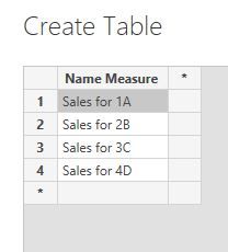
1) create a new table with the names of your measures by selecting the "Enter Data" option in the Home tab in the ribbon. For my example I'm working with 4 measures, so here is my new table (I've called it 'Slicer by measure'):
2) now create a new measure which will deliver the measure based on the selection made in the new slicer:
Selected Measure by Slicer = SWITCH(TRUE(),
    SELECTEDVALUE('Slicer by measure'[Name Measure]) IN {"Sales for 1A"}, [Sales for 1A],
        SELECTEDVALUE('Slicer by measure'[Name Measure]) IN {"Sales for 2B"}, [Sales for 2B],
            SELECTEDVALUE('Slicer by measure'[Name Measure]) IN {"Sales for 3C"}, [Sales for 3C],
                [Sales for 4D])
3) Create you line chart using this last measure, [Selected Meaure by Slicer], add the slicer to the page, and you get this:
Did I answer your question? Mark my post as a solution!
In doing so, you are also helping me. Thank you!
Proud to be a Super User!
Paul on Linkedin.
- Mark as New
- Bookmark
- Subscribe
- Mute
- Subscribe to RSS Feed
- Permalink
- Report Inappropriate Content
@PaulDBrown Thanks for your reply.
one question, can i put 2 lines in the graph using the filter?
- Mark as New
- Bookmark
- Subscribe
- Mute
- Subscribe to RSS Feed
- Permalink
- Report Inappropriate Content
@colourfullife
Yes, it is possible. Since you have a measure for each line in the graph, create a table using the Enter Data option on the Home ribbon. Enter All the measure names that you use in the charts. Insert a slicer and drop the measure names.
Modify each measure to check if the particular measure is selected in white, this way you can select what to display on the chart.
You can even select multiple measures.
You can download the file : https://1drv.ms/u/s!AmoScH5srsIYgYYwi9h4WbIw8meNxw?e=cRbXdT
________________________
If my answer was helpful, please consider Accepting it as the solution to help other members find it
Click the Thumbs-Up icon if you like this🙂🙂
⭕ Subscribe and learn Power BI from these videos
⚪ Website ⚪ LinkedIn ⚪ PBI User Group
- Mark as New
- Bookmark
- Subscribe
- Mute
- Subscribe to RSS Feed
- Permalink
- Report Inappropriate Content
- Mark as New
- Bookmark
- Subscribe
- Mute
- Subscribe to RSS Feed
- Permalink
- Report Inappropriate Content
@colourfullife
Modify each measure to include the condition to show the selected measure. Check my file and you will understand how it works.
I provided the steps in my original reply.
________________________
If my answer was helpful, please consider Accept it as the solution to help the other members find it
Click on the Thumbs-Up icon if you like this reply 🙂
⭕ Subscribe and learn Power BI from these videos
⚪ Website ⚪ LinkedIn ⚪ PBI User Group
- Mark as New
- Bookmark
- Subscribe
- Mute
- Subscribe to RSS Feed
- Permalink
- Report Inappropriate Content
@Fowmy yes, i thought i understood your steps and followed but the result doesn't come out like yours.
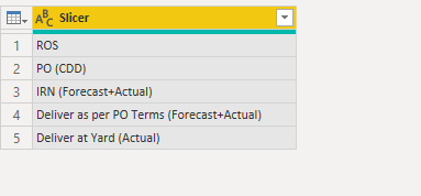
1. made a table
2. added highlighted dax part in my origianl dax to link.
did i miss something here?? if so please let me know.!
- Mark as New
- Bookmark
- Subscribe
- Mute
- Subscribe to RSS Feed
- Permalink
- Report Inappropriate Content
@colourfullife
Make sure you are typing the same value in the measure as in the Slicer Table "PO (CDD)", you have space at then like "PO (CDD) "
Hope you make a slicer and inserted the Slicer column there?
________________________
If my answer was helpful, please consider Accept it as the solution to help the other members find it
Click on the Thumbs-Up icon if you like this reply 🙂
⭕ Subscribe and learn Power BI from these videos
⚪ Website ⚪ LinkedIn ⚪ PBI User Group
- Mark as New
- Bookmark
- Subscribe
- Mute
- Subscribe to RSS Feed
- Permalink
- Report Inappropriate Content
@Fowmy thanks for your reply.
I tried to open the link but got this error message..
and can you please let me know which video i need to refer in the youtube channel ?
thanks,
CL
- Mark as New
- Bookmark
- Subscribe
- Mute
- Subscribe to RSS Feed
- Permalink
- Report Inappropriate Content
@colourfullife
Can you check the link now?
________________________
If my answer was helpful, please consider Accept it as the solution to help the other members find it
Click on the Thumbs-Up icon if you like this reply 🙂
⭕ Subscribe and learn Power BI from these videos
⚪ Website ⚪ LinkedIn ⚪ PBI User Group
- Mark as New
- Bookmark
- Subscribe
- Mute
- Subscribe to RSS Feed
- Permalink
- Report Inappropriate Content
@Fowmy still got the same error message. 😞
is it because i didn't have a latest version of PBI? hmm
is there any way to share the file? i feel like you have what i am after!
- Mark as New
- Bookmark
- Subscribe
- Mute
- Subscribe to RSS Feed
- Permalink
- Report Inappropriate Content
@colourfullife
Send me your email to the private Message.
________________________
If my answer was helpful, please consider Accept it as the solution to help the other members find it
Click on the Thumbs-Up icon if you like this reply 🙂
⭕ Subscribe and learn Power BI from these videos
⚪ Website ⚪ LinkedIn ⚪ PBI User Group
- Mark as New
- Bookmark
- Subscribe
- Mute
- Subscribe to RSS Feed
- Permalink
- Report Inappropriate Content
@colourfullife , This one is tricky.
if the line is because of legend, create a slicer on the legend
So you need control multiple lines with the slicer
line 1 measure =
var _max =maxx(Filter(allselected(Slicer[value]),Slicer[value] ="Line1"), [Value])
return
if(_max = null , blank(), [measure])
line 2 measure =
var _max =maxx(Filter(allselected(Slicer[value]),Slicer[value] ="Line2"), [Value])
return
if(_max = null , blank(), [measure])
if need one line at a time , refer
https://radacad.com/change-the-column-or-measure-value-in-a-power-bi-visual-by-selection-of-the-slic...
https://community.powerbi.com/t5/Desktop/Slicer-MTD-QTD-YTD-to-filter-dates-using-the-slicer/td-p/50...
At the Microsoft Analytics Community Conference, global leaders and influential voices are stepping up to share their knowledge and help you master the latest in Microsoft Fabric, Copilot, and Purview. ✨
️ November 12th-14th, 2024
Online Event
Register Here
Helpful resources
| User | Count |
|---|---|
| 105 | |
| 98 | |
| 97 | |
| 68 | |
| 34 |
| User | Count |
|---|---|
| 146 | |
| 141 | |
| 116 | |
| 98 | |
| 52 |


